New on YCharts: Heat Maps for Stocks, Indices & Sectors
We’re excited to share that the Stocks Data page on YCharts has been enhanced with new heat map modules and a cleaner, redesigned interface. These and other updates give you a more digestible view of trending stocks, indices, and sectors, empowering you to make more informed investment decisions—in less time.
Available to all YCharts users, the Stocks page can be customized with the indices you follow most to show which stocks are lifting or dragging an index, and lets you toggle between varying look back periods.
This capability enhances and expands upon the many ways advisors and asset managers use YCharts to research, visualize, and discuss market trends with their clients. Watch or read below to learn more!
Follow Intraday & Long-Term Index Trends
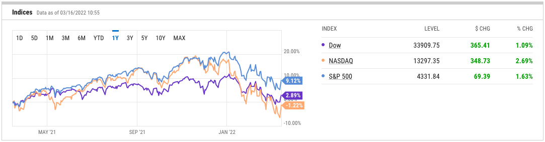
The Indices module gives a quick, high-level view of the three major US equity averages: the Dow Jones Industrial Average (^DJI), Nasdaq Composite (^IXIC), and S&P 500 (^SPX).
On the left-hand side, the performance chart can be toggled to show index performance intraday (1D) or over longer timeframes. On the right-hand side is a view of current level, intraday level change, and intraday percent-change for the three indices.
View the Stocks Data Page in YCharts
Identify the Stocks Driving Index Performance Over Time
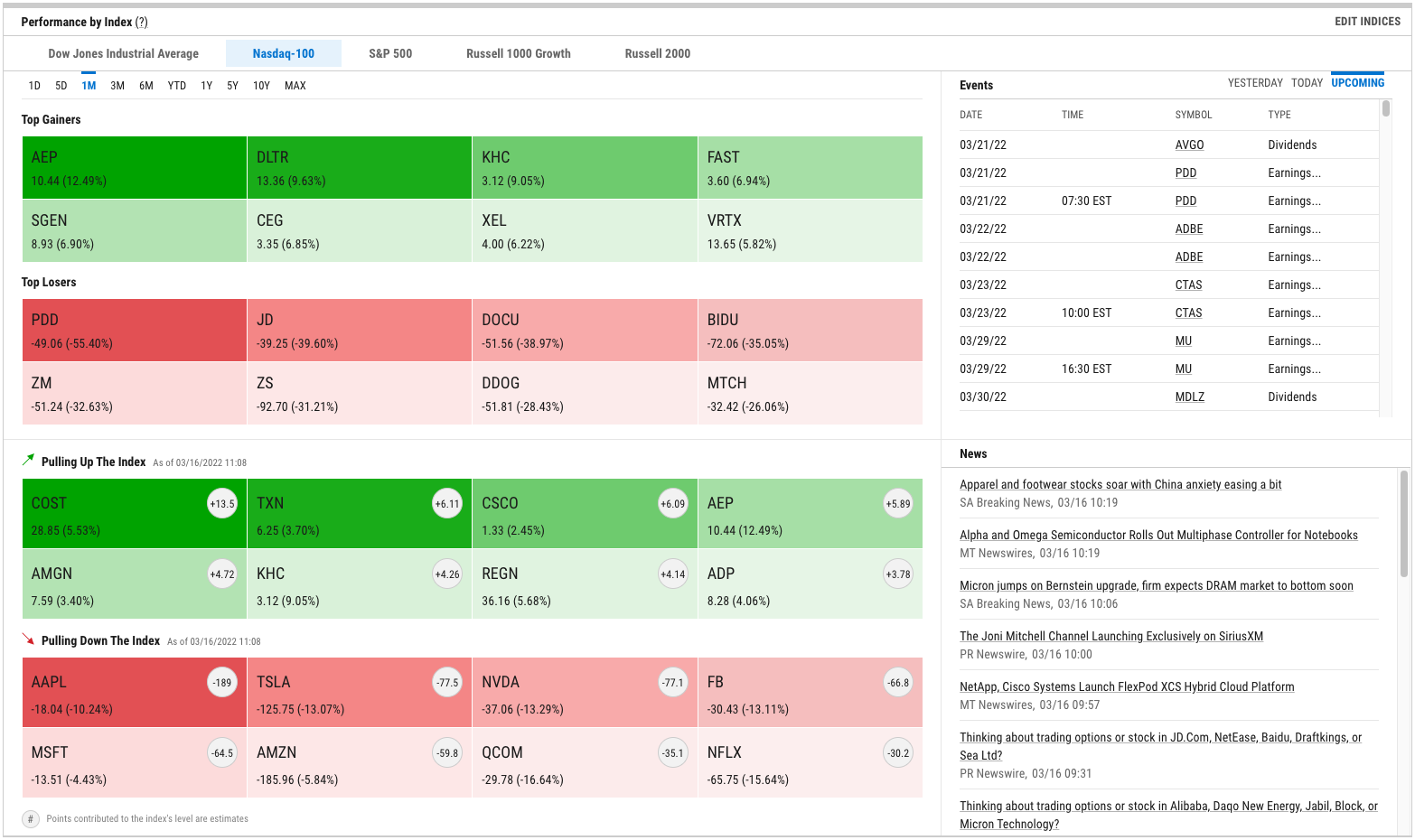
The Performance by Index module can be customized with up to five equity indices of your choosing (click “Edit Indices” in the module’s upper right-hand corner). Once configured to your liking, toggle between indices and timeframes to examine constituent performance in two unique ways.
Top Gainers and Top Losers show the stocks within a given index that are up, or down, the most on a percentage basis. The example below shows that American Electric Power (AEP) and Pinduoduo (PDD) are the Nasdaq 100’s top gainer and loser, respectively, over a one month look back.
Separately, the Pulling Up The Index and Pulling Down The Index heat maps show which stocks are the biggest drivers of an index’s overall level change, whether positive or negative. For each stock in this module, figures in the light gray circles are estimates of points contributed to—or detracted from—the index’s level for a given time frame.
View the Stocks Data Page in YCharts
The heat maps also provide easy access to investigate a stock further. Simply click any box on the heat map to visit a company’s quote page, where you can access key stats, financial statements, analyst estimates, and more.
The Events and News modules will also update as you switch between the five equity indices you’re tracking.
Examine Performance of Sectors & the Biggest Stocks in Each
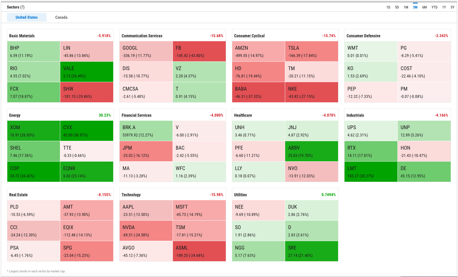
Use the Sectors module to understand performance over time for what are currently the largest companies in each sector. Toggle between the United States and Canada in the module’s upper-left corner, and change look back periods using the menu in the upper-right.
Click any box in the heat map to visit that company’s quote page, which includes key stats, financial statements, analyst estimates, and more.
View the Stocks Data Page in YCharts
Drill Down on Sector & Industry Stats, Performance
The Stocks page’s Sectors module provides quick-and-easy access to even more key stats, aggregated at the sector and industry levels. Sectors and Industry Data, which can be accessed from the Stocks page itself (or by clicking “Data” in the navigation bar, then “Sectors” in the dropdown menu), aggregates valuation ratios, performance and risk, and other key metrics for all eleven Standard & Poor’s sectors.
These metrics are not market cap-weighted statistics. Instead, they represent an aggregate of all stocks within a given sector in order to illustrate the overall size, growth, and valuation of each sector of the economy. (As an example of this methodology, the price and earnings per share (EPS) of every stock in a sector are summed separately, and those summations are used to calculate a sector-level PE Ratio. Alternatively, a market cap-weighted calculation of sector PE would not be reflective of stocks in that sector without PE ratios, and would effectively ignore companies with negative earnings.)
By clicking any sector’s name in the table, you can access a more exhaustive list of sector and industry-level stats related to performance, valuation multiples and ratios, and aggregated financial statement line items.
Connect with YCharts
Much like the advisors and asset managers we serve, we pride ourselves on listening to and understanding our clients’ needs.
The new Stocks Data and Sectors & Industry pages are available to all YCharts users. For questions or feedback, reach out to your account manager.
Not a YCharts user? Sign up for a 7-Day Free Trial or contact us via email at hello@ycharts.com and by phone at (866) 965-7552 to learn more.
Disclaimer
©2022 YCharts, Inc. All Rights Reserved. YCharts, Inc. (“YCharts”) is not registered with the U.S. Securities and Exchange Commission (or with the securities regulatory authority or body of any state or any other jurisdiction) as an investment adviser, broker-dealer or in any other capacity, and does not purport to provide investment advice or make investment recommendations. This report has been generated through application of the analytical tools and data provided through ycharts.com and is intended solely to assist you or your investment or other adviser(s) in conducting investment research. You should not construe this report as an offer to buy or sell, as a solicitation of an offer to buy or sell, or as a recommendation to buy, sell, hold or trade, any security or other financial instrument. For further information regarding your use of this report, please go to: ycharts.com/about/disclosure.
Next Article
Can You Hedge a Stock Market Crash with an ETF?Read More →