How YCharts Supports the Defined Outcome ETF Conversation
Options strategies are often perceived as speculative, complex, or time-consuming. However, outcome-based ETFs seem to be reshaping the perception of how advisors and investors can use options in portfolios.
Through the ETF wrapper, these funds seek to reduce risk, limit volatility, and align with long-term financial goals, without managing the complexity themselves.
Defined Outcome ETFs became mainstream quickly. According to BlackRock, assets under management surged from just $5 billion in 2019 to $181 billion in 2024, and they project that figure will climb to $650 billion by 2030.
This growth is fueled by real client needs, namely increased market volatility, the declining diversification benefits of the traditional 60/40 portfolio (see 2022), and rising retiree demographics.
According to the UN, by 2050, one in six people globally will be over 65 (up from one in eleven in 2019). At the same time, more than half of investable assets in the U.S. are now held by individuals with portfolios exceeding $5 million, according to Cerulli.
Advisors increasingly need solutions that protect the nest egg these clients have spent a lifetime building. These strategies seek to provide a smoother investment experience, aiming to mitigate downside risk while participating in equity market growth.
Sign up to recieve a copy of our monthly Fund Flows Report to see how the leaderboard in this space and other peer groups take shape:
Defined Outcome ETF Education
As Wentworth Financial Communications points out, making complexity accessible is crucial for Outcome ETFs. So, distribution teams must simplify the conversation around risk, illustrate how the strategies work, and answer questions surrounding liquidity.
Wentworth’s findings emphasize the need to illustrate data and move beyond pitch decks to real conversations with advisors. YCharts equips teams to showcase how defined outcome strategies performed in scenarios like 2022, tie outcomes to recent market volatility, and compare them directly to competing solutions in a format that builds trust and drives adoption.
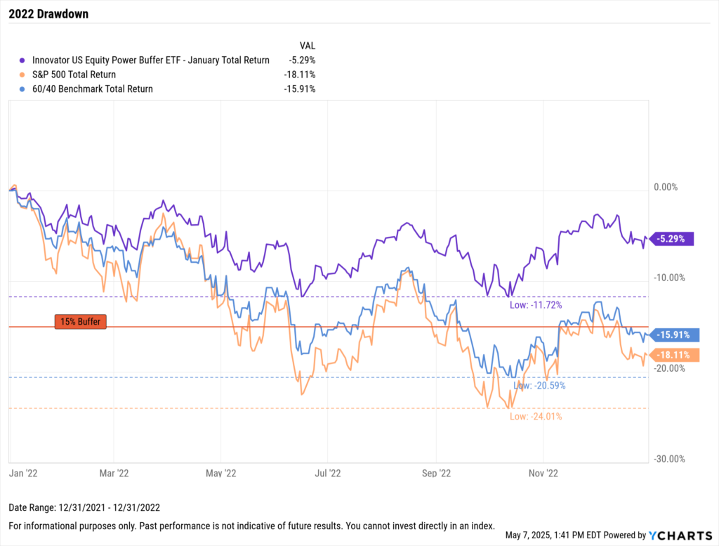
Let’s begin with simple education. Buffered ETFs are designed to offer defined protection (for example, the first 5% or 10% of losses) over a set “outcome period,” often around one year.
In YCharts, you can easily build and save a fundamental chart to demonstrate how a buffered ETF like the Innovator U.S. Equity Power Buffer ETF – January (PJAN), the largest non-laddered, non-fund-of-funds strategy in the category, performed during the volatility of 2022.
With a 15% downside buffer, PJAN can be directly compared to a traditional 60/40 portfolio and the S&P 500, helping advisors visualize how defined outcome strategies may have helped cushion downside risk in real-world scenarios.
Download Visual | Modify in YCharts
Real-world examples like 2022 can be saved as stress tests in YCharts, giving distribution teams quick access to historical periods to see how various strategies performed under pressure.
Competitive Analysis & Positioning Defined Outcome ETFs
The Defined Outcome ETF category is expanding rapidly, broadening across asset classes and evolving to serve goals like income generation or equity participation.
As such, distribution teams will increasingly encounter new competitors. YCharts makes competitive positioning easier; 97% of wholesalers say YCharts helps with positioning.
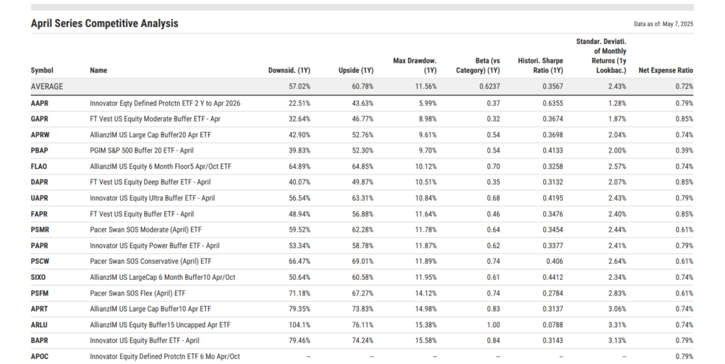
You can build comp tables to include key metrics like upside and downside capture, Sharpe ratio, standard deviation, beta, max drawdown, and expense ratio, a critical measure for cost-conscious investors.
Download Visual | Modify Comp Table
Whether preparing for an advisor meeting or refining your territory strategy, YCharts makes it easy to share up-to-date comp tables that reflect the latest outcome periods. You can share these insights directly within YCharts or export them as print-ready PDFs so every external has a data-backed story to tell on the road.
You’ll know exactly where you stand on cost, such as how your expense ratio compares to the 72 basis point average across the 20 largest ETFs that share an outcome period.
From there, you might lean into your strategy’s upside capture, like Allianz’s ARLU, which delivered a 76% one-year upside capture as of April 30, 2025.
Or you can highlight your strength in managing downside risk and volatility—similar to Innovator’s AAPR, First Trust’s GAPR, or Allianz’s APRW, which rank among the category’s leaders in max drawdown and volatility of monthly returns over the past year.
Educate Advisors on Buffer Levels with Visuals
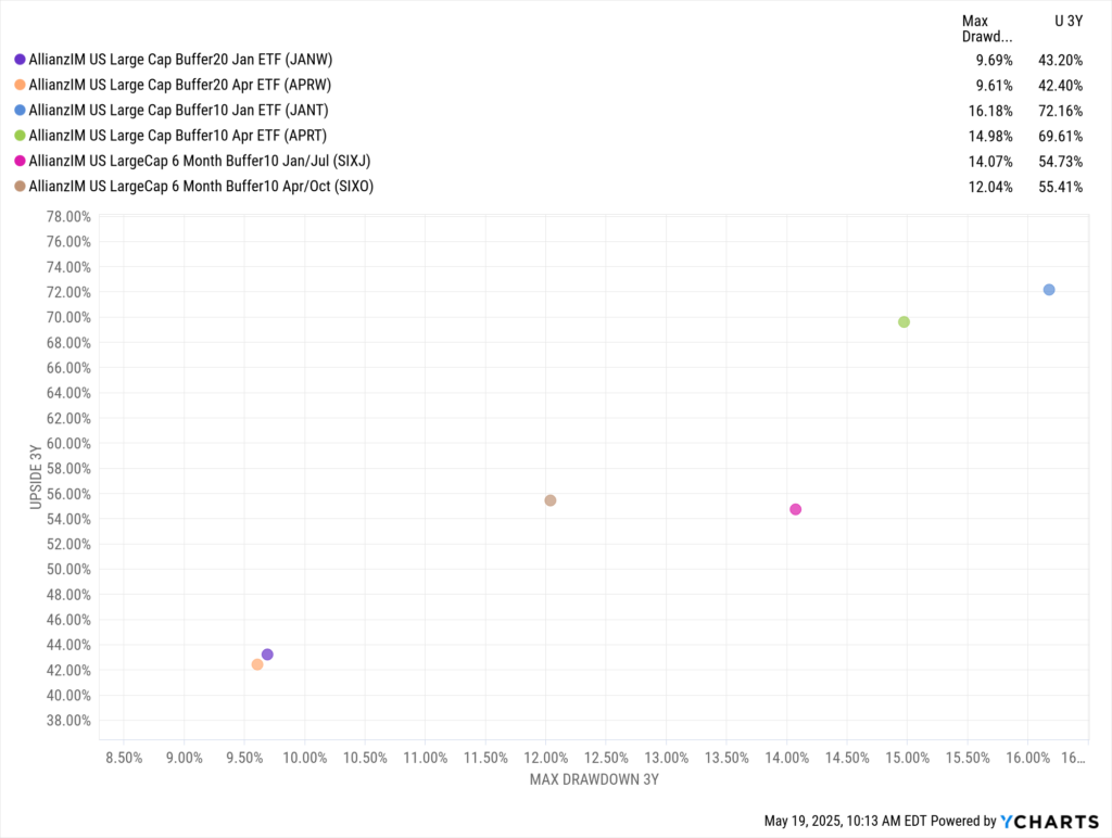
One of the most effective ways to help advisors understand how Defined Outcome ETFs align with client goals is through scatter plots. With YCharts, you can visually demonstrate the experience an advisor and their clients might expect over a given outcome period, such as April, based on the chosen buffer level.
This makes it easier to compare strategies in practical terms of upside potential and downside risk.
Download Visual | Modify in YCharts
The chart above shows Allianz’s January and April-dated buffer ETFs, illustrating the trade-off between risk and return. For instance, JANT, which targets a moderate buffer, posted the highest three-year upside capture at 72.2% with a max drawdown during the same period of 16.2%.
On the more conservative end, APRW had the lowest drawdown at 9.6%, though that came with the lowest upside at 42.4%. This breakdown allows advisors to match buffer strategies to client preferences.
Laddered Strategies and Allocation
For advisors incorporating Defined Outcome ETFs into client portfolios, laddered or fund-of-funds structures have proven to be the most popular option. This is evidenced by the $6 billion FT Vest Laddered Buffer ETF (BUFR), the largest strategy in the category.
These approaches offer a turnkey, hands-off experience. By holding staggered start and end dates, they may reduce timing sensitivity and allow clients to enter the strategy at any point without being penalized by market entry or capped upside. They may also help minimize reinvestment risk, automatically rolling into new outcome periods without manual oversight, making it easy for the advisor.
In a year already marked by meaningful turbulence, the “40” side of portfolios has resumed its role as a stabilizer, unlike in 2022. Yet, incorporating buffered equity exposure may have reduced drawdowns further.
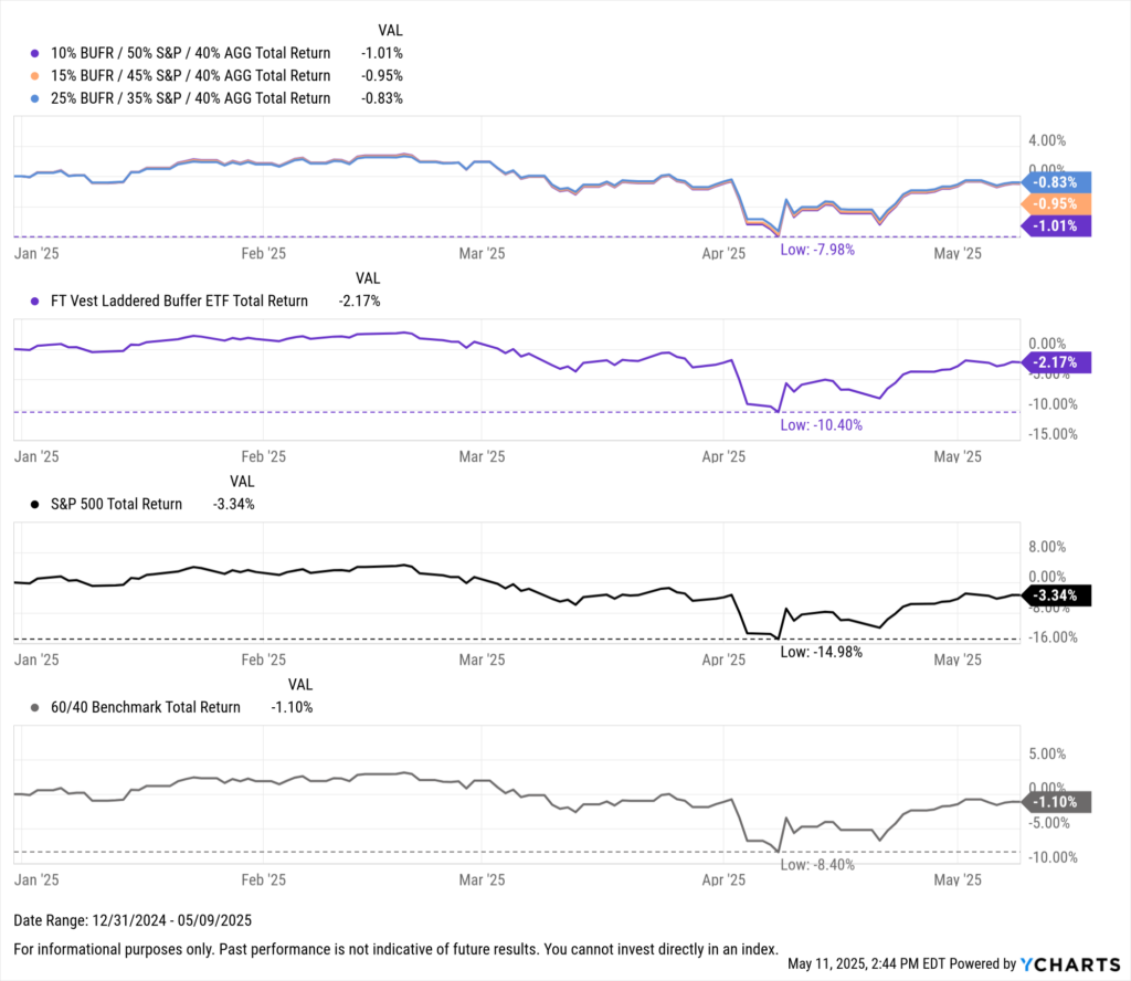
Download Visual | Modify in YCharts
For example, while the S&P 500 fell as much as 15%, and a traditional 60/40 portfolio dropped 8.4% at its low, a blended approach using BUFR meaningfully cushioned the downside, limiting peak drawdowns this year to just 8% in a 10% BUFR / 50% S&P / 40% AGG mix. Even modest allocations to buffered strategies helped mitigate volatility while keeping portfolios exposed to potential equity upside.
Defined Outcome ETFs offer a flexible, practical solution for advisors looking to manage risk without fully exiting the market or concerned that strong stock-bond correlations could resurface amid renewed inflation threats. YCharts empowers distribution teams to educate advisors on these strategies by visualizing use cases, comparing outcomes, and illustrating how buffered exposure may enhance portfolio resilience.
Whenever you’re ready, here’s how YCharts can help you:
Unlock access to our Fund Flows Visual Deck by becoming a client
Sign up for a copy of our Fund Flows Report:
Sign up to recieve a copy of our monthly Fund Flows Report:Disclaimer
©2025 YCharts, Inc. All Rights Reserved. YCharts, Inc. (“YCharts”) is not registered with the U.S. Securities and Exchange Commission (or with the securities regulatory authority or body of any state or any other jurisdiction) as an investment adviser, broker-dealer or in any other capacity, and does not purport to provide investment advice or make investment recommendations. This report has been generated through application of the analytical tools and data provided through ycharts.com and is intended solely to assist you or your investment or other adviser(s) in conducting investment research. You should not construe this report as an offer to buy or sell, as a solicitation of an offer to buy or sell, or as a recommendation to buy, sell, hold or trade, any security or other financial instrument. For further information regarding your use of this report, please go to: ycharts.com/about/disclosure
Next Article
Introducing the New Yield Curve Tool on YCharts: Analyze Interest Rates with ClarityRead More →