June ADP Report vs. Jobs Report: How Advisors Reconcile Conflicting Jobs Data
Introduction
Markets were jolted today, 2 July 2025 after the June ADP Report revealed a surprise 33,000 decline in private-sector payrolls, the first contraction in 26 months. Twenty-four hours later, the Bureau of Labor Statistics (BLS) is still expected to show a headline gain near 110,000. Advisors now face a compressed, pre-holiday window to explain the divergence, recalibrate positioning, and reassure clients before the Fourth-of-July break.
What We’ll Cover in This Blog:
- Why the June ADP Report triggered a sharp market reaction
- How and why ADP and BLS payrolls often diverge
- Which jobs data matters more for Fed policy and portfolios
- How to visualize labor trends in YCharts using side-by-side tools
- Key portfolio positioning takeaways based on evolving jobs data
- How to communicate data conflicts confidently to clients
How Jobs Data Impacts Markets
Jobs releases routinely spark some of the fastest intraday moves across equities, bonds, and currencies because payroll growth filters directly into inflation expectations, consumer demand, and ultimately Federal Reserve policy.
When hiring accelerates, investors infer resilient demand. Wages can climb, consumer spending improves, and policymakers may see upside inflation risks. Treasury yields tend to rise, rate-cut probabilities shrink, and cyclical sectors such as financials and industrials often lead short-term performance.
Conversely, job losses or rising unemployment hint at cooling momentum. Bond yields generally fall as traders price in easier policy. Growth stocks may gain an edge over defensives, while long-duration Treasuries and REITs usually benefit from lower discount-rate assumptions.
Although unofficial, the ADP release hits tapes one day before the government’s payroll number, granting it outsized influence over overnight futures and headline sentiment. Even with a patchy record of predicting the BLS figure, its timing can swing short-term rate expectations and set the tone for risk appetite into the following session.
For advisors, grasping this cause-and-effect chain, from payroll surprises to Fed rhetoric to sector rotation, enables faster client messaging, more nimble allocation shifts, and clearer explanations of what a shock jobs print really means for long-term portfolios.
Why This Topic Matters Now
Powell’s July 1st “wait and learn” guidance already signaled caution. The June ADP Report amplified that mood, briefly pricing two rate cuts by September and flattening the front end of the yield curve. Advisors juggling tariff-driven inflation, slowing growth signals, and thin holiday liquidity require a proactive framework rather than headline-driven reaction.
Q: Why did the ADP report shock markets this month?
A: Private payrolls slipped for the first time since April 2023, flagging potential momentum loss just as tariffs raise input costs. The surprise reversed intraday Treasury yields and ignited debate over imminent easing, forcing advisors to decode the divergence rapidly and credibly.
Seasonal quirks matter. Smaller firms often delay summer hiring into July, and ADP’s universe under-weights public employment. Tomorrow’s government survey includes education and municipal jobs, likely padding the headline and tempering recession chatter. Nevertheless, the gap magnifies volatility in a three-day trading span.
What Advisors Are Asking
Q: Which jobs report carries more weight – ADP or BLS?
A: Trust the BLS. Its 122 000-firm survey includes government payrolls and anchors Fed deliberations. ADP offers an early pulse but shows wide errors versus BLS; treat it as directional context, not a trading signal. For the full macro roadmap, see our pillar analysis, “June Jobs Report, ISM & Powell: What Financial Advisors Must Watch This Week.”
Q: Why do ADP and BLS numbers diverge so often?
A: Methodologies differ. ADP samples payroll processors tilted to mid-size companies, while BLS uses stratified surveys and seasonal adjustments. Sector weights, holiday timing, and revision cycles create frequent one-month gaps. Plotting both series in YCharts shows divergence is common, not exceptional.
Q: What if ADP weakness persists and BLS confirms?
A: Dual softness would bolster the case for Q3 cuts, pressing short yields lower and favoring quality bonds, long Treasuries, and defensive growth stocks. If BLS contradicts ADP, risk assets could rebound, and the Fed may delay easing until inflation data convincingly cools.
How to Analyze This Using YCharts
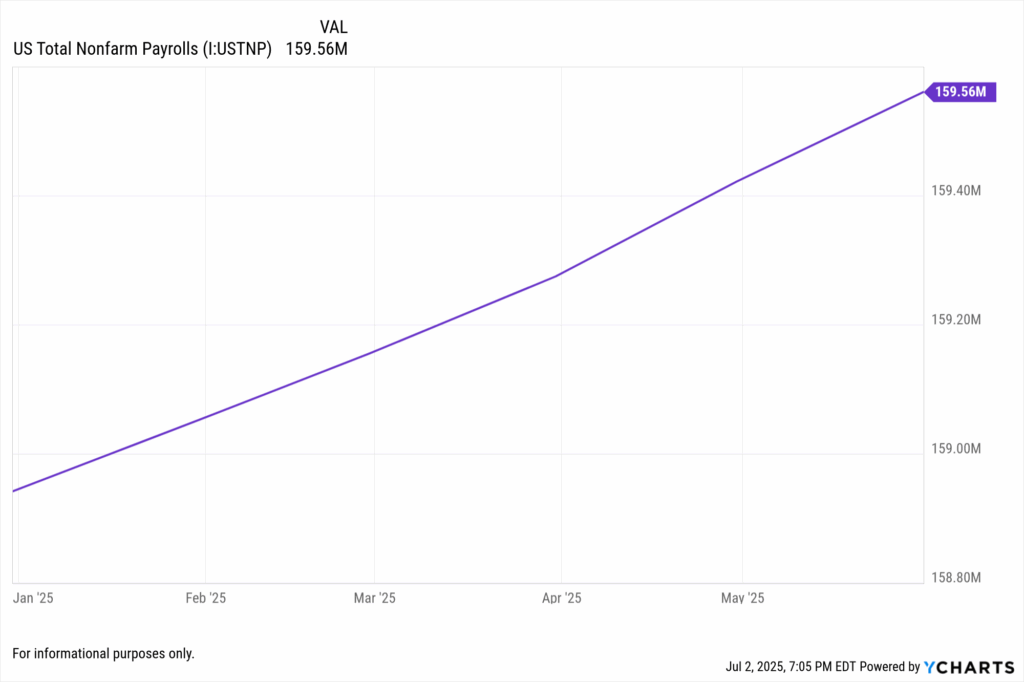
Advisors can use YCharts to visualize labor market strength and emerging inflection points. Begin by opening your Dashboard and pinning both the US Total Nonfarm Payrolls and US Unemployment Rate series side by side. These two indicators frame the labor narrative clearly: one shows hiring momentum, the other signals slack.
Switch between one-month and three-month views to smooth volatility and highlight longer-term direction. For example, while payrolls have continued climbing, any sustained rise in the unemployment rate could indicate hidden softness not yet reflected in hiring numbers.
Create a Fundamental Chart using:
- Series: US Total Nonfarm Payrolls (Level) and US Unemployment Rate (%)
- Range: March 2023 – Present
- Chart Type: Dual-axis line chart
- Annotations: Flag June 2025 payrolls estimate (+110k) and any uptick in the unemployment rate for the same month
This dual visualization offers a powerful narrative for client communication—when hiring slows and unemployment rises, markets begin to price in economic risk and Fed policy shifts.
Next, Set Alerts on both indicators. For example:
- Alert if Unemployment Rate rises above 4.3%
- Alert if Monthly Payrolls fall below +75,000
This ensures you’re instantly notified when headline labor trends begin to diverge from expectations—allowing you to prepare timely proposals and market commentary.
Use the Fund Screener to identify sector exposures sensitive to labor dynamics. Apply filters for:
- Consumer Discretionary (e.g., XLY)
- Regional Banks (e.g., KRE)
- REITs (e.g., VNQ)
Then apply Holdings Overlap to ensure tactical tilts don’t duplicate risk. If you’re rotating toward defensives, avoid overexposure to utilities or healthcare across multiple positions.
Add a second visual comparing market reaction:
- Series: US 10-Year Treasury Yield (US10Y) vs. Unemployment Rate
- Chart Type: Dual-axis line
- Range: Jan 2023 – Present
- Insight: Shows how yields tend to fall as unemployment ticks up, helping confirm whether markets are pricing in softness.
Tactical Portfolio Takeaways
1. Emphasize Trend Over Single Shocks
Blend ADP and BLS into a rolling three-month mean. When that composite falls below +75 000 and unemployment tops 4.3 percent, raise cash buffers, extend high-quality duration, and trim small-cap cyclicals. Clients grasp a moving-average story better than a lone data miss.
2. Prepare for Fed Flexibility
Powell’s cautious tone plus weaker private hiring raise cut odds. Ladder three- to seven-year Treasury ETFs or build a barbell pairing long Treasuries with ultra-short corporates. Capture roll-down and limit drawdown should growth stabilize.
3. Educate Through Divergence
Conflicting numbers unsettle investors. Share your dual-series YCharts visual, then outline rules-based triggers in a Proposal PDF. For example, “If the three-month payroll average slips below +50 000, we overweight utilities and healthcare.” Transparency converts confusion into trust.
Q: What does this mean for pre-retiree clients worried about downturns?
A: Stay diversified. Historical YCharts data shows balanced 60/40 portfolios weather soft-landing phases well, especially when advisors rebalance into quality bonds and dividend payers early. Slower payrolls may spark rate relief, supporting income streams without abandoning growth upside.
Conclusion
The June ADP Report delivered the first negative private-payroll print in two years, clashing with expectations for a positive BLS headline. Divergence is typical, yet holiday-compressed trading amplifies its impact. Advisors leveraging YCharts can visualize discrepancies, monitor rolling trends, set intelligent alerts, and convert macro noise into measured, client-aligned action.
Whether tomorrow’s payrolls confirm slowdown or nullify ADP weakness, the framework above turns uncertainty into opportunity. By focusing on trend thresholds, Fed-sensitive positioning, and proactive communication, you guide clients through volatile headlines with data-driven confidence – the hallmark of fiduciary value in 2025’s fast-moving market.
Whenever you’re ready, here’s how YCharts can help you:
1. Looking to Move On From Your Investment Research and Analytics Platform?
2. Want to test out YCharts for free?
Start a no-risk 7-Day Free Trial.
Disclaimer
©2025 YCharts, Inc. All Rights Reserved. YCharts, Inc. (“YCharts”) is not registered with the U.S. Securities and Exchange Commission (or with the securities regulatory authority or body of any state or any other jurisdiction) as an investment adviser, broker-dealer or in any other capacity, and does not purport to provide investment advice or make investment recommendations. This report has been generated through application of the analytical tools and data provided through ycharts.com and is intended solely to assist you or your investment or other adviser(s) in conducting investment research. You should not construe this report as an offer to buy or sell, as a solicitation of an offer to buy or sell, or as a recommendation to buy, sell, hold or trade, any security or other financial instrument. For further information regarding your use of this report, please go to: ycharts.com/about/disclosure
Next Article
Monthly Market Wrap: June 2025Read More →