How Strong Are Your Diamond Hands? with RAMP Capital
FEATURING RAMP Capital, @RampCapitalLLC
One year ago during the retail trader and meme stock revolution, a new cult quip dubbed “diamond hands” was being spread around the world. There are many definitions on the web, but in general, someone who has “diamond hands” has a high tolerance to ignore volatility and large drawdowns in order to hold onto a position.
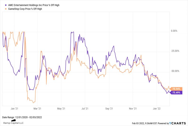
The two poster children of this meme stock revolution were AMC and GameStop, whose underlying businesses were rapidly decaying. While both of them had returns in excess of 1,180% and 687% respectively in 2021, they are both struggling this year to keep the meme alive. AMC is nearly 76% off of the highs and already -44% year-to-date. Meanwhile, GameStop is nearly 71% off of the highs and already -34% year-to-date.
Download Visual l Modify in YCharts
Whether or not you invested in some of these meme stocks from last year, you are undoubtedly facing some tough decisions if you own some individual tech stocks right now.
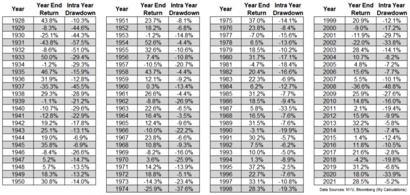
For being in the midst of a pandemic, 2021 was a pretty smooth ride for investors, with only a 5.2% maximum drawdown from the highs for the S&P 500. According to Sam Ro: In an average year, the S&P 500 sees three sell-offs of 5% or greater. The average annual max drawdown (i.e., the biggest intra-year sell-off) is 14%.
Ben Carlson also put together an informational table showing the annual calendar year returns for the U.S. stock market along with the intra-year peak-to-trough drawdowns. This is all normal, but our brains do a great job of forgetting and bringing fear, doubt, and uncertainty to the forefront.
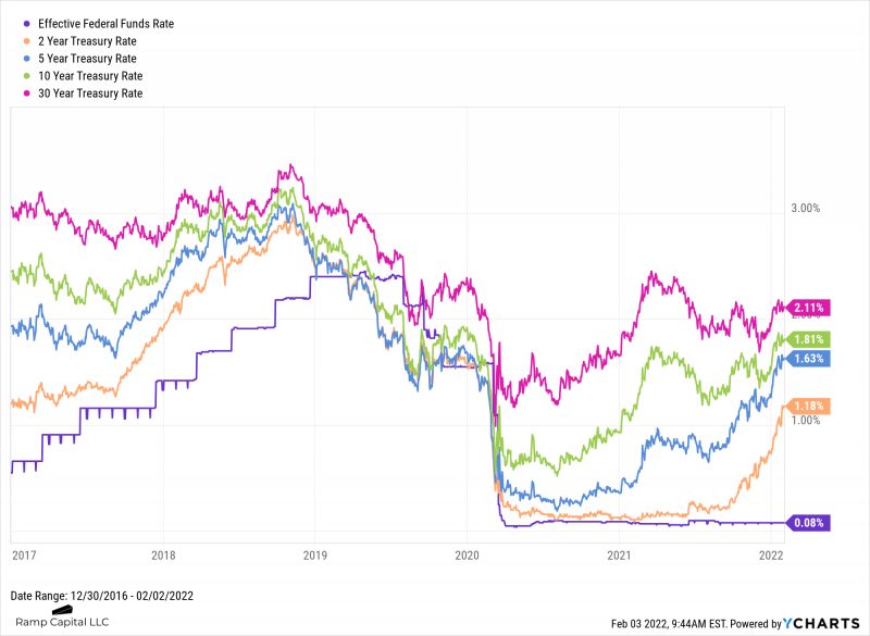
So far, 2022 has turned out to be a much more difficult investing landscape. The Fed is planning to raise the Fed Funds Rate in March and start reducing their balance sheet. This has caused a selloff in riskier assets (which started last Thanksgiving), with the biggest hits being taken in unprofitable high-flying tech companies. You can see from the chart below most of the interest rates along the curve are back to pre-pandemic levels, except now we are in a new era of trying to battle inflation which has been attributed to supply chain breakdowns, labor shortages, and excess fiscal and monetary stimulus.
Download Visual l Modify in YCharts
As mentioned previously, we’ve already seen many tech stocks and small caps getting absolutely crushed under the radar while being masked by the relative strength of the indices. The chart below contextualizes this:
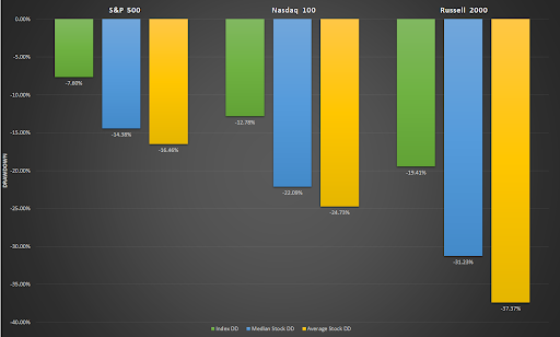
If you’ve been sitting mostly in index funds, you probably haven’t lost a single night’s sleep on this latest drawdown. However, if you’ve been buying individual stocks, as many of us do, you’re probably trying to figure out when these names will bottom. There is no magic sauce to knowing when stocks will bottom; one has to be willing to sit through different thresholds of pain to get excess returns. No one said investing is easy.
One metric I like to look at to see if stocks are oversold is looking at the 200-day moving average (200 DMA)–but not in the traditional sense that many others use it for.
A simple moving average is calculated by adding the security’s prices for the most recent time periods (200 in this case) and then dividing by the period (200). Traditionally, longer-term moving averages such as the 200 DMA have been used to predict the bullish or bearish sentiment on the market in the medium to longer term. I like to use this moving average to smooth erratic data, form better market trend lines, and look for large divergences between the current price and the moving average.
As of the close on Friday (1/28/22), the current price of the four major indices that investors follow are currently below their 200 DMA. Many trend followers use this as a bearish signal to dump their stocks. I look at it as a time to be cautiously optimistic. Looking through recent history I can show you why.
I went back and looked at the Nasdaq 100 going all the way back to the year 2000, right near the pop of the Dot Com Bubble. Nearly everyone who was a trader or investor back then knew that tech stocks were in a bubble. But people kept chasing them higher until one day people said enough is enough and it turned into a fire sale.
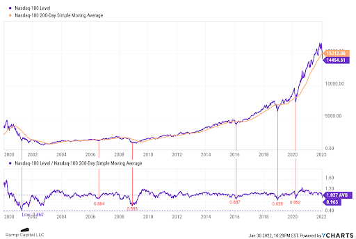
During that run up from 1999 to the peak in 2000, the price of the Nasdaq 100 peaked at 59.4% above the 200 DMA. In comparison to how parabolic that move was to the upside, the next highest ratio of the index price to the 200 DMA since then was 30%. It was quickly rejected both times and marked intermediate tops.
What we are trying to focus on is the velocity of the moves (higher or lower) using the 200 DMA as a reference point. Because the 200 DMA is an average of the past 200 trading days and the market is only open 251-253 trading days per year, it’s easier spot when large sigma moves occur without even doing the calculations. And if history is a guide, these types of moves are sharp and swift on the downside and typically rebound quickly.
The chart of the Nasdaq 100 below shows all of the occurrences from the year 2000 when the ratio of the price to the 200 DMA price was below 0.90. Outside of the two major outliers (the Dot Com Bubble in 2000 and the Great Depression in 2008), you can see that the index has bottomed historically between 0.83 and 0.88 during major routes. On January 30th the ratio sat at 0.963, while the average since the year 2000 sat at 1.037. So while we are below the 20+ year average, we are still above those recent lows. Now the biggest question becomes “Is it different this time?”
Download Visual l Modify in YCharts
Takeaway: This year is shaping up to be a very difficult investing landscape with a lot of moving parts. All eyes continue to be on the Fed as they use their tools to drive policy that sends ripples throughout the world. Every bullish investor is hoping for a soft landing.
While some individual tech stocks are down precipitously from last November’s highs, the indices are masking the pain. This could lead to a massive buying opportunity for those willing to take risks at these lower prices and potentially sit through an unknown period of pain until we bottom.
The 200 DMA isn’t a magical indicator that can tell you precisely when stocks will top or bottom but can show when they become overheated on the upside or overdone on the downside – note that it will always be relative to the current situation at hand. Using historical data we can come up with a risk-adjusted plan to start accumulating positions slowly that can hopefully reduce the amount of pain experienced and give you some peace of mind during volatile times.
How strong are your diamond hands? 💎🤲

RAMP Capital – Founder and CEO of RAMP Capital LLC
Connect With YCharts
To get in touch, contact YCharts via email at hello@ycharts.com or by phone at (866) 965-7552
Interested in adding YCharts to your technology stack? Sign up for a 7-Day Free Trial.
Disclaimer
©2022 YCharts, Inc. All Rights Reserved. YCharts, Inc. (“YCharts”) is not registered with the U.S. Securities and Exchange Commission (or with the securities regulatory authority or body of any state or any other jurisdiction) as an investment adviser, broker-dealer or in any other capacity, and does not purport to provide investment advice or make investment recommendations. This report has been generated through application of the analytical tools and data provided through ycharts.com and is intended solely to assist you or your investment or other adviser(s) in conducting investment research. You should not construe this report as an offer to buy or sell, as a solicitation of an offer to buy or sell, or as a recommendation to buy, sell, hold or trade, any security or other financial instrument. For further information regarding your use of this report, please go to: ycharts.com/about/disclosure
Next Article
YCharts Wrapped 2021: Our Most Searched For PagesRead More →

