After the Storm: How Active Bond ETFs Weathered Recent Volatility
April 2025 will likely be remembered as one of the most volatile months in recent financial history.
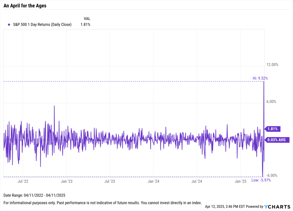
In just the first few days, the S&P 500 fell sharply—dropping 4.8% on April 3rd, nearly 6% on Friday the 4th, and another 1.6% on the 8th—as markets digested the ramifications of President Trump’s then-newly announced tariffs.
Download Visual | Modify in YCharts
Volatility works both ways, however.
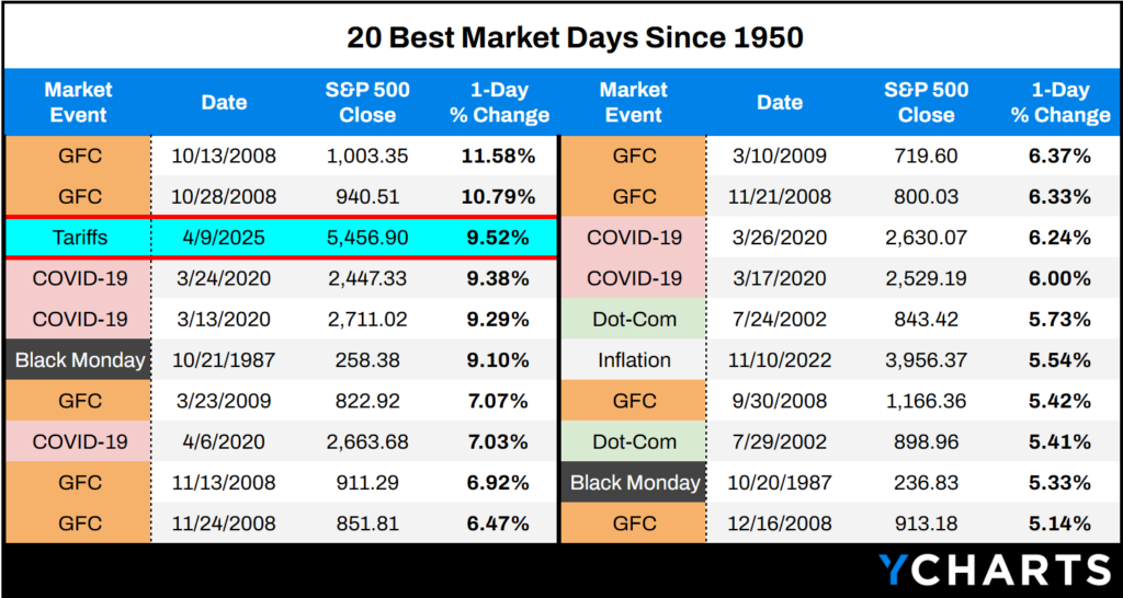
By Wednesday, April 9th, the S&P 500 rebounded, posting its third-best single day since 1950 with a 9.52% gain after many of the announced tariffs were postponed for 90 days.
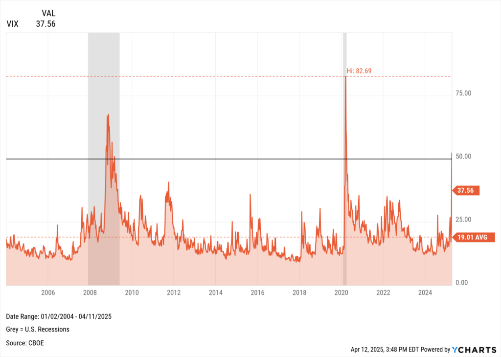
As expected, volatility gauges spiked.
The VIX closed above 50 on Monday, the 7th (52.33) — something that’s only occurred three times since 2004.
Download Visual | Modify in YCharts
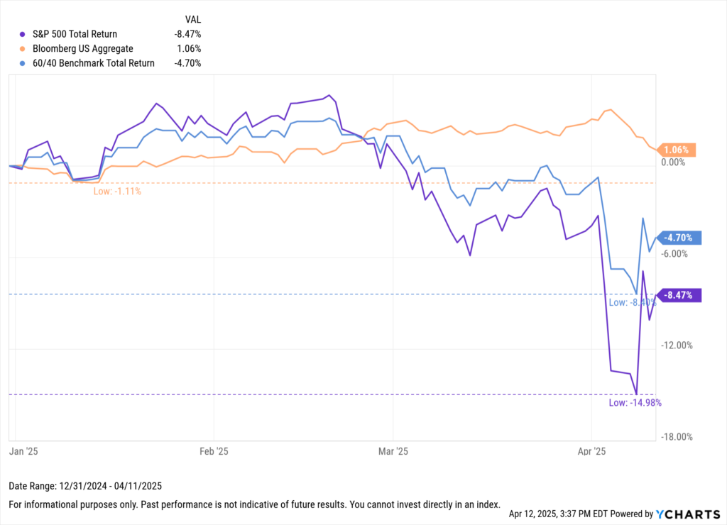
By market close on April 11th, despite the rollercoaster in equity prices, the S&P 500 remained down 8.8% year-to-date.
During periods like this, market headlines become ubiquitous. For advisors, it’s critical to remind clients of their end goals and that volatility is the price of admission for long-term equity returns.
Most importantly, that moments of panic, while emotionally taxing, are temporary, “this, too, shall pass.”
Markets react in real time—but great investment decisions often depend on stepping back. This visual deck explores the historical, cyclical, and strategic impacts of tariffs on asset classes, sectors, and economic growth.
Bonds: Diversification Matters Again
After addressing clients’ behavioral concerns, based on this flurry of financial news, advisors can point to a silver lining: Bonds are doing their job again.
In contrast to 2022, when bonds and stocks fell in tandem, and the 60/40 portfolio posted its worst year in decades, fixed income is once again acting as a portfolio stabilizer.
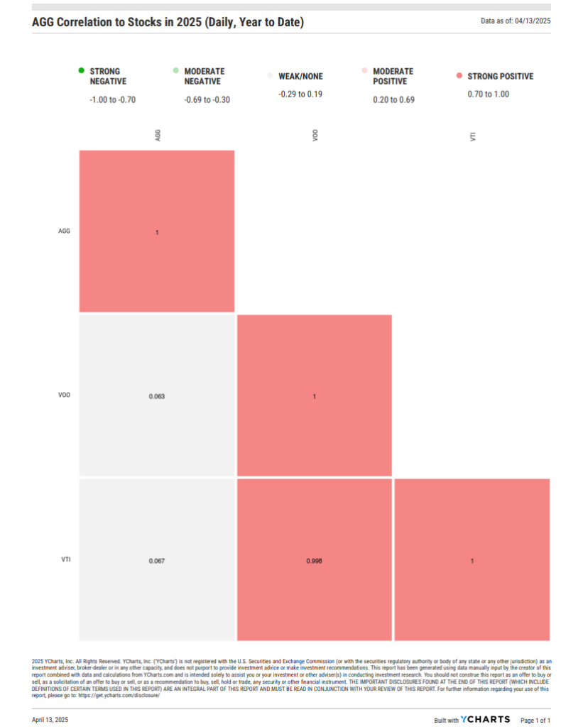
Year-to-date, bonds, represented by AGG, have exhibited near-zero correlation with equities and even posted positive returns during the recent equity drawdown.
Download Visual | Modify in YCharts
The Rise of Active Fixed Income ETFs
As we’ve previously covered, beyond simply diversifying, many advisors are now leveraging active fixed income ETFs to enhance portfolio flexibility.
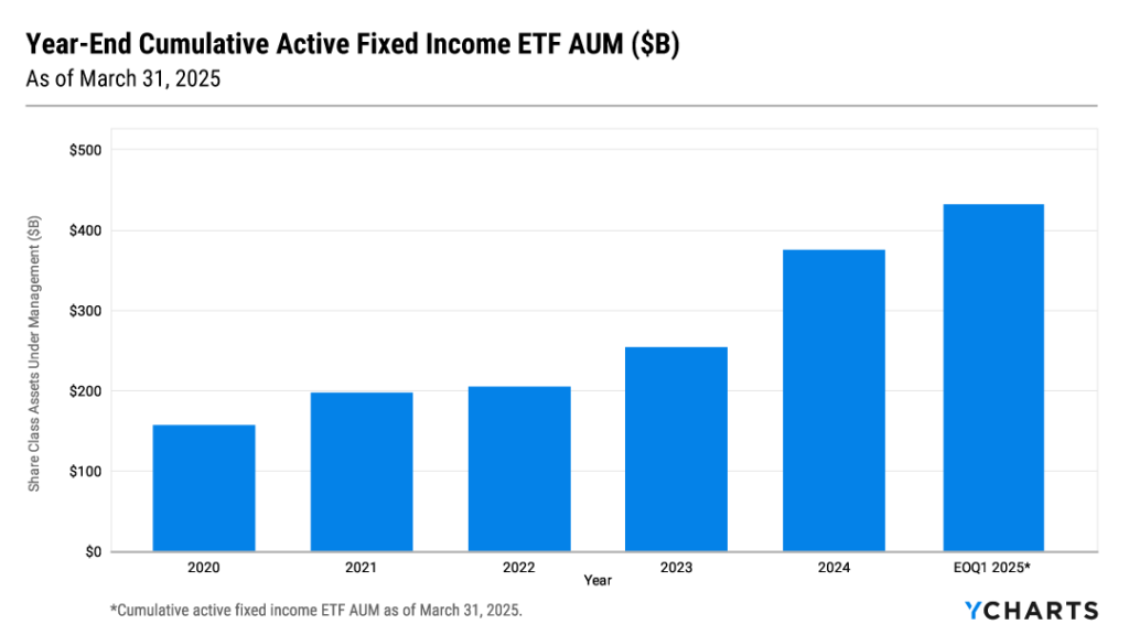
Active managers can dynamically adjust duration, credit risk, and geographic exposure — key advantages in today’s environment of rising rates and geopolitical uncertainty.
Additionally, the ETF wrapper often offers lower expense ratios and greater transparency compared to traditional mutual funds (though transaction cost considerations remain important, as discussed below).
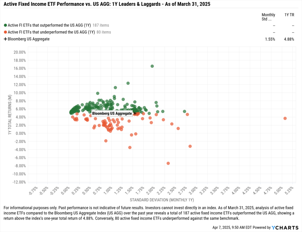
Importantly, active strategies are delivering results. As of March 31, 2025, 70% (187 of 267) of active fixed income ETFs with at least a one-year track record have outperformed AGG over the past year.
Rates, Duration, and the New Fixed Income Reality
Given today’s higher base rates, carry—the yield earned from holding bonds—has typically been the primary driver of returns for active managers and bond investors.
With longer-dated bond prices under pressure, steady income from higher yields has become even more critical to total return. This has been especially true recently, as 10-, 20-, and 30-year Treasury yields spiked.
Growing uncertainty over tariff impacts reduced demand for longer-dated bonds, driving their prices down and exacerbating duration risk.
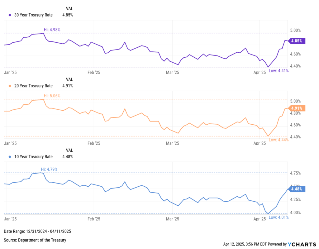
Download Visual | Modify in YCharts
The recent rise in long-term rates also has broader implications. With U.S. interest expense now surpassing $1 trillion, higher rates mean that any newly issued government debt would be refinanced at steeper costs, compounding fiscal pressures over time.
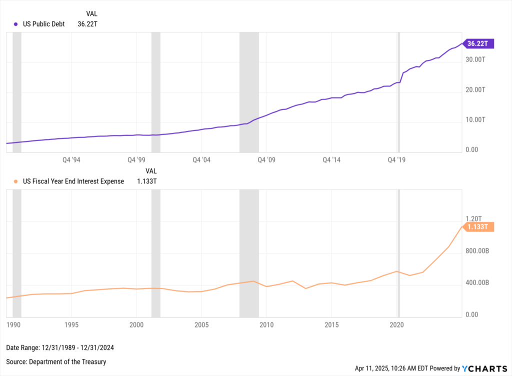
Download Visual | Modify in YCharts
Active Core, Core-Plus, and Multi-Sector Fixed Income
As previously discussed, one of the key advantages of active bond management is flexibility. Depending on a fund’s prospectus, active managers are not limited to specific sectors or maturities.
They can shorten duration, shift away from U.S. Treasuries, or diversify across sectors and geographies as needed to mitigate duration risk and reduce single-sector concentration. These types of moves are generally restricted in passive strategies, as they are bound by their benchmarks.
The chart below illustrates the wide range of options available to fixed income managers by showing the current distribution yields and effective durations across a selection of domestic bond ETFs.
This highlights the types of exposures active managers can tactically pursue based on their investment views, in addition to international and securitized options.

Download Visual | Modify in YCharts
In our analysis, we focused specifically on Core, Core-Plus, and Multi-Sector bond strategies, as these active managers have the broadest discretion to adjust duration, sector allocations, and credit exposures.
These peer groups are where managers can meaningfully differentiate themselves from passive benchmarks, tailoring portfolios to the prevailing rate environment and credit landscape.
As of April 9, 2025, the 20 largest funds in these peer groups had a median duration of 5.9 years and a median distribution yield (TTM) of 4.74%.
Within this universe, the iShares Flexible Income Active ETF (BINC) and the Capital Group US Multi-Sector Income ETF (CGMS) offer the shortest effective durations—3.5 and 4.1 years, respectively—providing lower sensitivity to rising rates.
BINC also delivers the highest distribution yield among the group at 6.6%, followed by the PIMCO Multisector Bond Active ETF (PYLD) at 6.1%.

Download Visual | Modify in YCharts
Sector & Geographic Exposure Across Active Bond ETFs
Beyond duration and yield, sector allocations further highlight the flexibility in active strategies. The table below captures sector breakdowns across government, corporate, and securitized fixed income holdings:
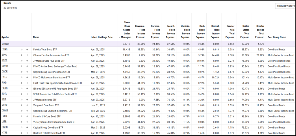
The median allocation to government fixed income across these strategies is 33%, with funds like the SPDR DoubleLine Total Return Tactical ETF (TOTL) and the iShares ESG Aware U.S. Aggregate Bond ETF (EAGG) leading the way at 50% and 47% government exposure, respectively.
Corporate bonds represent a median 24% allocation across the group. However, some funds are leaning more heavily into corporate credit to capture higher spreads. CGMS and the Capital Group Core Bond ETF (CGCB) stand out with corporate exposures of 54% and 36%, respectively, as of their latest holdings data.
Geographically, most funds remain heavily concentrated in domestic bonds, with a median of 82% exposure to the United States. However, some managers are taking a more global approach. BINC maintains only 39% exposure to U.S. bonds, while the First Trust TCW Opportunistic Fixed Income ETF (FIXD) holds approximately 52% domestically.
This increased international allocation may help managers mitigate localized risks — such as higher U.S. deficits or interest rate shocks.
Hypothetical Implementation of Active Bond ETFs
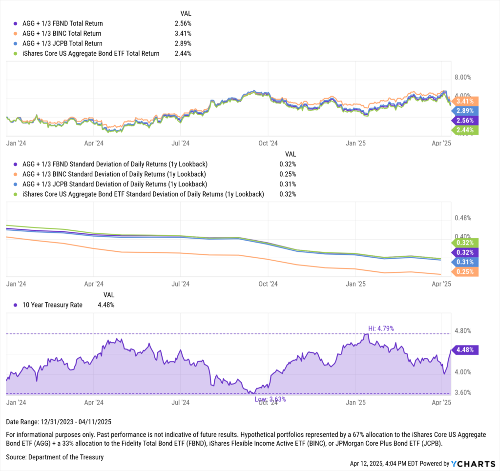
When it comes to portfolio construction, advisors might adopt active fixed income ETFs as satellite positions within their fixed income allocation. As these strategies may complement a core holding like AGG, or a client’s individual bonds.
As such, the chart below illustrates a hypothetical implementation: a portfolio with a 67% allocation to AGG combined with a 33% allocation to one of the largest active funds we’ve discussed — the Fidelity Total Bond ETF (FBND), BINC, or the JPMorgan Core Plus Bond ETF (JCPB).
Download Visual | Modify in YCharts
Throughout 2024 and into early 2025, all three blended strategies have delivered higher total returns compared to AGG alone.
Notably, the allocation to BINC not only achieved the strongest total return at 3.48% but also produced a lower one-year standard deviation (0.25%) than both AGG alone and the other two blended strategies.
The portfolios incorporating FBND and JCPB also maintained similar or slightly lower volatility.
Trading Considerations for Active Bond ETFs
While active fixed income ETFs offer flexibility, attractive income-potential, and typically lower expense ratios compared to traditional mutual funds, advisors should be mindful of several trading nuances before implementation.
First, because fixed income ETFs distribute taxable interest income regularly, they may offer less tax efficiency than equity ETFs.
Advisors typically rely on the fixed income sleeve for steady income, but it’s important to remind clients that this income is fully taxable, potentially reducing the overall tax advantages of the ETF wrapper.
Second, unlike mutual funds, ETFs do not always trade exactly at their Net Asset Value (NAV). Market prices can fluctuate slightly above (premium) or below (discount) NAV, depending on demand and liquidity. As a result, managing trading costs becomes crucial for maximizing returns.
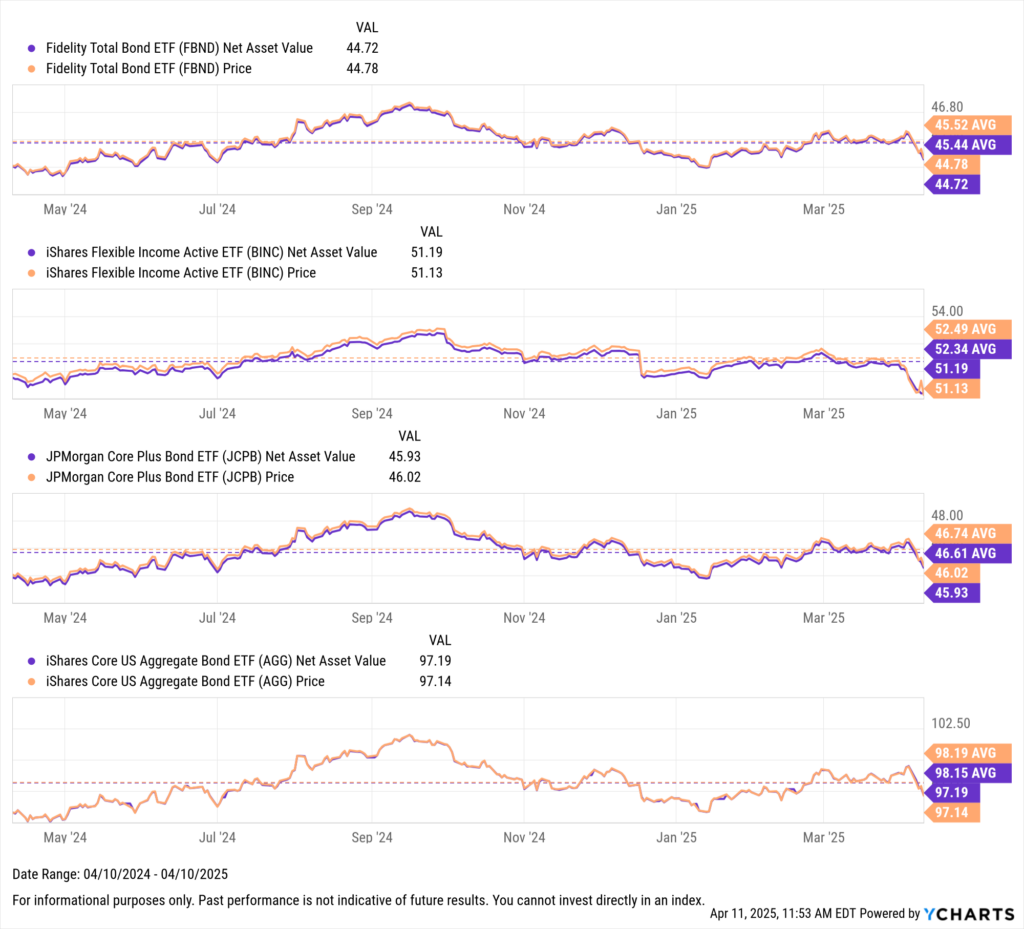
Download Visual | Modify in YCharts
On average, FBND traded at a 0.08% premium to NAV, BINC at a 0.15% premium, and JCPB at a 0.13% premium.
For comparison, AGG averaged a smaller premium of 0.04%.
Although these premiums may appear modest, if not carefully managed, they can meaningfully erode returns over time, particularly with large allocations.
To help minimize transaction costs, investors should prioritize ETFs with higher average trading volumes, use limit orders to avoid paying excessive premiums (or selling at unnecessary discounts), and monitor exit strategies to ensure shares are sold when the market price is closely aligned with NAV or with the original premium at purchase.
Recent volatility underscores an enduring truth: markets move fast, and emotions move faster.
But portfolio construction that leverages active fixed income ETFs may offer advisors a way to navigate through turbulence while keeping client goals front and center.
Whenever you’re ready, here’s how YCharts can help you:
1. Want to see how YCharts can transform your proposal process?
Calculate Your ROI with YCharts and discover the impact on your proposal workflows.
2. Looking to move on from your investment research and analytics platform?
3. Want to test out YCharts for free?
Start a no-risk 7-Day Free Trial.
Disclaimer
©2025 YCharts, Inc. All Rights Reserved. YCharts, Inc. (“YCharts”) is not registered with the U.S. Securities and Exchange Commission (or with the securities regulatory authority or body of any state or any other jurisdiction) as an investment adviser, broker-dealer or in any other capacity, and does not purport to provide investment advice or make investment recommendations. This report has been generated through application of the analytical tools and data provided through ycharts.com and is intended solely to assist you or your investment or other adviser(s) in conducting investment research. You should not construe this report as an offer to buy or sell, as a solicitation of an offer to buy or sell, or as a recommendation to buy, sell, hold or trade, any security or other financial instrument. For further information regarding your use of this report, please go to: ycharts.com/about/disclosure
Next Article
Q1 2025 Earnings Season: A High-Stakes Test for Tariff-Era Market SentimentRead More →