Dots and Derivatives: Comparing Covered Call ETFs with Scatter Plots
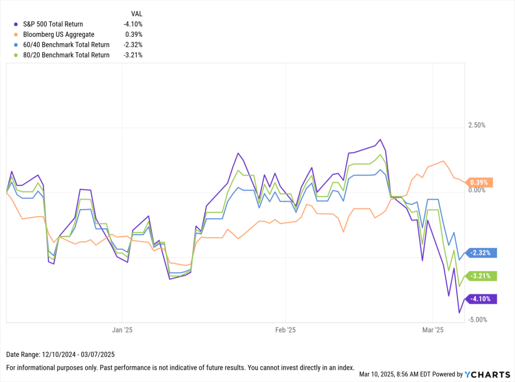
By market close on March 7, 2025, the S&P 500 was 6% off its ATH, and the Nasdaq-100 was flirting with correction territory. Moments like these serve as reminders of two things.
One, this too shall pass. Over the last five years, the S&P 500 has experienced six declines of 5% or more from its peak. Despite these fluctuations, the market has achieved a cumulative increase of 93.7% during this period (13.6% annualized), including two consecutive years of 25% gains.
Secondly, the current conditions highlight the critical importance of diversification. At its core, diversification aims to reduce portfolio risk. This can be achieved through a traditional mix of equities and bonds, which helps mitigate asset class risk.
Download Visual | Modify in YCharts
Furthermore, within the equity component of a portfolio, reducing home country bias has proven advantageous, especially in the current climate where global equities have outperformed their US counterparts in 2025.

Download Visual | Modify in YCharts
Essentially, when primary strategies falter, diversification aims to provide investors with exposure to different lower-correlated market segments that may still be performing well.
Current Markets & the Case for Alternative Strategies
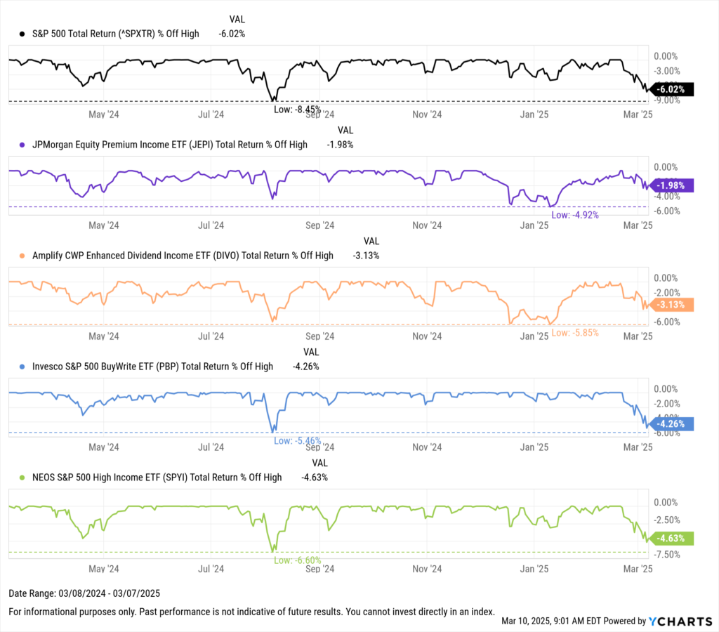
To that point, there continues to be growing interest in income-oriented equity strategies, particularly those involving options such as covered calls.
Although not primarily designed for risk mitigation, derivative income strategies tend to allocate a portion of portfolio assets to writing options instead of full equity investments. This approach reduces exposure to direct equity risks and, thus far, has cushioned investors through the current downturn.
Download Visual | Modify in YCharts
The potential for these strategies becomes even more compelling in volatile markets.
Writing covered calls on underlying holdings can increase the premium of the options, driven by the volatility component in their pricing. Higher premiums can enhance income potential, offset losses from declining stock prices, or boost returns during market rallies.
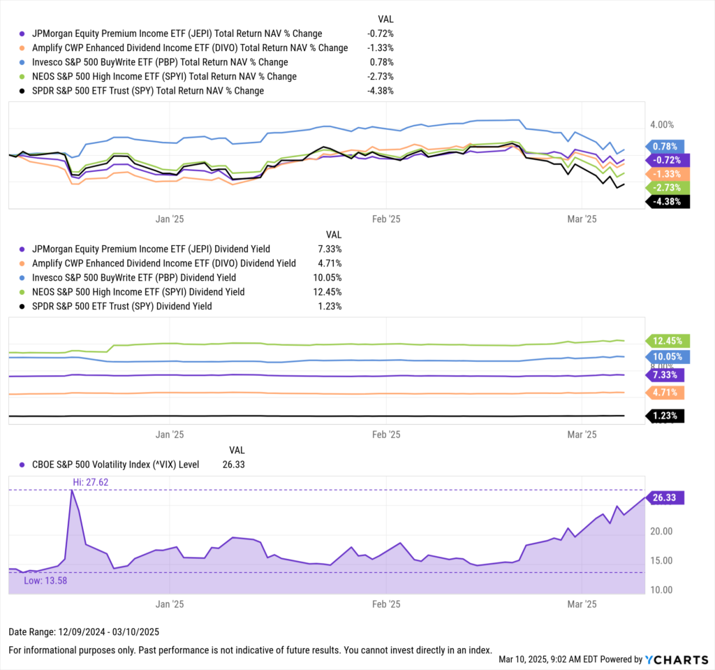
In the last three years, the VIX—an indicator of market volatility—has averaged 18.95. On Friday, it ended the day at 23.37. Over the last three months, the VIX has seen quite a bit of action, hitting a high of 27.62 in mid-December from a low of 12.77 earlier that month.
During this recent swing, particularly as the VIX rose from the mid-teens in mid-February to its current level, option-based strategies like JEPI, DIVO, PBP, and SPYI have outperformed the S&P 500.
Download Visual | Modify in YCharts
While Fundamental Charts effectively highlight the opportunities within these products, particularly in the current market environment, Scatter Plots excel at revealing the quantitative differences between similar strategies.
Assessing Volatility in Covered Call ETFs
Moving forward, we will concentrate on the largest option-based ETFs by AUM that align their strategies to the S&P 500. These include BALI, DIVO, FTHI, GPIX, ISPY, JEPI, PBP, SIXH, SPYI, and XYLD.
As we dive into option-based ETFs, it’s clear that volatility has been a major player in shaping their recent performance. However, if we look back over the past year (as of February 28, 2025), these ETFs haven’t outperformed the S&P 500 (represented by SPY). But that’s not the whole story.
These ETFs are designed for income-focused investors—people who tend to value steady income and stability more than outsized returns. And on that front, they’re doing quite well. In fact, ten out of the 11 ETFs we’re looking at have shown less volatility than SPY. For instance, consider the Global X S&P 500 Covered Call ETF (XYLD) and the Invesco S&P 500 BuyWrite ETF (PBP). Over the past year, these ETFs maintained low monthly standard deviations of 1.51% and 1.55%, respectively. Despite this lower risk profile, they still managed to generate returns of 17.1% and 17.7%, respectively.

Download Visual | Modify in YCharts
With volatility in focus, it’s equally important to consider how costs factor into the equation.
Cost Considerations for Covered Calls
According to the findings from Charles Schwab’s 2024 ETFs and Beyond Study, total cost and low expense ratios are paramount. 57% and 52% of ETF investors, respectively, cite these as “extremely important” factors in their investment decisions, the highest among all choices. This focus on cost efficiency is particularly crucial for income-focused ETFs, where net returns directly impact the actual income for investors after expenses and taxes.
In this regard, the Goldman Sachs S&P 500 Core Premium Income ETF (GPIX) sports the lowest expense ratio among the strategies we observed at 0.29%. That’s a whole 20bps higher than SPY, which, due to its trust structure, maintains the highest expense ratio among vanilla S&P 500 ETFs. GPIX’s expense ratio is paired with an 8.6% dividend yield, ranking it fifth among observed strategies. The NEOS S&P 500 High Income ETF (SPYI) ranked first in terms of yield, with a dividend yield of 12.5%.

Download Visual | Modify in YCharts
Across the board, the average net expense ratio for the ETFs we’ve analyzed is 0.53%, reflecting the typical costs associated with options-based strategies. These include higher management fees due to the active nature of covered call execution and trading costs from frequent options transactions.
Additionally, investors should consider potential opportunity costs, as covered calls can cap upside potential in strong bull markets. Beyond these direct costs, tax efficiency is another factor to weigh, as the frequent turnover of options contracts can generate short-term capital gains, which may result in a higher tax burden for investors.
Meanwhile, the average dividend yield across these strategies is 8.29% as of March 6, 2025, illustrating the varying trade-offs between cost and income potential.
Visualizing these metrics is essential when positioning these ETFs to advisors. It ensures they align with investor expectations for cost efficiency and income generation, ultimately supporting long-term client satisfaction.
Evaluating Full Performance: Income Potential & Total Returns
Price appreciation and income potential are top considerations for income-focused investors, particularly in the context of covered call strategies. The success of these strategies can hinge significantly on the selection of stocks for which calls are written, which can influence the overall capital appreciation potential. Furthermore, advisors may compare these strategies to the traditional equity indices they aim to replace when integrating them into portfolios. As of March 6, 2025, the ProShares S&P 500 High Income ETF (ISPY) stands out as the only fund that has outperformed the S&P 500 over the past year, alongside a healthy dividend yield of 9.45%.

Download Visual | Modify in YCharts
Scatter Plots like the ones above can serve as invaluable tools for distribution teams looking to visualize a comparison of covered call strategies. By illustrating the various trade-offs accompanying these strategies, these plots can help educate advisors looking to incorporate these strategies into models or individual client portfolios.
Whenever you’re ready, here’s how YCharts can help you:
1. Looking to Move On From Your Investment Research and Analytics Platform?
2. Want to test out YCharts for free?
Start a no-risk 7-Day Free Trial.
Disclaimer
©2025 YCharts, Inc. All Rights Reserved. YCharts, Inc. (“YCharts”) is not registered with the U.S. Securities and Exchange Commission (or with the securities regulatory authority or body of any state or any other jurisdiction) as an investment adviser, broker-dealer or in any other capacity, and does not purport to provide investment advice or make investment recommendations. This report has been generated through application of the analytical tools and data provided through ycharts.com and is intended solely to assist you or your investment or other adviser(s) in conducting investment research. You should not construe this report as an offer to buy or sell, as a solicitation of an offer to buy or sell, or as a recommendation to buy, sell, hold or trade, any security or other financial instrument. For further information regarding your use of this report, please go to: ycharts.com/about/disclosure
Next Article
Government Efficiency & Market Impact: Comparing Clinton-Era Reform to Trump’s 2025 Deregulatory PushRead More →