Economic Update — Reviewing Q4 2022
Want the Economic Update slide deck sent straight to your inbox? Get it here:
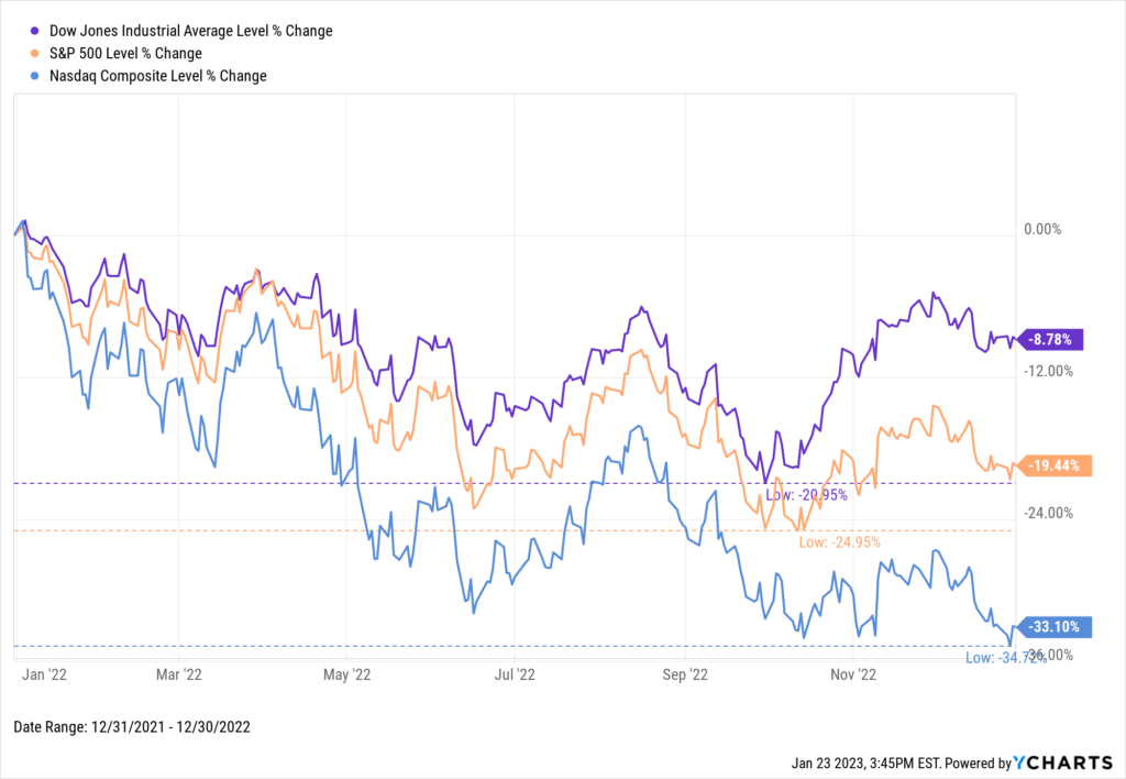
2022 is in the books, and US stocks closed out a down year on a relatively positive note. The Dow rose 15.4% in the final quarter of 2022, the S&P 500 added 7.1%, and the NASDAQ shed only 1.0%.
The Dow clawed back from an intra-year low of 21.0% to finish down only 8.8%, and the S&P 500 escaped bear market territory with a decline of 19.4%. The growth-heavy NASDAQ, however, tumbled 33.1% on the year.
Download Visual | Modify in YCharts
Below is a sneak peek of insights from the YCharts Q4 2022 Economic Summary Deck. The deck, published quarterly, arms advisors and investors with key insights from the previous quarter to help you make smarter investment decisions going forward. The deck is also easily customizable with your own firm branding to be leveraged in client communications.
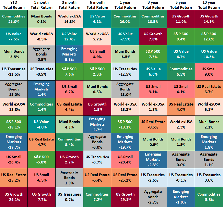
Asset Class Performance
The table below shows the performance of asset classes over increasingly longer lookback periods.
Click to Download the Economic Summary Deck
All of the above asset classes logged a positive Q4 for 2022. World ex-USA led the way with a 16.3% return, followed by US Value’s 12.4% increase. US Treasuries fell back to the bottom of the pack, but eked out a 0.7% gain.
Commodities was the only positive asset class in 2022 despite recording a 7.2% loss in the back half of the year. US Value was the second-best full-year performer, albeit down 7.5%. US Growth lagged behind all asset classes in 2022 with a 29.1% decline.
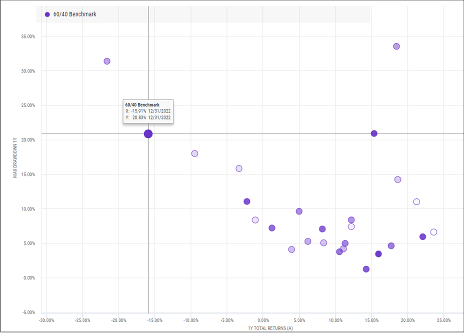
Death of the 60/40 Portfolio?
2022’s 15.9% decline was the second worst year for the 60/40 portfolio since 1997. Not only did the S&P fall almost 20%, but in an unusual fashion the US Aggregate Bond Index dove 13.1% as well. When stocks fall out of favor, the portfolio’s 40% bond allocation tends to offer much-needed downside protection, but apparently not so much last year.
Click to Download the Economic Summary Deck
YCharts users—download the full deck in the Support Center. Not a current client? Reach out to get access, or enter your email below to receive a free version of the deck:
Get the Economic Update slide deck sent straight to your inbox:
Connect with YCharts
To get in touch, contact YCharts via email at hello@ycharts.com or by phone at (866) 965-7552
Interested in adding YCharts to your technology stack? Sign up for a 7-Day Free Trial.
Disclaimer
©2023 YCharts, Inc. All Rights Reserved. YCharts, Inc. (“YCharts”) is not registered with the U.S. Securities and Exchange Commission (or with the securities regulatory authority or body of any state or any other jurisdiction) as an investment adviser, broker-dealer or in any other capacity, and does not purport to provide investment advice or make investment recommendations. This report has been generated through application of the analytical tools and data provided through ycharts.com and is intended solely to assist you or your investment or other adviser(s) in conducting investment research. You should not construe this report as an offer to buy or sell, as a solicitation of an offer to buy or sell, or as a recommendation to buy, sell, hold or trade, any security or other financial instrument. For further information regarding your use of this report, please go to: ycharts.com/about/disclosure
Next Article
Are Advisors Communicating Enough with Their Clients?Read More →