Fed’s June 2025 Rate Pause Explained: Why No Change Amid Cooling Inflation & Fed Dot Plot Projections

Introduction
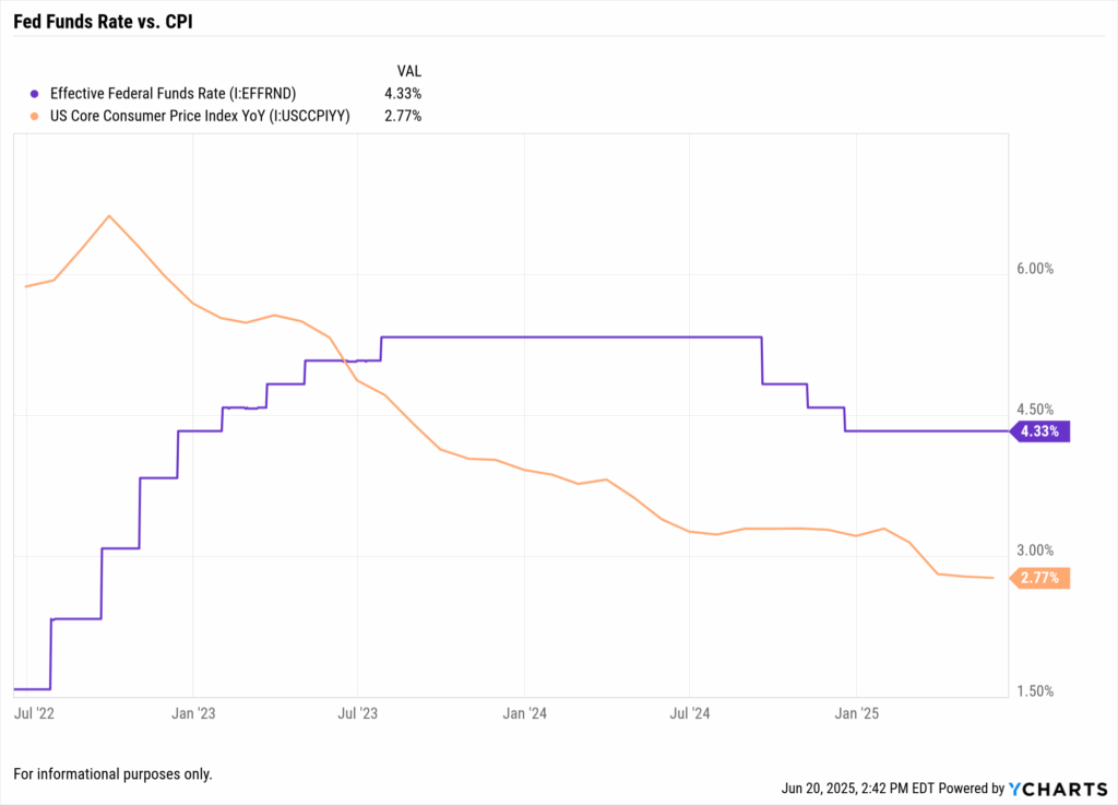
The Federal Reserve’s June 2025 meeting ended with a collective pause, no rate hike or cut, even as inflation has cooled markedly from last year’s highs. Headline CPI has fallen to ~2.4% (core ~2.8%) as of June, a dramatic improvement from 2023’s 6%+ readings. Yet the Fed held the benchmark rate steady around 4.25–4.50%.
Why stand pat when price pressures are easing? The answer lies in the Fed’s cautious outlook, reflected in the Fed dot plot projections and recent macro developments.
In our analysis of the Federal Reserve’s June 2025 meeting, we reviewed the broader macro backdrop, slowing growth, cooling inflation, and new wildcard risks like tariffs.
This supporting post now drills down into why the Fed made no change amid cooling inflation, and what it means for advisors navigating bond and equity markets.
What’s Covered in This Blog
- • Why the Fed paused rates despite falling inflation
- • What the June 2025 Fed dot plot projections reveal about future rate cuts
- • Market reactions across bonds, equities, and the yield curve
- • How to interpret macro risks like tariffs and sticky core inflation
- • What advisors are asking — and how to answer client questions
- • How to use YCharts tools to analyze the Fed’s pause
- • Tactical portfolio strategies based on the Fed’s current stance
Why This Topic Matters Now: Fed Dot Plot Projections & Market Impact
This moment represents a potential inflection point in monetary policy. After an aggressive hiking cycle and a plateau in rates, the Fed is at a crossroads between declaring victory over inflation or erring on the side of restraint.
The June 2025 decision, and the Fed’s own dot plot projections, provide critical clues about the second half of 2025.

Mixed Signals on Future Rates
Markets have been betting on rate cuts later in 2025. Fed Funds futures pricing showed ~65% odds of at least one cut by September.
However, the Fed’s June dot plot sent a more tempered message. The median projection still shows no rate cuts until late 2025, and even then only about two quarter-point reductions by year-end.
Notably, 7 out of 18 FOMC members foresee no change at all in 2025 — a hawkish tilt that diverges from market expectations.
Cooling Inflation vs. New Inflation Risks
Yes, inflation is falling — a key reason many expected the Fed might start signaling easier policy. But the context of that cooling is critical.
Core inflation at ~2.8% is still above the 2% target. In early June, the U.S. reintroduced tariffs on over $200B in key imports. These tariffs could raise import costs and nudge inflation back up in coming months.
Fed Chair Jerome Powell acknowledged this risk, noting in his press conference that while May’s inflation readings showed “noticeable cooling,” prices may increase in coming months as tariffs take effect.
Macro Turning Point
Economic growth is slowing. The Fed trimmed its 2025 GDP forecast to 1.4%, down from 1.7%.
Meanwhile, the labor market remains solid (unemployment ~4.2%) but is showing subtle signs of softening. We have a late-cycle mix of cooling inflation and moderating growth.
The Fed’s dual mandate requires balancing inflation and employment. By standing pat, the Fed signals it’s prioritizing inflation control over boosting growth at this juncture.
Market Volatility and Client Concerns
Markets are hanging on every Fed signal in 2025. The Fed’s pause, and hints about future moves, are moving bond yields, stock valuations, and even currency trends.
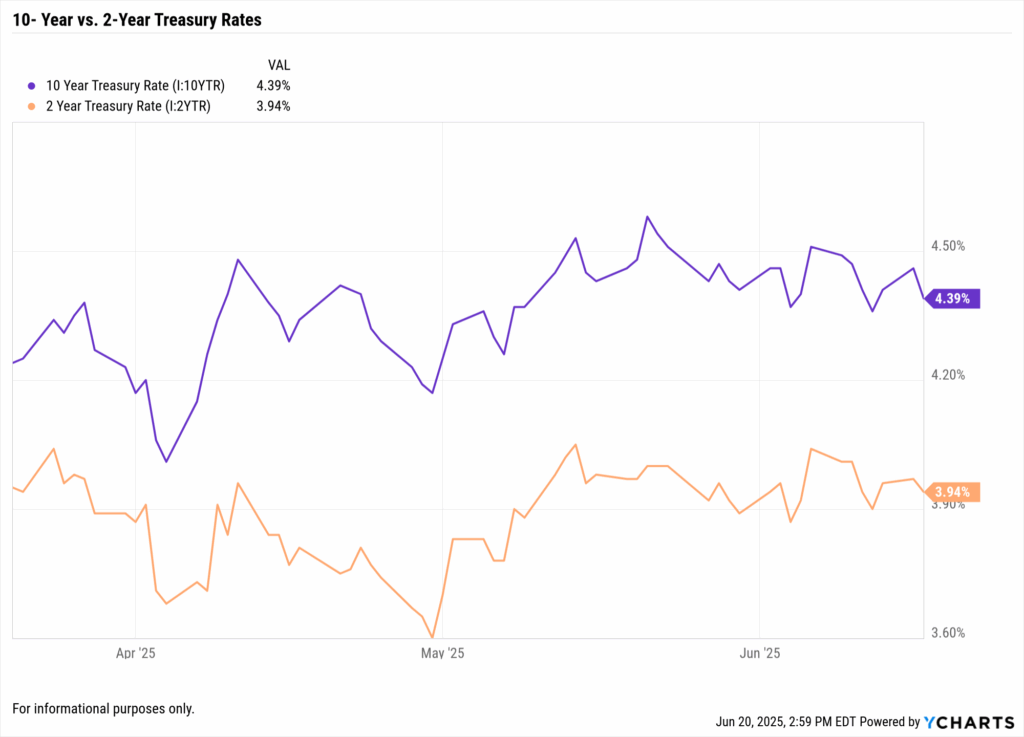
The U.S. Treasury yield curve has been extraordinarily sensitive to Fed expectations. Going into the June meeting, the 10-year yield hovered around 4.4% while the 2-year was near 3.9%.
After the Fed’s no-hike decision and somewhat hawkish projections, long-term yields stabilized instead of plunging. This suggests the market believes the Fed may stay higher for longer.
Equity markets likewise gyrated. Stocks initially rallied on the pause, then pulled back as Powell emphasized “sticky” inflation above 2% and uncertainty around tariffs.
What Advisors Are Asking
Q1: With inflation finally cooling, why didn’t the Fed cut rates?
The Fed’s decision comes down to credibility and caution. While inflation has improved, core prices are still above target.
Fed officials want to be absolutely sure that inflation’s decline is durable. New factors like tariffs have introduced upside risks.
Powell emphasized that short-term disinflation is welcome, but persistent 2% inflation is the goal. In practical terms, the Fed is in wait-and-see mode.
Client takeaway: The Fed isn’t ignoring the good inflation news; it’s making sure that good news sticks before changing course.
Q2: What are the Fed’s dot plot projections telling us about future rate changes?
The Fed dot plot projections offer a window into the Fed’s collective mindset. The June 2025 dot plot showed policymakers are split on the path forward.
The median projection still points to roughly two rate cuts by the end of 2025. However, 7 out of 18 members penciled in no rate cuts for 2025.
This divided outlook explains why the Fed’s tone remains cautious. Advisors should interpret this as the Fed hedging its bets.
Bottom line: The dot plot’s message is a bias toward holding rates elevated for the foreseeable future, barring a significant change in data.
(For a deeper dive into how to read the dot plot, see our post Demystifying the Fed Dot Plot: Clues for Future Rates.)
Q3: How does the Fed’s pause impact bond and equity markets now?
The immediate impact of the Fed’s “no change” decision is a subtle shift in market tone. Bond markets interpreted the pause as a sign that rates will plateau.
Long-term Treasury yields, which had been trending down into the meeting on hopes of a dovish pivot, stabilized around mid-4%.
The yield curve (2-year vs 10-year spread) remains inverted, but slightly less so than at peak tightening. Equity markets initially rose, then softened as Powell signaled ongoing inflation vigilance.
Sector rotation is a key tactic. Financials and value stocks may perform better if rates stay elevated. Growth stocks may underperform unless dovish signals emerge.
(For more, see Why Treasury Yields Are Spiking and What It Means for Your Portfolio.)
Q4: How should I communicate the Fed’s decision to my clients?
Clients might ask, “Why isn’t the Fed cutting rates to help the economy?” Advisors can explain that the Fed is taking a measured approach to cement the gains against inflation.
It’s also worth noting that the Fed’s own projections (the dot plot) still anticipate lower rates down the road — just not immediately.
Client takeaway: A pause is not a negative. It means we’re in a watch-and-wait period where the Fed will respond if needed, but isn’t rocking the boat.
How to Analyze This Using YCharts
YCharts provides a suite of tools that allow advisors to dissect and visualize the key metrics behind the Fed’s decision.
Track Macro Indicators in One Dashboard
Use the YCharts Dashboard or Economic Indicators library to monitor inflation trends, employment figures, and interest rates all in one place.
Plot YoY CPI and Core CPI alongside the Fed Funds target rate to see divergences. YCharts even includes series like Fed Funds futures-implied rates, helping advisors chart expectations versus reality.
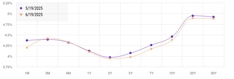
Dive into the Yield Curve
With YCharts’ Yield Curve Tool, compare the Treasury yield curve from before the Fed meeting to after. Use visualizations to show a slight steepening — perhaps the 2-year yield nudged down while the 10-year held steady.
Screen for Opportunities and Risks
Use the ETF Screener to identify short-duration bond funds or floating-rate funds, which can be prudent if rates remain elevated.
If anticipating a 2026 easing cycle, screen for long-duration Treasury ETFs or rate-sensitive sector funds (like homebuilders or tech).
Scenario Builder & Proposals
Advisors can use YCharts’ Scenario Builder tools to model “what-if” cases. For instance, what if tariffs push inflation back up? What if inflation falls sharply?
YCharts helps turn these analyses into client-friendly outputs. Use the Proposal Tool to create custom visuals comparing “Fed holds” vs. “Fed cuts” scenarios.
Tactical Portfolio Takeaways
Maintain Duration Discipline
Overweighting short-term Treasuries or high-quality ultrashort bond funds can provide solid yield with less volatility. Keep dry powder for longer durations when cuts look more likely.
Evaluate Sector Exposures
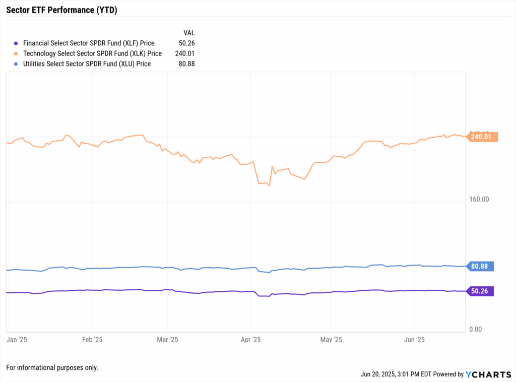
If rates remain elevated, tilt toward sectors that can thrive in that environment. Financials and dividend-paying sectors can offer resilience. Growth sectors may shine again once cuts are confirmed.
Hedge for Inflation Surprises
Maintain or add modest allocations to inflation-sensitive assets. TIPS, gold, and commodities can provide a buffer if inflation rebounds.
Prepare for the Pivot (but don’t front-run it)
Eventually, the Fed will likely cut. Use YCharts to monitor entry points and valuation trends for long-term bonds and growth assets.
Client takeaway: The Fed’s June pause is a sign of prudence, neither slamming the brakes nor hitting the gas. We’re doing the same with your portfolio: staying balanced and ready.
Conclusion: Fed Dot Plot Projections Confirm Patience, Not Passivity
The Federal Reserve’s June 2025 decision to hold interest rates steady — despite clear evidence of cooling inflation — reflects a strategy rooted in patience, not passivity. Advisors interpreting this pause through the lens of Fed dot plot projections can see the Fed’s intent: remain cautious, control expectations, and avoid premature moves that could reignite inflationary pressures.
Markets may have hoped for an early pivot, but the Fed’s message was clear — progress on inflation is encouraging, not conclusive. The central bank needs durability, not just direction.
For financial advisors, this moment is an opportunity. The dot plot reveals a divided Fed, with several members advocating no cuts this year. That tells us policy is likely to stay tighter longer than many portfolios may be positioned for.
Whenever you’re ready, here’s how YCharts can help you:
1. Looking to Move On From Your Investment Research and Analytics Platform?
2. Want to test out YCharts for free?
Start a no-risk 7-Day Free Trial.
Disclaimer
©2025 YCharts, Inc. All Rights Reserved. YCharts, Inc. (“YCharts”) is not registered with the U.S. Securities and Exchange Commission (or with the securities regulatory authority or body of any state or any other jurisdiction) as an investment adviser, broker-dealer or in any other capacity, and does not purport to provide investment advice or make investment recommendations. This report has been generated through application of the analytical tools and data provided through ycharts.com and is intended solely to assist you or your investment or other adviser(s) in conducting investment research. You should not construe this report as an offer to buy or sell, as a solicitation of an offer to buy or sell, or as a recommendation to buy, sell, hold or trade, any security or other financial instrument. For further information regarding your use of this report, please go to: ycharts.com/about/disclosure
Next Article
Demystifying the Fed Dot Plot: Reading the Clues for Future RatesRead More →