Demystifying the Fed Dot Plot: Reading the Clues for Future Rates

Introduction: Why the Dot Plot Deserves Advisors’ Attention
In the world of central banking, few visuals carry more market-moving weight than the Fed dot plot. Released after select Federal Reserve meetings, the dot plot displays policymakers’ projections for the federal funds rate over the next few years. And with the June 2025 Fed meeting now in the rearview, financial advisors are turning to this chart to extract signals about interest rate policy, inflation expectations, and market direction.
In our analysis of the Federal Reserve’s June 2025 meeting we reviewed the broader macro conditions and policy backdrop. This supporting post now drills down into the Fed dot plot, translating its implications into actionable insights for advisors and client portfolios.
Why the Fed Dot Plot Matters More Than Ever
The dot plot is more than a forecast — it’s a window into the Fed’s current mindset, offering clues about the pace and direction of future interest rate decisions. Right now, its importance is magnified by a market caught between optimism and caution.
- Inflation is easing, with headline CPI at 2.4% and core at 2.8% (as of June 2025) — a sharp improvement from 2023’s 6%+ readings.
- The Fed has paused, holding its policy rate steady at ~4.25–4.50% for multiple meetings, signaling caution despite cooling prices.
- Markets are betting on cuts. Fed Funds futures imply a ~65% probability of at least one rate cut by September — but the dot plot might not agree.
- Tariffs are back. In early June, the U.S. reintroduced tariffs on select imports, raising inflation risks and injecting fresh policy uncertainty.
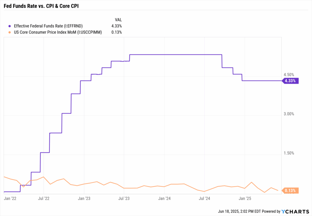
In this environment, each dot carries more weight. As the market hangs on Powell’s every word, the dot plot moves yields, equity valuations, sector leadership, and client confidence. Advisors must be prepared not just to interpret the dots, but to act on them.
Reading Between the Dots: What the Yield Curve Is Saying
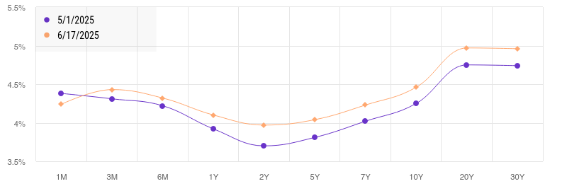
The Treasury yield curve, particularly the 2s/10s spread, is often viewed as a real-time referendum on the Fed’s future path. For most of 2023 and early 2024, the curve remained inverted, flashing recession signals. But now, the shape is changing.
By mid-June 2025:
- The 10-year yield climbed to ~4.4%
- The 2-year yield dipped to ~3.9%
- This shift suggests that bond markets are anticipating rate cuts in 2026 (or at least a softer Fed)
Yet, if the Fed dot plot shows the median 2025 projection holding above 4%, this could signal disagreement between the market and the Fed. Advisors should ask: are we pricing in cuts too soon?
Advisor Tip: If the Fed signals hawkishness (higher for longer), expect long-term yields to remain elevated, a headwind for long-duration assets. If the dot plot softens, long bonds and growth equities could rally.
5 Key Questions Advisors Are Asking About the Fed Dot Plot
1. How reliable is the Fed’s dot plot?
It’s a projection, not a promise. The Fed dot plot represents each FOMC member’s rate expectations — but they evolve as data changes. Advisors must treat it as a snapshot of sentiment, not a fixed roadmap.
2. What does the median dot tell us about future hikes or cuts?
The “median dot” is the focal point, it reflects the central tendency among policymakers. A flat or rising median implies continued restraint, while a lower median could signal easing. Advisors must interpret the median in context with inflation, jobs data, and growth.
3. Why is there dispersion among the dots?
A wide spread between the highest and lowest dots reveals Fed uncertainty. Some members may fear inflation resurgence; others may be more dovish. That variance is critical and can complicate portfolio planning.
4. How should we adjust portfolios based on the dot plot?
Portfolio implications depend on the message:
- No change or hikes → Stay short-duration, focus on quality, be selective in growth exposures
- Easing implied → Add duration, reassess equity sector tilts, lock in current yields
5. How do I explain the dot plot to clients?
Simplify: “The Fed thinks rates will be around X% next year, but that can change.” Use YCharts visuals to support your narrative, and show how your strategy flexes as the Fed’s outlook evolves.
How to Analyze the Fed Dot Plot Using YCharts Tools
Turning the Fed dot plot into actionable guidance requires translating policy language into portfolio implications. Here’s how YCharts can help:
Dashboard
Track live economic data that underpins the Fed’s rate path: CPI, core PCE, wages, unemployment, GDP growth. Use these dashboards to justify or challenge the dots — and to illustrate why the Fed may hold, hike, or cut.
Yield Curve Tool
Plot Treasury curves before and after key Fed events. Use the shape and shifts to explain positioning:
- Steepening? → Consider longer-duration exposure
- Flattening or inverting? → Stay short, reduce risk
Comparing 2s/10s over time helps you visualize the tug-of-war between Fed policy and market expectations.
ETF & Fund Screener
If the dot plot suggests no cuts, screen for short-duration, floating-rate, or inflation-hedged ETFs. If easing is on deck, surface long-duration funds, such as TLT or zero-coupon bond funds. Use filters by duration, yield, and credit quality to fine-tune allocations.
Fundamental Charts & Scenario Analysis
Overlay historical Fed dot plot medians with actual Fed Funds rates, inflation, or recession periods. Run scenario tests: e.g., “What happens if rates fall 100bps in 2026?” Use visual evidence to stress-test portfolios and support rebalancing decisions.
Tactical Portfolio Takeaways
Stay Nimble with Duration
Use barbell strategies or bond ladders to balance income and flexibility. Short-term yields (~4.5%) offer solid income today, but long-duration bonds may gain if cuts materialize in 2026.
Credit Quality Should Reflect Policy Risk
- If the Fed stays hawkish → favor investment-grade corporates or agency-backed securities
- If the Fed softens → consider measured exposure to high-yield (watch spread trends closely)
YCharts can help monitor credit spreads and volatility across bond categories.
Equity Sector Positioning Needs to Reflect Rate Trajectory
- Higher for longer → Financials, value stocks, energy
- Dovish pivot → Growth sectors, tech, rate-sensitive names like housing or REITs
Use YCharts tools to chart sector total returns vs. Fed policy moves over prior cycles.
Capture Curve-Based Income Opportunities
The evolving shape of the yield curve presents opportunities to lock in income across maturities. If short rates remain anchored and long yields fade, there may be windows to lock in attractive coupons on the longer end.
Use the Fed Dot Plot to Enhance Client Conversations
Your clients aren’t parsing dot charts — they want clarity and confidence. Use the Fed dot plot as a conversation starter:
- “Here’s what the Fed expects for rates.”
- “Here’s how we’re positioning if that outlook proves right — or wrong.”
- “Here’s a chart that shows how markets are reacting in real time.”
Using YCharts, you can show:
- The gap between market pricing and Fed guidance
- Yield curve shifts pre- and post-meeting
- Model outcomes under divergent scenarios
By turning opaque projections into transparent strategy, you reinforce your value — and help clients stay calm, informed, and invested.
Bottom Line: Advisors Must Interpret and Act on the Fed Dot Plot
The Fed dot plot is a policy compass — not a map. It offers insight into what the Fed may do, but not certainty. Your job is to:
- Interpret the dots alongside real-time economic and market data
- Position portfolios to align with evolving expectations
- Communicate clearly, using visuals and evidence
- Stay flexible and ready to pivot as the Fed’s path changes
With YCharts, you have the tools to analyze, visualize, and operationalize the dot plot’s implications, transforming guesswork into game plans, and projections into portfolios that are built to adapt.
Whenever you’re ready, here’s how YCharts can help you:
1. Looking to Move On From Your Investment Research and Analytics Platform?
2. Want to test out YCharts for free?
Start a no-risk 7-Day Free Trial.
Disclaimer
©2025 YCharts, Inc. All Rights Reserved. YCharts, Inc. (“YCharts”) is not registered with the U.S. Securities and Exchange Commission (or with the securities regulatory authority or body of any state or any other jurisdiction) as an investment adviser, broker-dealer or in any other capacity, and does not purport to provide investment advice or make investment recommendations. This report has been generated through application of the analytical tools and data provided through ycharts.com and is intended solely to assist you or your investment or other adviser(s) in conducting investment research. You should not construe this report as an offer to buy or sell, as a solicitation of an offer to buy or sell, or as a recommendation to buy, sell, hold or trade, any security or other financial instrument. For further information regarding your use of this report, please go to: ycharts.com/about/disclosure
Next Article
Make Summer Work Harder: The Mid-Year Checklist for AdvisorsRead More →