How Financial Stocks Navigate Falling Rate Cycles

As inflation retreats from 40-year highs and the Federal Reserve signals its first rate cuts since 2020, financial sector investors face a critical question: how will this massive sector perform as monetary policies shift and what has happened in previous falling rate cycles?
The answer lies in three distinct falling-rate cycles that reshaped the financial landscape. Each tells a different story about how banks, insurers, REITs, and brokerages navigate the transition from rising to falling rates. What makes 2025 unique isn’t just rate cuts, it’s the unwinding of the most aggressive inflation fight in four decades.
Key Takeaways
| Key Insight | Impact |
|---|---|
| Initial pressure period | Financial stocks face 6-12 months of pressure during rate cuts, with 20-40% average drawdowns |
| Sub-sector divergence | Trust banks and diversified giants outperform regional banks by 20-30% |
| Recovery potential | Patient investors buying quality banks at peak pessimism earn 50-100% returns |
| Current cycle uniqueness | Combines unique inflation dynamics with traditional rate-cut challenges |
| Stock selection | Winners include JPMorgan Chase, Bank of America, Northern Trust; avoid regional banks with heavy CRE exposure |
|
Powered by
|
|
Table of Contents
Three Rate Cycles That Shaped Financial Markets
The financial sector represents nearly 11% of the S&P 500, but it doesn’t move as one monolithic $8 trillion block during rate cycles. Within this sector, sub-industries respond dramatically differently to the same monetary policy shifts. Understanding these patterns is the difference between riding sector rotations and getting crushed by them.
The COVID-19 Emergency Cuts (2020): When Sectors Diverged
When the Fed slashed rates to zero in March 2020, the financial sector split into distinct performance camps. Banks initially plummeted 45% as investors feared margin compression, while REITs and insurance companies faced entirely different pressures.
The sector’s response revealed a crucial pattern: rate sensitivity varies dramatically by business model. While traditional banks suffered immediate margin pressure, mortgage REITs saw their portfolios explode in value as refinancing surged. Insurance companies faced the long-term challenge of reinvesting maturing bonds at near-zero yields.
COVID Financial Sector Performance (March 2020-March 2021):
| Sector | Peak Decline | Recovery | Net Return |
|---|---|---|---|
| Traditional Banks | -45% | +15% | -30% |
| Mortgage REITs | -60% | +25% | -35% |
| Insurance | -35% | +10% | -25% |
| Brokerage | -25% | +45% | +20% |
| Credit Card | -40% | +30% | -10% |
|
Powered by
|
|||
The lesson? Even in the same rate environment, financial sub-sectors can move in opposite directions based on their underlying business mechanics.
The 2008 Financial Crisis: When Rate Cuts Failed
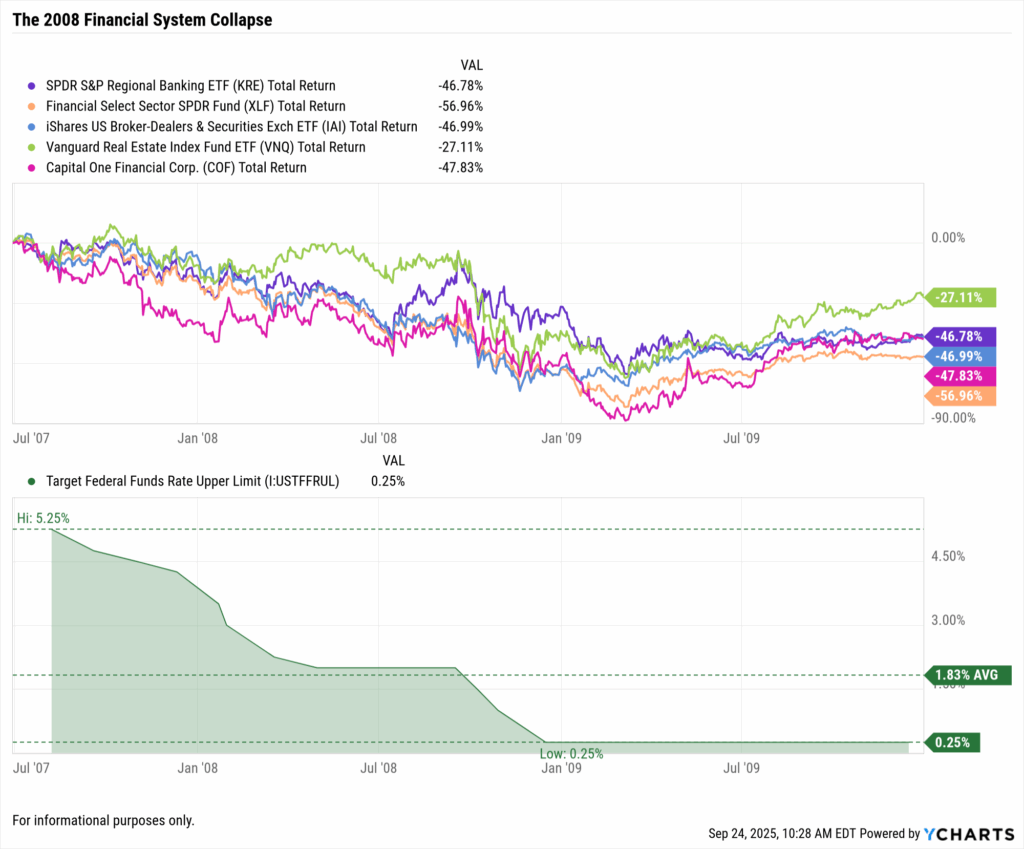
The 2008 cycle tells a darker story. Starting in September 2007, the Fed cut rates from 5.25%, but the sector’s problems ran deeper than monetary policy could solve. This wasn’t about rate sensitivity, it was about fundamental business model failures.
The sector’s collapse revealed how different financial sub-industries fare when rate cuts signal economic distress rather than growth stimulus:
2008 Financial Sector Destruction (Peak to Trough):
| Sector | Ticker/ETF | Peak to Trough Decline |
|---|---|---|
| Regional Banks | KRE | -89% |
| Investment Banks | XLF | -85% |
| Insurance Companies | IAI | -76% |
| REITs | VNQ | -78% |
| Credit Services | COF | -92% |
|
Powered by
|
||
The critical insight: when rate cuts respond to credit crises rather than growth concerns, the entire financial ecosystem suffers regardless of theoretical benefits from lower funding costs. Rate cuts become warning signals, not relief mechanisms.
The Dotcom Era (2001-2003): The Template for Success
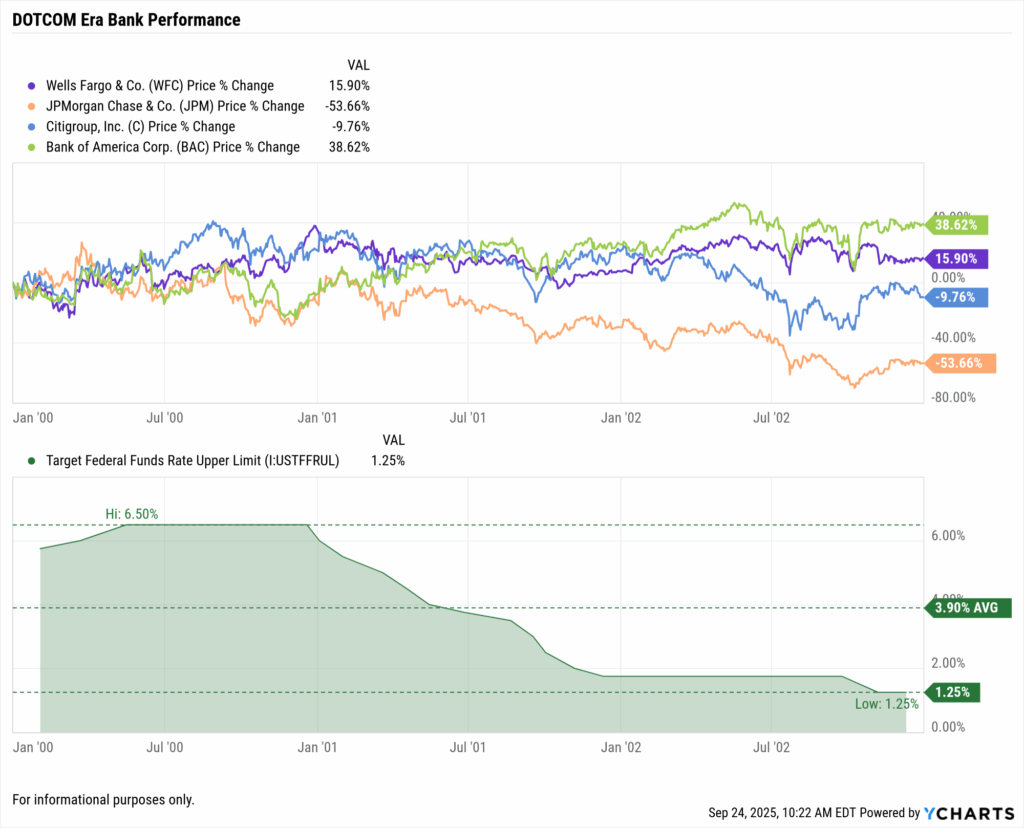
The 2001-2003 cycle offers the blueprint for how financials thrive during falling rates when cuts respond to growth concerns rather than financial system stress. As the Fed cut from 6.5% to 1% over 18 months, different financial sub-sectors found distinct opportunities.
Dotcom-Era Financial Performance (2001-2003):
| Sector | Ticker/ETF | Performance | Driver |
|---|---|---|---|
| Regional Banks | KRE | +35% | Mortgage refinancing boom |
| Mortgage REITs | REM | +65% | Spread expansion |
| Insurance Companies | IAI | +15% | Stable but pressured |
| Brokerage Firms | SCHW | +25% | Trading volume surge |
| Large Banks | XLF | +20% | Diverse revenue streams |
|
Powered by
|
|||
This cycle demonstrated how controlled rate cuts during economic slowdowns benefit the financial sector through refinancing booms, yield curve steepening, lower funding costs, and economic stimulus effects.

Why 2025 Is Different (And Why It Isn’t)
The Inflation Factor Changes Everything
Today’s setup has one crucial difference: we’re coming off a 40-year inflation high. The Fed isn’t cutting to save the economy, they’re cutting because inflation is cooling from 9% to 2.7%.
Unique 2025 Dynamics:
| Factor | Current Status | Impact |
|---|---|---|
| Real interest rates | Positive at 1.55% | Fed funds 4.25% minus inflation 2.7% |
| Bank deposit costs | Locked at 3-4% | Set during inflation surge |
| Loan demand | Weakening | Borrowers adjusting to “higher for longer” |
| CRE exposure | Concentrated in regionals | Major risk factor |
| Consumer credit | Early stress signals | Credit cards and auto loans showing strain |
|
Powered by
|
||
PNC Financial CEO William Demchak captured the industry’s dilemma: “We’re caught between a rock and a hard place. Our deposits are priced for yesterday’s inflation, our loans are repricing for tomorrow’s recession fears, and our investors want today’s dividends.”
The Yield Curve’s Mixed Message
After 18 months of inversion, the yield curve turned positive in August 2025, reaching 50-60 basis points. While this signals eventual margin improvement, banks face immediate challenges:
| Challenge | Current Level | Outlook |
|---|---|---|
| Deposit costs | Stuck at 3.5% average | Slow to reprice down |
| Loan yields | Falling rapidly | Borrowers refinancing aggressively |
| Credit losses | Normalizing | Rising from unsustainable lows |
| Regulatory pressure | Increasing | Focus on fees and capital requirements |
|
Powered by
|
||
Benefits from a normalized yield curve take 12-18 months to materialize, creating a painful transition period.
Investment Playbook: Identifying Winners and Losers
Banks Positioned to Win
Diversified Giants
JPMorgan Chase and Bank of America leverage massive trading and investment banking operations. When net interest income falls, trading revenue often surges. During COVID, JPMorgan’s trading revenue jumped 30% even as lending income collapsed.
Trust and Custody Banks
Bank of New York Mellon and Northern Trust generate fee-based revenue regardless of rate levels. They charge for assets under custody regardless of rate levels. In 2008, while commercial banks imploded, Northern Trust actually raised its dividend.
Conservative Lenders
US Bancorp and M&T Bank survive downturns through disciplined underwriting. Their secret? Lower returns during booms, but survival during busts.
Banks to Avoid
Regional Banks with CRE Exposure
The SPDR Regional Banking ETF (KRE) faces concentrated commercial real estate exposure as office vacancies hit record highs, plus maximum sensitivity to margin compression. History suggests 20-30% underperformance during rate-cutting cycles.
High-Growth Digital Banks
Fintech darlings that thrived on rising rates face an existential question: can they maintain deposit growth when traditional banks offer competitive rates? Early evidence suggests challenges ahead.
Timeline for Financial Sector Investors
Phase 1: Q4 2025 (Next 3 Months)
- Fed cuts 25-50 basis points
- Bank stocks fall 5-10% on margin concerns
- Action: Reduce bank exposure from 15% to 10% of portfolio, keep only quality names
Phase 2: Q1 2026 (Months 3-6)
- Total cuts reach 75-100 basis points
- Bank earnings disappoint; dividend concerns emerge
- Action: Begin accumulating select positions in diversified banks and trust companies
Phase 3: Q2-Q3 2026 (Months 6-12)
- Credit losses prove manageable
- Yield curve steepens past 100 basis points; M&A speculation begins
- Action: Increase allocation back to market weight, focusing on survivors with clean balance sheets
Phase 4: Q4 2026-2027 (Months 12-24)
- Bank earnings recover; consolidation accelerates
- Action: Overweight the sector for recovery trade
The Bottom Line: Patience Pays, Panic Doesn’t
Financial stocks face 6-12 difficult months ahead. History shows banks initially suffer during rate cuts, with average drawdowns of 20-40%. But history also shows patient investors who buy quality banks during peak pessimism enjoy 50-100% returns during recovery.
We’re in Act One of a three-act play. Act One brings margin compression. Act Two brings credit quality resolution. Act Three brings recovery through M&A and normalization.
As one grizzled bank investor who survived all three cycles told me: “Everyone knows banks are interest-sensitive. What they forget is they’re also fear-sensitive. The time to buy is when everyone else is convinced they’re zeros.”
The charts tell a consistent story: in 2001, 2008, and 2020, banks crashed first, crashed hardest, then recovered fastest. The pattern is clear. The opportunity is coming.
And history suggests that “when” is closer than most think, but not as close as the optimists hope.
For those who understand the pattern, the next 24 months offer career-defining opportunities. Just ask anyone who bought banks in March 2009, March 2020, or October 2002.
They’re not complaining about rate cuts anymore.
Whenever you’re ready, here’s how YCharts can help you:
1. Curious what’s included in bond data and how to access it?
Visit the FAQ page for coverage details and to request the add-on.
2. Interested in how other advisors are growing with YCharts?
Read Alan Cohen’s success story to see how proposals helped double his business.
3. Ready to try YCharts for yourself?
Start a no-risk 7-day free trial.
Disclaimer
©2025 YCharts, Inc. All Rights Reserved. YCharts, Inc. (“YCharts”) is not registered with the U.S. Securities and Exchange Commission (or with the securities regulatory authority or body of any state or any other jurisdiction) as an investment adviser, broker-dealer or in any other capacity, and does not purport to provide investment advice or make investment recommendations. This report has been generated through application of the analytical tools and data provided through ycharts.com and is intended solely to assist you or your investment or other adviser(s) in conducting investment research. You should not construe this report as an offer to buy or sell, as a solicitation of an offer to buy or sell, or as a recommendation to buy, sell, hold or trade, any security or other financial instrument. For further information regarding your use of this report, please go to: ycharts.com/about/disclosure
Next Article
Access Individual Bond Data on YCharts for Smarter ProspectingRead More →