The Housing Market & Interest Rates: Understanding the Ripple Effect

- Home prices are at record highs while affordability has slipped below its breakeven threshold.
- Existing home sales sit near decade lows as the lock-in effect weighs on supply and demand.
- The labor market stands as the wildcard that will determine whether lower rates translate into the housing market.
Interested in testing out YCharts for free?
Start 7-Day Free TrialThe Fed has officially begun cutting interest rates, with a move of 25 basis points down to 4.00–4.25%. This marks the first step in an easing cycle that advisors and clients have anticipated for months.
While markets may react instantly to a move like this, one of the most pressing questions for clients is what this means for mortgages and the housing market.

Table of Contents
Current State of the Housing Market
U.S. median existing home prices reached an all-time high of $432,700 in June 2025, while the cost of borrowing has stayed elevated. For households, this combination has created one of the most challenging environments in years.
In fact, the Housing Affordability Index slipped below the threshold of 100 in May. This level signals that the typical family does not earn enough to qualify for a median-priced home at current mortgage rates, clearly indicating how stretched affordability has become.
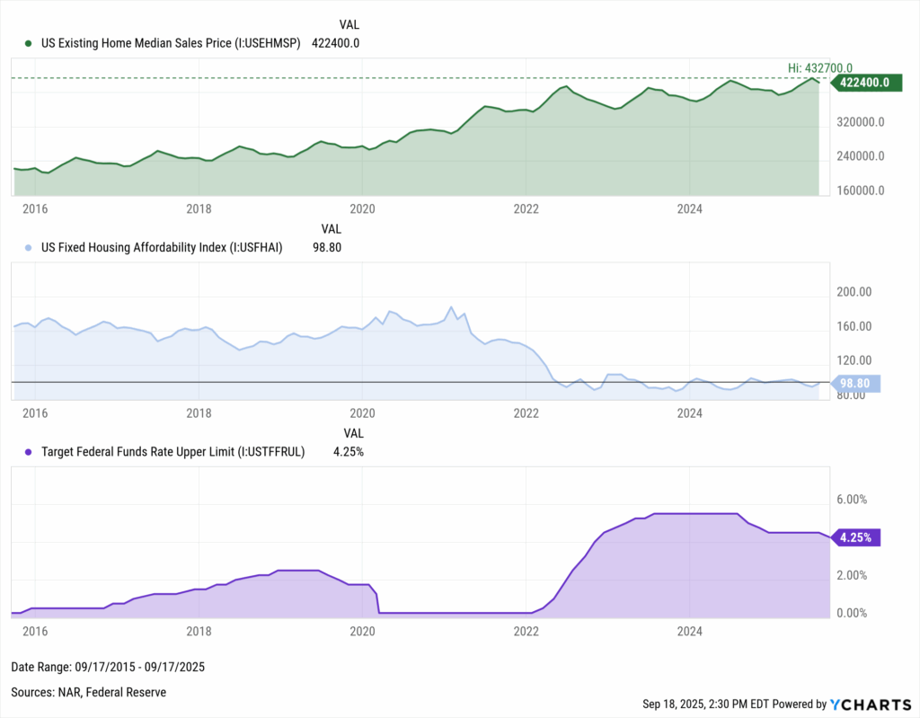
Download Visual | Modify in YCharts
Home Sales Under Pressure
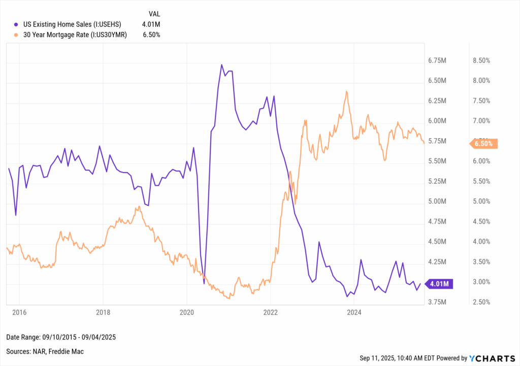
This squeeze has had an apparent effect on housing activity, with existing home sales hovering just above their lowest level in more than a decade.
A major driver of this slowdown is the “lock-in effect.” Millions who refinanced or purchased at historically low mortgage rates have little incentive to sell, as moving would mean trading into today’s higher rates. Doing so would lead to significantly higher payments, leaving homeowners to stay put.
Download Visual | Modify in YCharts
The relationship is inverse: when mortgage rates climb, sales fall, and when rates ease, activity picks back up.
For advisors, this is where client conversations often start. Families see record home prices alongside decade-low sales and want to know whether the new cycle of Fed rate cuts can change the current narrative.
Jobs are the Wildcard
Employment is the bridge between Fed policy and housing demand. Households need stable jobs and reliable income to qualify for mortgages and to feel confident making major purchases. Without that foundation, lower rates alone may not spark activity.
In 1995, that bridge held. The Fed cut rates, unemployment stayed low, and housing activity improved steadily as affordability returned. This soft landing stands out because strong labor conditions allowed lower borrowing costs to translate into real demand.
Download Visual | Modify in YCharts
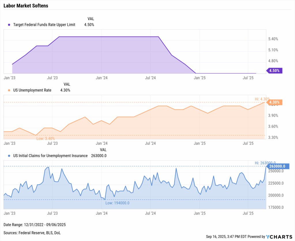
Today, the landscape is more fragile. Unemployment has climbed to 4.3%, and jobless claims have recently reached their highest level in over two years.
In his address following September’s FOMC, Powell stated, “Risks to inflation are tilted to the upside, and risks to employment are tilted to the downside, a challenging situation.”
These cracks in the labor market were a key reason the Fed began cutting, and they now stand as the wildcard for how much housing can truly rebound.
How Mortgage Rates Respond
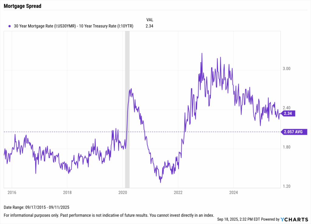
When clients ask why mortgage costs don’t drop the moment the Fed cuts rates, the answer is that mortgages move with the bond market rather than directly with Fed policy.
Lenders look to the 10-year Treasury yield as the benchmark for long-term borrowing, then add a spread, which typically runs around 2 percentage points. This spread accounts for risks like defaults, refinancing patterns, and lender margins, and it can widen or narrow as conditions change.
Download Visual | Modify in YCharts
Though mortgage rates do not move in lockstep with the Fed Funds Rate, households should begin to feel relief as the easing cycle progresses. The first round of cuts in late 2024 already pulled mortgage rates down from their peak of 7.8%, even if that relief has not yet been enough to break the lock-in effect weighing on sales.
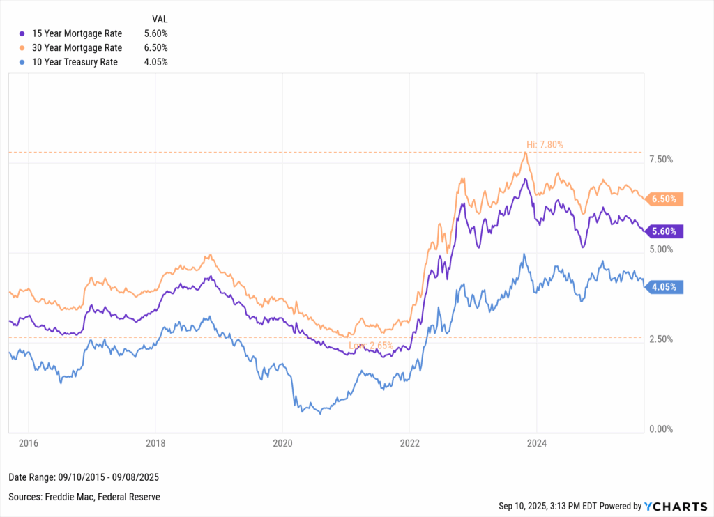
Download Visual | Modify in YCharts
The renewed easing cycle underway could shift that dynamic. Additional cuts may create better conditions for buyers, encourage more homeowners to list, and gradually ease affordability pressures. Each step lower in borrowing costs increases the likelihood that housing activity begins to recover.
Signals That Shape the Outcome
The next stage for advisors is helping clients understand what this all means in practice. While the mechanics of how rates flow into mortgages are essential, the bigger value is answering the questions clients are likely to ask now that they’ve been announced.
Key Questions Clients May Ask
- “Will mortgage rates go back to 3%?” → Unlikely. Relief is more realistic in the 5–6% range, which would still mean hundreds of dollars in lower monthly payments for many borrowers.
- “When will I feel the impact?” → Mortgage rates can adjust quickly, but housing activity usually lags by several months. Early signs often show up in refinancing applications before sales volumes recover.
- “Should I refinance or wait?” → Refinancing typically makes sense once rates fall 75–100 bps below a client’s current loan. Running the math now ensures clients are ready to act if favorable conditions arise.
Signals to Watch
- Mortgage spreads: Narrower spreads would accelerate the drop in consumer borrowing costs, while persistent wide spreads would slow the pass-through of Fed cuts.
- Affordability metrics: A move decisively above 100 on the Housing Affordability Index would be a clear signal that Fed cuts are making housing more accessible again.
- Sales volumes: A rebound in existing home sales would show that the lock-in effect is easing and that buyers are reentering the market.
The path forward will hinge on how well the Fed executes this easing cycle. Cutting rates provides relief, but the real test is whether inflation can cool and growth can steady without broader instability.
A soft landing would mean gradual improvement in affordability alongside a stable economy. A harder landing might deliver faster rate relief, but at the cost of weaker confidence and demand.
Housing does not exist in isolation. The Fed must balance its approach across jobs, inflation, credit, and financial conditions. How carefully it manages those broader indicators will ultimately shape how the housing market responds to this cycle of cuts.
Ready to Move On From Your Investment Research and Analytics Platform?
Follow YCharts Social Media to Unlock More Content!
Disclaimer
©2025 YCharts, Inc. All Rights Reserved. YCharts, Inc. (“YCharts”) is not registered with the U.S. Securities and Exchange Commission (or with the securities regulatory authority or body of any state or any other jurisdiction) as an investment adviser, broker-dealer or in any other capacity, and does not purport to provide investment advice or make investment recommendations. This report has been generated through application of the analytical tools and data provided through ycharts.com and is intended solely to assist you or your investment or other adviser(s) in conducting investment research. You should not construe this report as an offer to buy or sell, as a solicitation of an offer to buy or sell, or as a recommendation to buy, sell, hold or trade, any security or other financial instrument. For further information regarding your use of this report, please go to: ycharts.com/about/disclosure.
Next Article
The Great Rate Cut Debate: Will the Fed Ease in 2025?Read More →