
“Is now the right time to invest, or should I wait for better conditions?”
Interested in testing out YCharts for free?
Start 7-Day Free TrialThe short answer: the historical data consistently favors investing now over waiting. Across every scenario (worst-case entry timing, panic-selling during a crash, or missing the market’s best days), the cost of waiting has historically outweighed the cost of imperfect timing
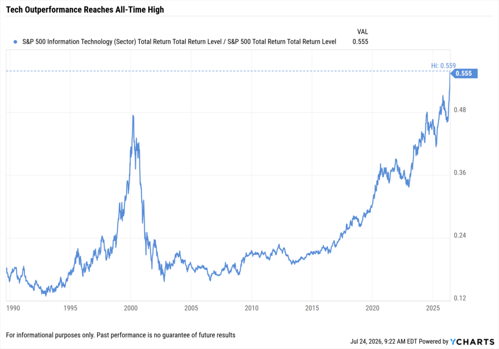
The S&P 500 spent the first half of 2026 setting 24 new all-time highs, continuing a bull market that has stretched more than 3.7 years and seen the index increase by more than 104% since October 2022. This run, while still shorter than the average bull market’s 5.4 years, comes with its own warning signs:
- Tech overconcentration: Technology now accounts for more than 37% of the S&P 500 index by weight, an all-time record.
- AI valuation concerns: Extreme capital expenditures and lofty AI valuations have raised bubble comparisons.
- Geopolitical risk: Ongoing tensions in the Middle East and elevated inflation continue to cloud the economic outlook.
Against this backdrop, clients are asking the question that surfaces in every uncertain market: Should I wait for a pullback, move to the sidelines, or invest now?
No advisor can answer with certainty. But the historical record on waiting is far more decisive than the question itself suggests.
Table of Contents
What Happens If You Invest at the Worst Possible Moment?
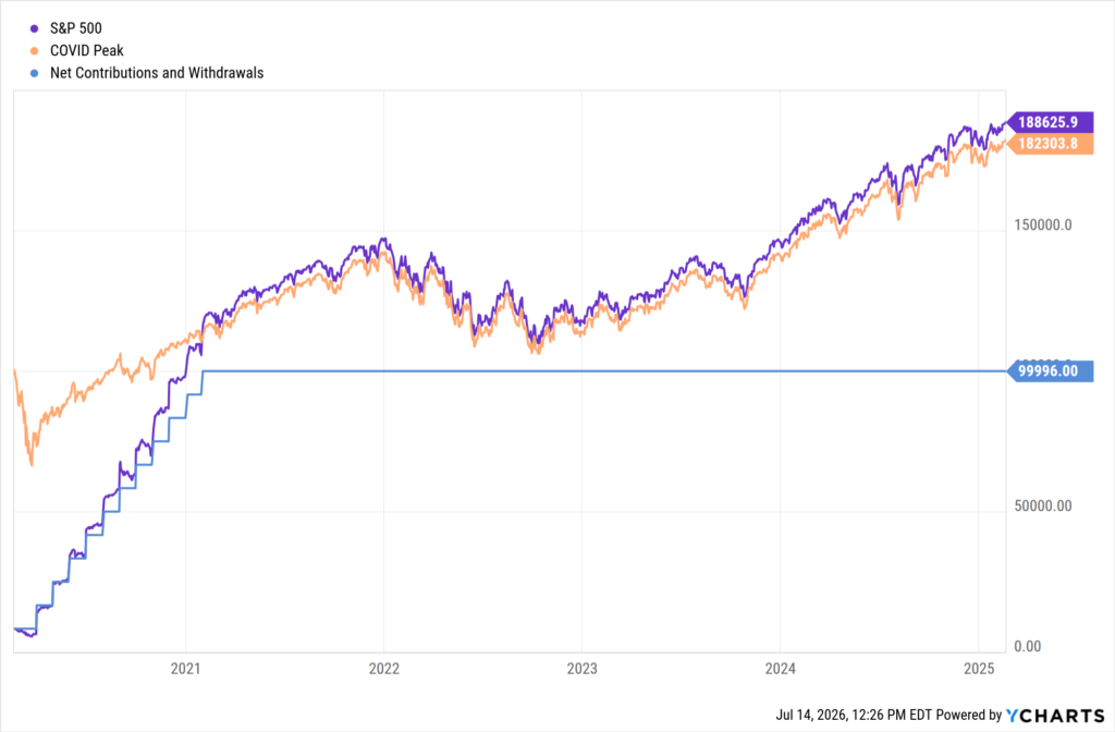
Even the worst-timed investment in recent history still produced strong long-term returns. Consider an investor who deployed $100,000 into the S&P 500 on February 19, 2020, the absolute peak before the COVID-19 crash.
- In 33 days, the S&P 500 fell 33.9%, erasing roughly $34,000.
- Compare that to an investor who spread the same $100,000 across the next twelve months via dollar-cost averaging (DCA), buying into the crash and recovery.
Five years later, both strategies gained more than 80%. Despite buying at the single worst possible moment, the lump-sum investor finished just 6.3% behind the DCA approach.
Click to view Scenarios in YCharts →
The takeaway: entry timing matters less than clients fear. The ability to remain invested through volatility plays a far more important role.
What Is the Real Cost of Moving to Cash During a Downturn?
Stepping out of the market, even briefly, has a measurable and lasting cost. Using YCharts scenario analysis, we can illustrate exactly what happens when investors try to “wait for things to calm down”:
- An investor who moved to cash for just one month at the bottom of the COVID crash would have sacrificed more than $25,000 over five years.
- An investor who moved to cash and never returned ended the period with annualized losses of -2.90%, finishing 18 percentage points per year behind someone who did nothing at all.
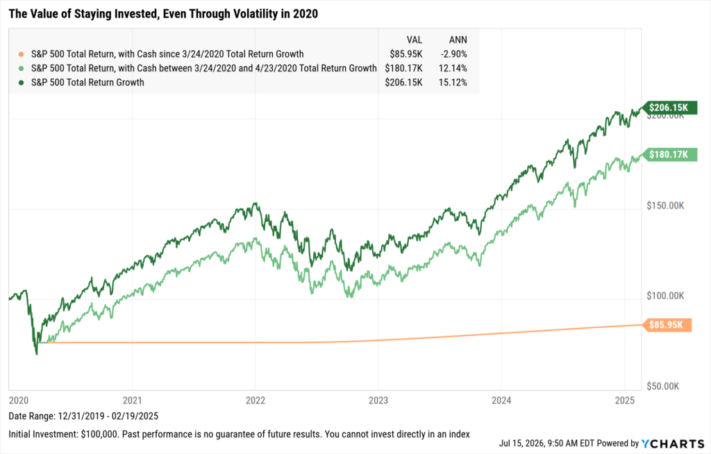
The bigger danger to returns is not when clients invest. It is how they behave when the market is falling.
Does Staying Invested Longer Produce Meaningfully Better Returns?
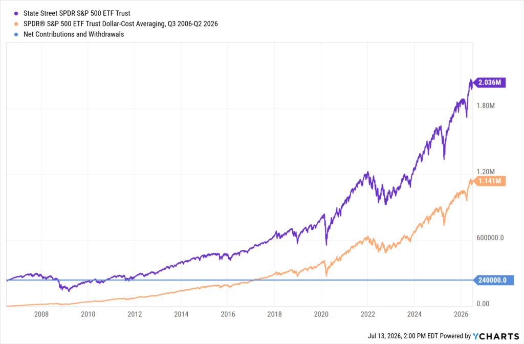
The longer the time horizon, the more dramatically compounding favors early, sustained investment. Looking at a 20-year window that included two major recessions:
- A lump sum investment of $240,000 made 20 years ago returned 748% total.
- The same amount invested via monthly DCA contributions returned 375%.
- The difference in ending wealth: nearly $900,000.
Click to view Scenarios in YCharts →
The same principle applies to timing an exit and attempting a re-entry. YCharts data across a 25-year window shows the cost of missing the market’s best days:
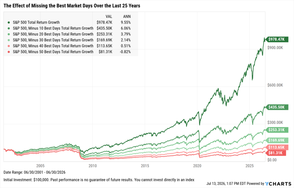
Missing just the 10 best market days over 25 years cut annualized returns by more than a third. These best days are impossible to predict, and they tend to cluster very close to the worst ones.
There’s Always a Reason to Sell
Many of these best days have shown up during periods that felt like exactly the wrong time to be invested. Since 1990, the S&P 500 has weathered the dot-com collapse, the 2008 financial crisis, a global pandemic, and many more events that each felt a legitimate reason to step back.
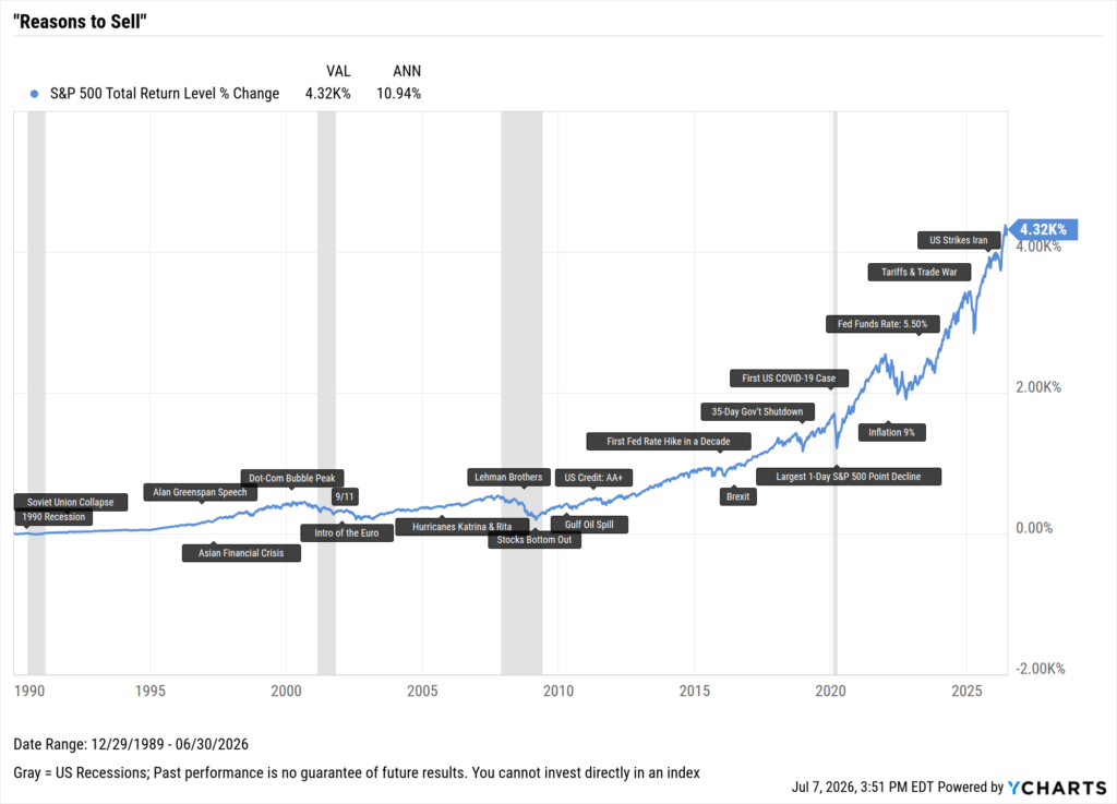
Today’s AI valuation concerns, elevated rates, and conflict in the Middle East raise the same instinct to step back, yet through all of those, the index has returned 4,320% at an annualized rate of 10.94%.
Is Now the Right Time to Invest?
The answer is that nobody knows what the next six months hold. The data across the worst possible entry point, panicking and moving to cash, and missing the market’s best days all point to the same conclusion: the cost of waiting has historically outweighed the cost of being wrong about timing.
Advisors already understand this. The challenge is helping clients feel it when uncertainty and fear creep in. YCharts gives advisors the scenario analysis, chart overlays, and data visualizations to turn “trust me” moments into “look at this,” turning client anxiety into a grounded conversation backed by decades of market history.
Frequently Asked Questions (FAQ)
Should I invest at market all-time highs? Yes, historically. All-time highs are common during bull markets, and research consistently shows that buying at all-time highs produces returns comparable to buying at any other time, because markets tend to continue setting new highs over long periods.
What is dollar-cost averaging, and is it better than a lump sum? Dollar-cost averaging (DCA) means investing a fixed amount at regular intervals rather than all at once. While DCA reduces the emotional difficulty of investing during volatility, lump-sum investing has historically outperformed DCA in most market environments when the full investment period is considered.
What happens if the market crashes right after I invest? Even investors who bought at the single worst moment before the COVID-19 crash (February 19, 2020) still gained more than 80% over the following five years, just 6.3% less than an investor who timed the DCA perfectly. Staying invested mattered far more than entry timing.
How does moving to cash affect long-term returns? Significantly. YCharts data shows that an investor who moved to cash for just one month during the COVID crash bottom sacrificed more than $25,000 over five years. An investor who moved to cash and never returned earned -2.90% annualized, finishing 18 percentage points per year below someone who stayed invested.
Ready to Move On From Your Investment Research and Analytics Platform?
Follow YCharts Social Media to Unlock More Content!
Next Article
Access Individual Bond Data on YCharts for Smarter ProspectingRead More →