iShares, PIMCO, and Fidelity Are Leading the Charge in Active Fixed Income ETFs
As volatility gripped the markets in Q1, investors sought refuge, retreating into cash and, even more notably, into fixed income strategies.
With yields hovering near decade highs and geopolitical risks escalating, bonds provided a compelling alternative for investors seeking to evade some of the geopolitical-induced volatility that afflicted the equity market.
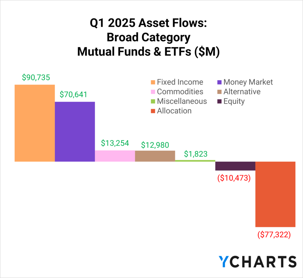
Q1 Fixed Income Fund Flows
In Q1 2025, fixed income mutual funds and ETFs attracted $90.7 billion in net new assets, leading all asset classes and outpacing the $70.6 billion that flowed into money market funds.
Meanwhile, equities faced net outflows of $10.4 billion during the same period, highlighting a clear investor preference for the stability of fixed income.
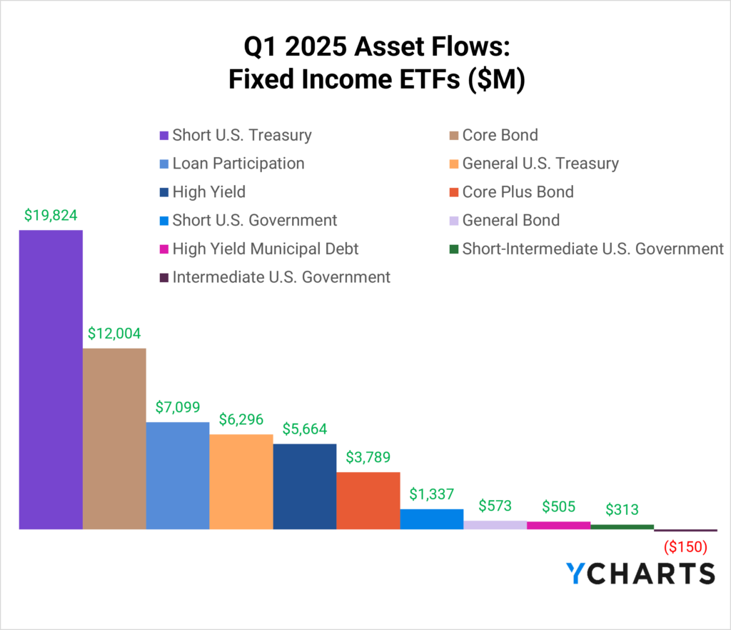
Zooming in on ETFs, growth has been explosive across the fixed income universe. Short-term Treasury ETFs were the biggest beneficiaries, pulling in $19.8 billion in net new assets.
Investors favored these products to extend duration out of cash positions, capturing higher yields without taking on the interest rate risk of longer-term bonds.
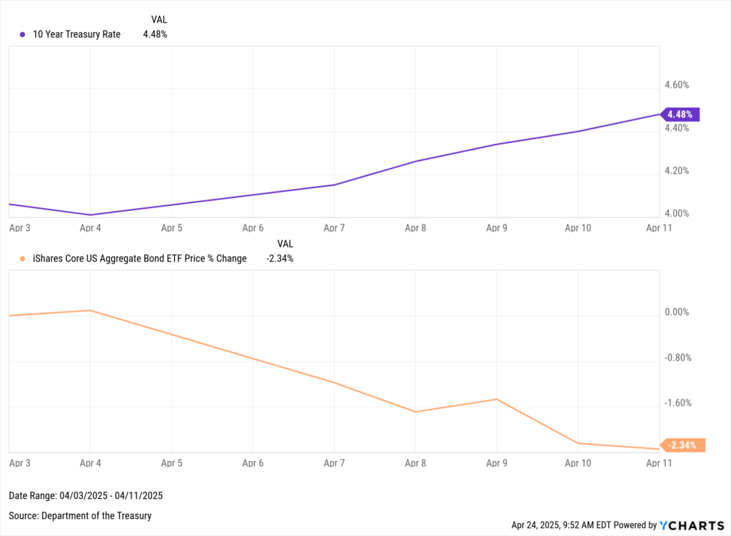
A reminder of that risk surfaced early in Q2 when the 10-year Treasury yield spiked 42 basis points—from 4.06% on April 3 to 4.48% on April 11—sending bond prices lower.
Download Visual | Modify in YCharts
Beyond short-term Treasuries, the “belly” of the curve also attracted interest, with core bond ETFs bringing in $12 billion.
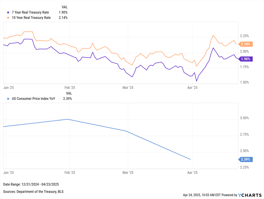
With both the 7- and 10-year Treasury yields sitting above 4% and a March CPI print of just 2.39%, real yields stood at attractive levels of 1.9% and 2.14% as of April 23, 2025.
Download Visual | Modify in YCharts
Loan participation funds also benefited, drawing over $7 billion in new assets as investors sought floating-rate income amid tightening spreads.
Active Fixed Income ETFs Are Capturing Investors’ Attention
Active fixed income strategies have been a standout story in 2025.
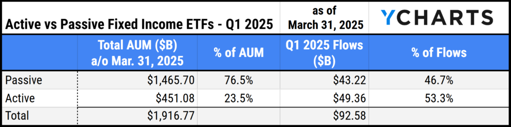
Over the last three months, active strategies accounted for 53% of all flows into fixed income ETFs, despite representing just 23% of total fixed income ETF assets as of March 31, 2025.
Investors have become increasingly comfortable allocating part of their bond sleeve to active managers—especially those who can adapt to rapid changes in rates, inflation, and geopolitics while offering the liquidity benefits of an ETF wrapper.
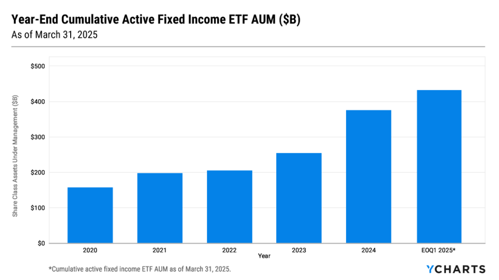
This was punctuated by the fact that active fixed income ETFs cumulatively surpassed $450 billion in AUM for the first time in Q1.
This increase in demand is a reflection of the efficacy of active management in fixed income.
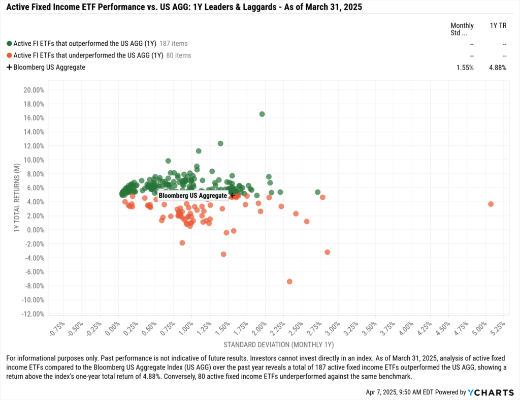
Over the last year, 70% of active fixed income ETFs outperformed the AGG, as managers have adjusted duration, credit risk, and geographic exposure as they adjust to the ever-changing rate and geopolitical environment.
At Exchange in Las Vegas this year, Dave Abner, head of global ETFs and funds at Northern Trust, said that the next $10 trillion in ETF assets will come from the ‘meat and potatoes’ or core part of portfolios.
With volatility front and center, it appears that a large portion of that poultry and starch dish will come from the active fixed income space, specifically strategies where the manager has wide discretion, like in the multi-sector, core, and core-plus peer groups.
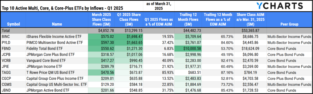
Here are the five active fixed income ETFs in those peer groups that have attracted the most assets to start the year: BINC, PYLD, FBND, JCPB, and VCRB.
Download Visual | Modify Comp Table in YCharts
1. iShares Flexible Income Active ETF (BINC)
The iShares Flexible Income Active ETF (BINC) led all active fixed income ETFs in Q1, gathering $1.7 billion in net new assets. Over the last year, it raised $5.7 billion, representing 65.7% of its AUM as of March 31, 2025.
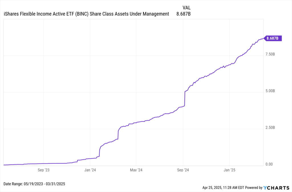
Download Visual | Modify in YCharts
Investors have likely flocked to BINC for its income potential and relatively low duration risk.
Managed by industry veteran Rick Rieder and his team, BINC’s yield-to-maturity is 109 basis points higher than the 20-year passive strategy offered by iShares (TLT), while maintaining lower duration risk than both AGG and the 3–7 year Treasury ETF (IEI) as of March 31, 2025.
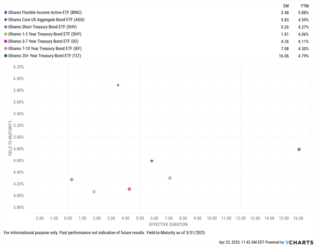
Download Visual | Modify in YCharts
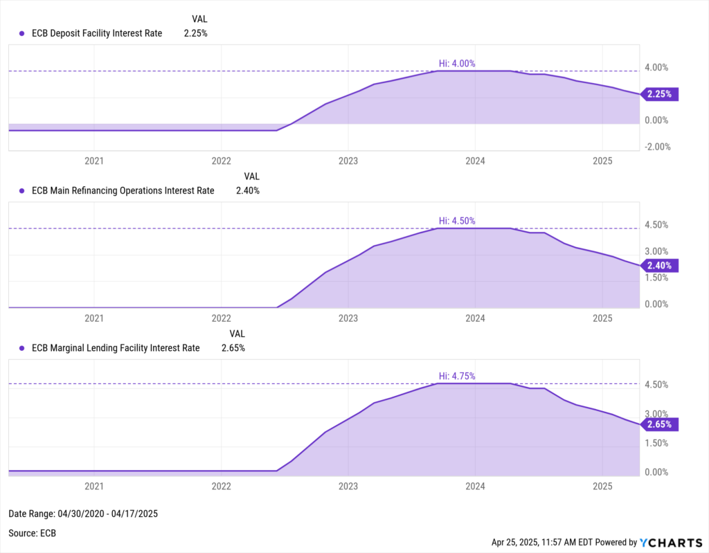
Another factor driving flows into BINC is its global diversification.
Only 38.5% of BINC’s exposure is U.S.-based, which reduces single-country concentration risk—an important consideration amid an uncertain rate environment, rising geopolitical tensions, and concerns about international demand for U.S. Treasuries.
Meanwhile, BINC has over 18% exposure to developed European markets, where the European Central Bank (ECB) has been aggressively cutting rates, most recently on April 17, 2025, marking its seventh cut in a year.
Download Visual | Modify in YCharts
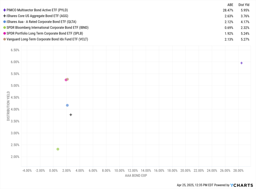
2. PIMCO Multisector Bond Active ETF (PYLD)
Trailing just behind BINC, the PIMCO Multisector Bond Active ETF (PYLD) attracted $1.6 billion in Q1, representing 37.4% of its AUM as of March 31, 2025.
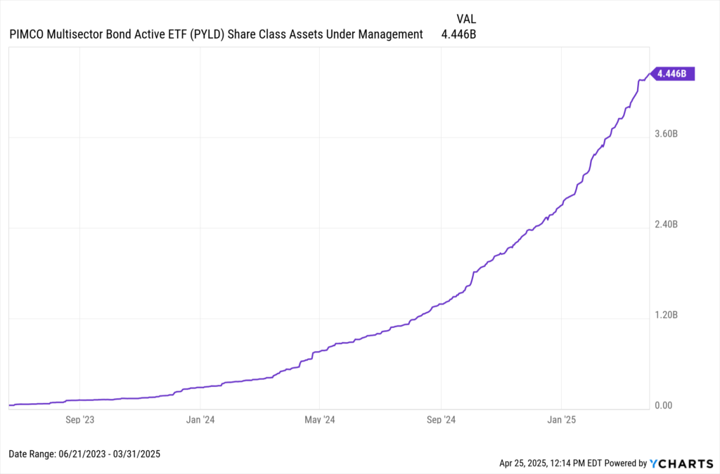
Download Visual | Modify in YCharts
PYLD distinguishes itself by reducing government bond exposure to 16.4% of the portfolio, compared to AGG’s 47%, while significantly increasing exposure to securitized fixed income at 44.3%.
This positioning has delivered a 5.95% distribution yield as of April 24, 2025. For investors mindful of credit quality, PYLD maintains strong credit ratings, with 28.5% of its portfolio rated triple-A and 33.1% rated double-A.
Download Visual | Modify in YCharts
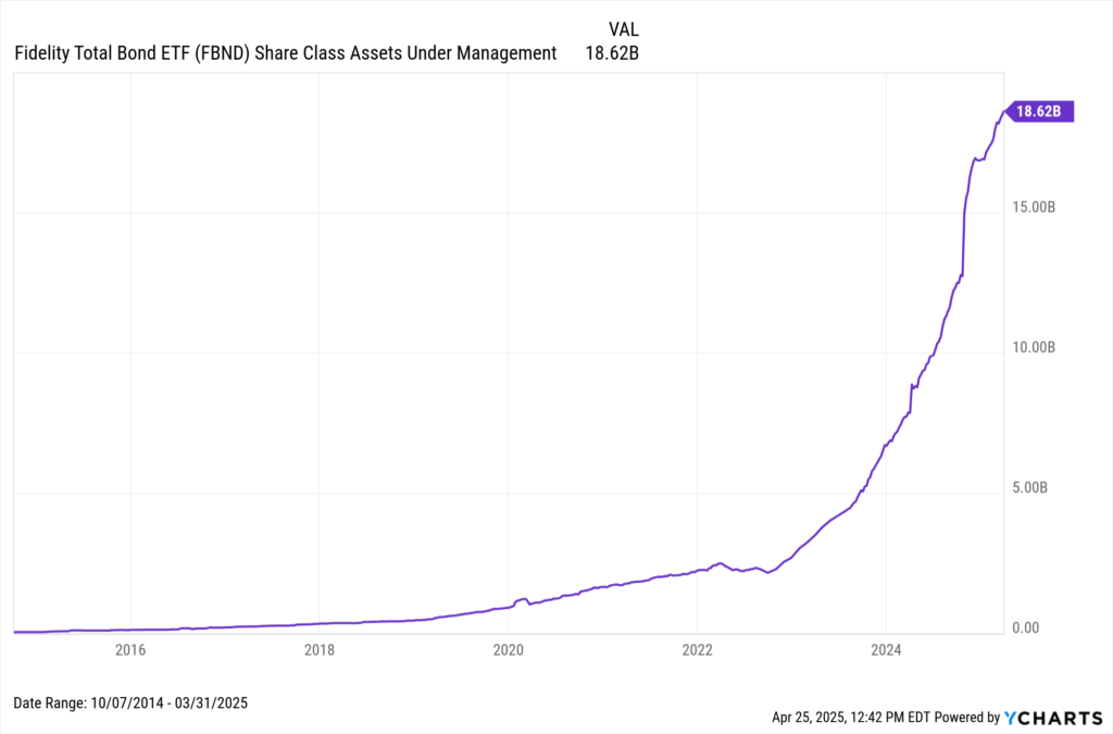
3. Fidelity Total Bond ETF (FBND)
The oldest and largest strategy on this list (launched in 2014), Fidelity’s Total Bond ETF (FBND) attracted $1.3 billion in Q1.
Download Visual | Modify in YCharts
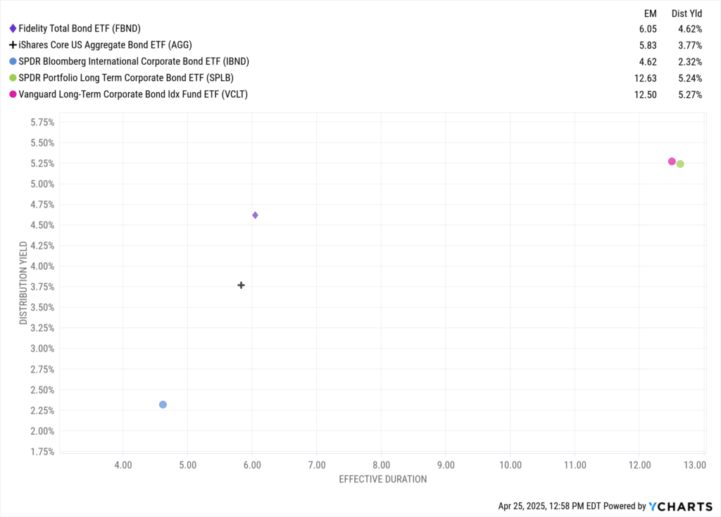
FBND mirrors the theme among the funds on this list: a move away from government bonds, with only 39% allocated to Treasuries compared to AGG’s 47%.
As of March 31, 2025, FBND was overweight corporate bonds at 32% and tilted toward lower-rated securities, with 18.5% exposure to BBB-rated and below versus AGG’s 13.2%.
Going out on the risk curve has partially led to increased income potential, adding 85 basis points of distribution yield over AGG, with similar duration risk. That’s a sharp contrast to many longer-dated corporate bond strategies, which often carry double-digit duration.
Download Visual | Modify in YCharts
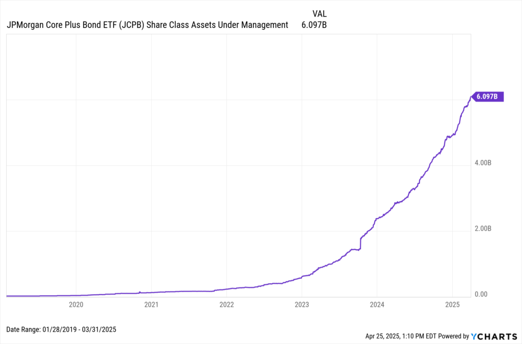
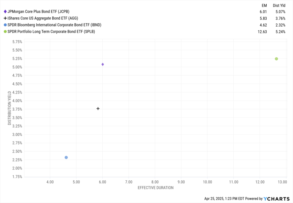
4. JPMorgan Core Plus Bond ETF (JCPB)
The JPMorgan Core Plus Bond ETF (JCPB) pulled in $1 billion in Q1 and $3 billion over the past year, accounting for nearly half its total AUM as of March 31, 2025.
Download Visual | Modify in YCharts
Like FBND, JCPB is relatively overweight in corporate credit (33%) and BBB-rated bonds (14.8%) compared to AGG as of February 28, 2025.
Thanks to its balanced allocation between corporate and securitized credit, JCPB offers income potential competitive with longer-duration corporate strategies while maintaining duration risk comparable to AGG—a meaningful advantage as volatility persists.
Download Visual | Modify in YCharts
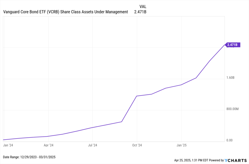
5. Vanguard Core Bond ETF (VCRB)
Rounding out the list, Vanguard’s VCRB attracted $990 million in Q1. As a newer fund, it has amassed $2 billion over the last year, representing over 90% of its AUM as of March 31, 2025.
Download Visual | Modify in YCharts
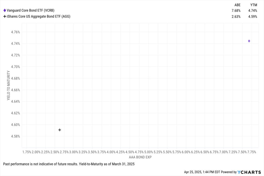
VCRB’s allocation most closely mirrors AGG, with 41% in government bonds.
However, it stands apart through its higher-quality bond selection, featuring over 7.7% exposure to triple-A-rated securities, more than double AGG’s sub-3% exposure. This focus on quality is tied to a 4.74% yield-to-maturity, 15 basis points higher than AGG’s, as of the end of Q1.
Download Visual | Modify in YCharts
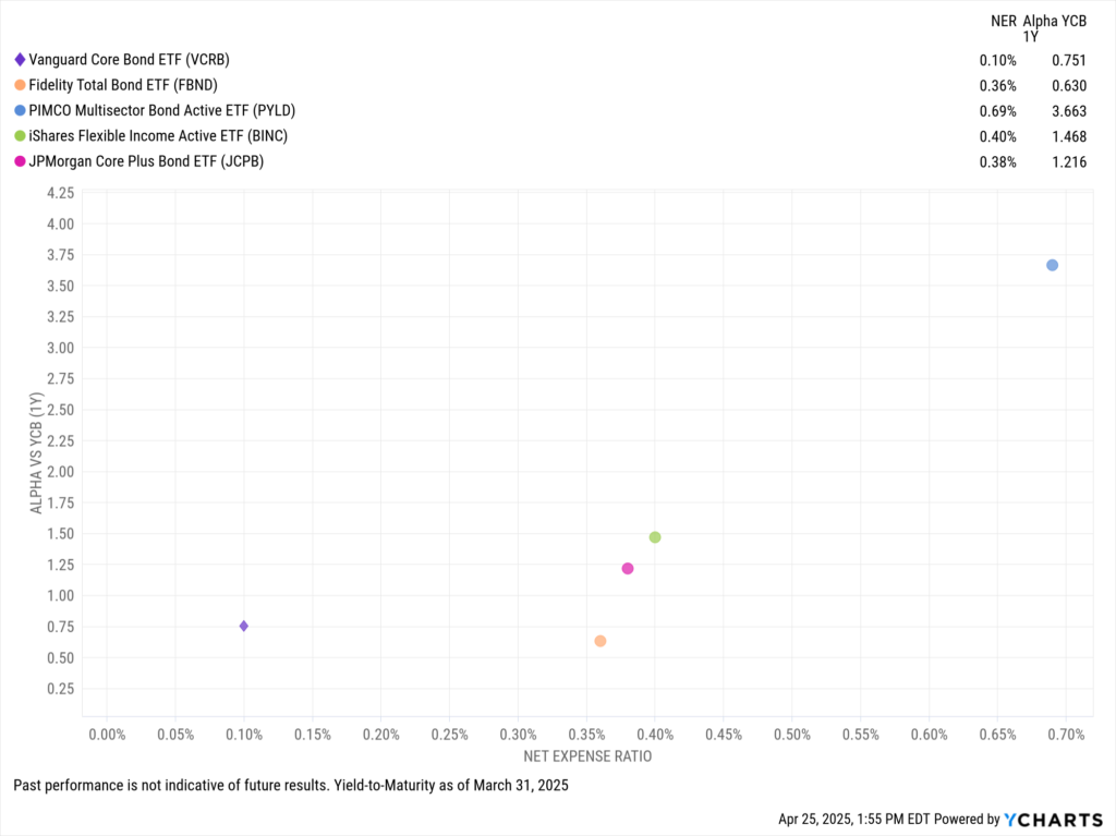
One of VCRB’s strongest advantages, in typical Vanguard fashion, is its cost.
With a net expense ratio of just 0.10%, it offers significantly lower fees than the other strategies on this list, all while delivering approximately 75 basis points of alpha over the past year.
Download Visual | Modify in YCharts
As fixed income reclaims its role as a cornerstone of portfolio construction in 2025, advisors are embracing active bond ETFs that provide flexibility, income potential, and strategic credit exposure—all while navigating a complex rate and geopolitical environment.
The surge in flows to funds like BINC, PYLD, FBND, JCPB, and VCRB underscores a growing preference for strategies that can dynamically manage risk and return in real time. Whether prioritizing income, credit quality, or cost efficiency, these funds highlight the evolving toolkit advisors are deploying to meet today’s challenges—and tomorrow’s opportunities—in the bond market.
Whenever you’re ready, there are three ways YCharts can help you:
Have questions about how YCharts can help you grow AUM and prepare for meetings?
Email us at hello@ycharts.com or call (866) 965-7552. You’ll get a response from one of our Chicago-based team members.
Unlock access to our Fund Flows Report and Visual Deck by becoming a client
Sign up for a copy of our Fund Flows Report and Visual Deck:
Sign up to recieve a copy of our monthly Fund Flows Report:Disclaimer
©2025 YCharts, Inc. All Rights Reserved. YCharts, Inc. (“YCharts”) is not registered with the U.S. Securities and Exchange Commission (or with the securities regulatory authority or body of any state or any other jurisdiction) as an investment adviser, broker-dealer or in any other capacity, and does not purport to provide investment advice or make investment recommendations. This report has been generated through application of the analytical tools and data provided through ycharts.com and is intended solely to assist you or your investment or other adviser(s) in conducting investment research. You should not construe this report as an offer to buy or sell, as a solicitation of an offer to buy or sell, or as a recommendation to buy, sell, hold or trade, any security or other financial instrument. For further information regarding your use of this report, please go to: ycharts.com/about/disclosure
Next Article
Q1 2025 Industrials Sector Earnings: Live Updates & Market ReactionsRead More →