Gold Glitters Again: Inside Q3’s Commodity and Alternative Fund Flows
Everything that glitters may not be gold, but it’s undoubtedly been the brightest spot in investors’ portfolios this year.
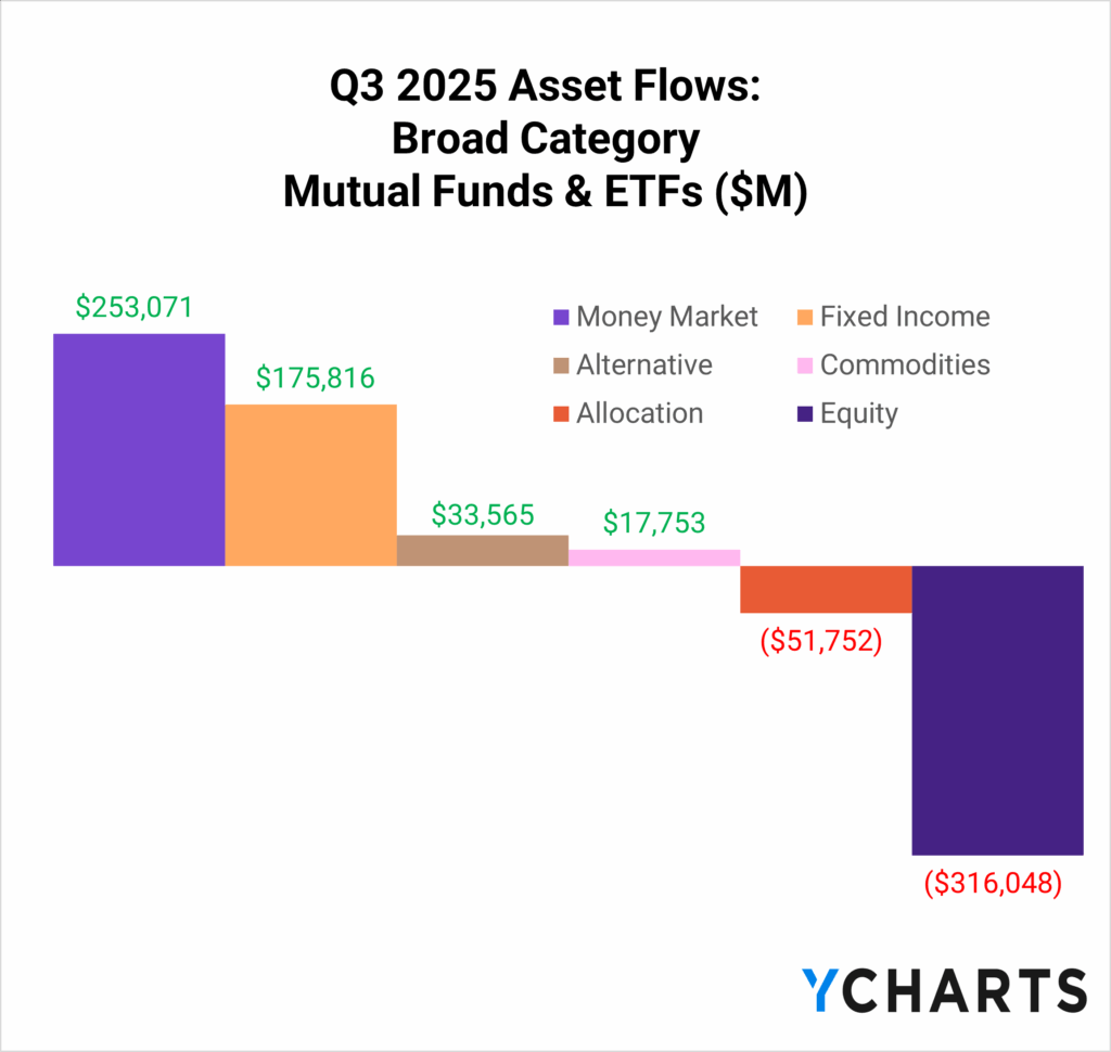
In the third quarter, nearly $18 billion flowed into commodity strategies, with gold-focused funds capturing the lion’s share as the yellow metal surged more than 50% year to date.
Subscribe to the Fund Flow Report
Sign up for our free monthly Fund Flow Report to stay updated on how assets are moving in and out of these strategies:
Elsewhere during the Q3 equity exodus, alternative strategies, led by crypto ETFs, secured over $33 billion in net new assets.
At the same time, advisors have continued their steady migration into fixed income and cash-like vehicles. Monthly deposits into money market funds show little sign of slowing, underscoring investors’ desire for yield and stability.
And yet, even as capital crowds into safety, assets with capped supply, like gold and bitcoin, have surged to new all-time highs. That contrast has renewed attention on what’s driving these flows and the macro undercurrents beneath them.
Table of Contents
Charting the “Debasement Trade”
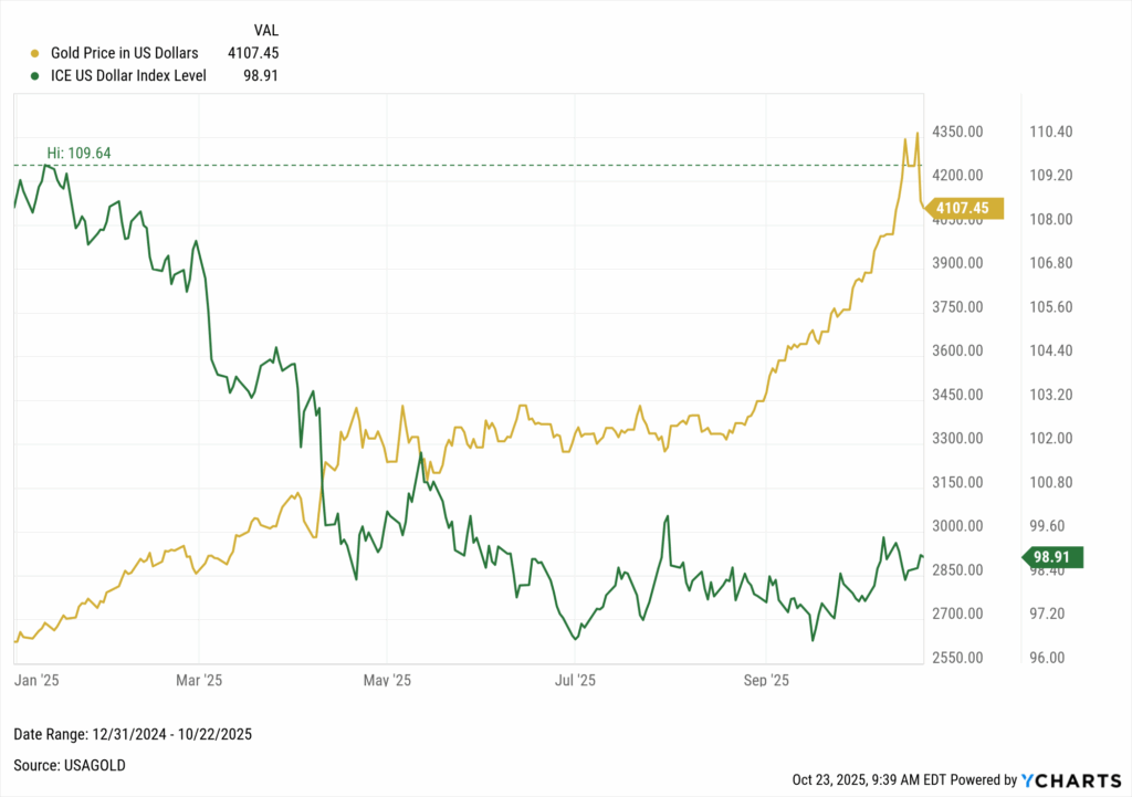
Since the start of the year, the U.S. dollar has lost nearly 9% of its value relative to other major currencies. At the same time, even after a pullback from $4,300 an ounce, gold remains up more than 50%.
That divergence, a weakening dollar alongside a rally in hard assets, is the essence of what wall street has been calling the “debasement trade.”
Historically, debasement referred to rulers diluting the value of gold or silver coins by mixing in base metals.
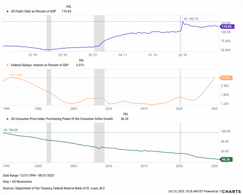
In the modern economy, currency debasement occurs when governments allow the real value of money to erode through inflation, low interest rates, or aggressive deficit spending.
So, why would a country pursue, or tolerate, a weaker currency? Because inflation reduces the real value of debt, governments let the currency lose value over time, making it easier to repay old obligations with cheaper dollars.
This becomes a tempting tradeoff when debt-to-GDP is high and interest costs consume a growing share of federal spending, making maintaining a strong currency and high real rates politically and economically untenable.
So when the Federal Reserve’s September rate cut signaled that employment now outweighs inflation as a policy priority, markets interpreted it as a green light for looser financial conditions.
In that environment, capital seeks refuge in assets that can’t be printed, can’t be defaulted on, and retain value as purchasing power slips.
Enter gold, commodities, and increasingly, digital stores of value.
Why This Gold Rally Is Different
Gold’s past surges tend to be born of crisis: the 2007–09 recession, the first year of the COVID-19 pandemic, and the inflationary shock of 1979.
Viewed through that lens, 2025’s rally looks unusual: there’s no comparable downturn, credit crunch, or inflation panic.
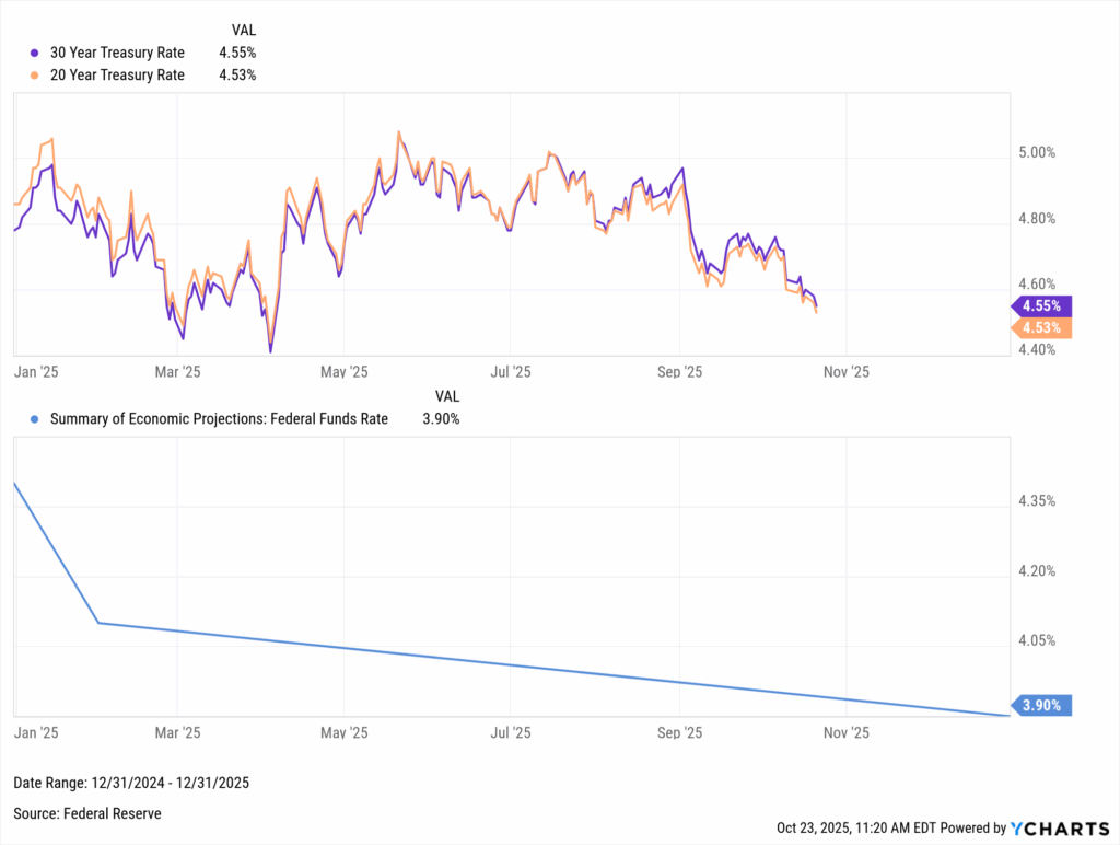
Long-term Treasury yields have eased from around 5% to 4.5% this year, but that move has been orderly. The Federal Reserve’s September rate cut and its signals of future easing have pushed rates lower, yet the absence of a sharp breakdown in yields suggests this isn’t a fear-driven rally.
That steadiness in the bond market conflicts with concerns about outright debasement.
Suggesting that the spike in gold may be powered by something less academic: a mix of anticipation, hedging, and speculation.
Investors Are Talking About Gold
Whatever the motive, investors are clearly paying attention.
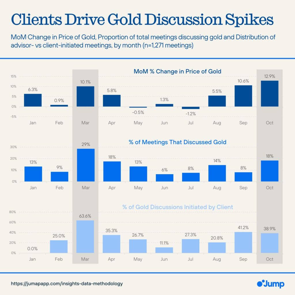
According to Liam Hanlon of Jump AI, nearly one in five advisor-client meetings discussed gold in October, up from 8% in September. In both months, clients initiated the topic about 40% of the time, and throughout the year, these spikes in “gold chats” have aligned closely with rallies in the metal’s price.
Now onto the flows.
Commodity Fund Flow Leaders – Q3 2025
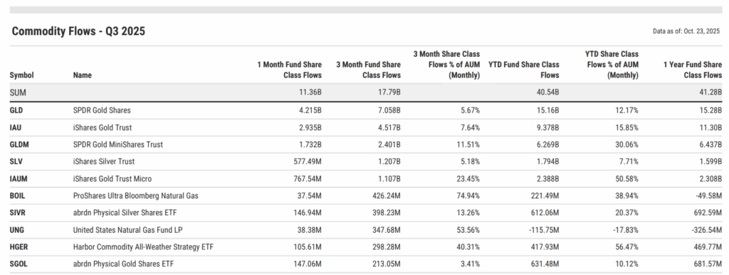
Commodity strategies attracted $17.8 billion in inflows during Q3 2025. With demand accelerating through September, year-to-date inflows have surpassed $24 billion.
Gold led the way. The SPDR Gold Shares (GLD) pulled in $7.1 billion for the quarter and over $15 billion YTD, roughly 12% of its assets. The iShares Gold Trust (IAU) followed with $4.5 billion in Q3 and $9.4 billion YTD, while SPDR Gold MiniShares (GLDM) added $2.4 billion, expanding assets by more than 30%. These gold ETFs accounted for over 75% of all commodity fund inflows in Q3.
It’s worth noting that GLD and GLDM serve distinct investor bases: GLD caters to institutions and traders seeking liquidity and tight spreads, while GLDM offers the same physical gold exposure at a lower cost (0.10% vs. 0.40%), with shares tied to 1/100 of an ounce versus GLD’s 1/10-ounce structure.
Subscribe to the Fund Flow Report | View in YCharts
Beyond gold, other precious metals also drew interest. The iShares Silver Trust (SLV) added $1.2 billion in Q3, and the abrdn Physical Silver Shares (SIVR) gained $398 million, underscoring silver’s growing role as a complementary inflation hedge. Additional gold exposures, including the Goldman Sachs Physical Gold ETF (AAAU) and the VanEck Merk Gold Trust (OUNZ), collected $161 million and $141 million, respectively, as advisors diversified across issuers.
Outside precious metals, diversified and energy-linked commodity funds also stood out. The ProShares Ultra Bloomberg Natural Gas ETF (BOIL) led non-precious strategies with $426 million in inflows, followed by the Harbor Commodity All-Weather Strategy ETF (HGER) with $298 million, the SPDR Bloomberg Enhanced Yield Commodity Strategy ETF (CERY) with $180 million, and the PIMCO Commodity Strategy Active ETF (CMDT) with $173 million. These flows reflect broader real-asset diversification across metals, energy, and multi-commodity exposures.
Alternative Fund Flow Leaders – Q3 2025
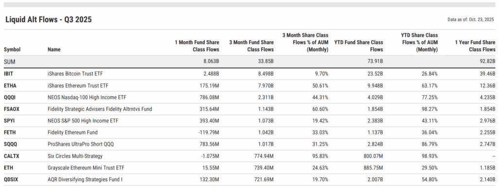
Liquid alternative strategies attracted over $33 billion in Q3 2025, one of the most active quarters on record, as investors sought diversification beyond traditional equity and fixed income.
The quarter was defined by digital asset and income-focused alternatives. The iShares Bitcoin Trust (IBIT) led all funds with $8.5 billion in quarterly inflows, followed by the iShares Ethereum Trust (ETHA), which gathered $8 billion, equivalent to more than 50% of its assets, underscoring growing institutional acceptance of tokenized exposure and ETF-based access.
Subscribe to the Fund Flow Report | View in YCharts
Outside of digital assets, option-based and other alternative strategies remained popular solutions. The NEOS Nasdaq-100 High Income ETF (QQQI) and NEOS S&P 500 High Income ETF (SPYI) brought in $2.3 billion and $1.1 billion, respectively, while the Fidelity Strategic Advisers Alternatives Fund (FSAOX) collected $1.1 billion, marking 61% growth in AUM. The ProShares UltraPro Short QQQ (SQQQ) also drew $1 billion as tactical traders positioned defensively into quarter-end.
Among multi-strategy and hedge fund–style approaches, AQR’s Diversifying Strategies Fund (QDSIX) gained $722 million, while its Long-Short Equity Fund (QLEIX) added $700 million. BlackRock’s Strategic Income Opportunities Fund (BSIIX) and Global Equity Market Neutral Fund (BDMIX) also saw strong inflows of $685 million and $627 million, respectively, highlighting renewed institutional demand for risk-managed absolute return products.
Other notable gainers included Eaton Vance’s Global Macro Absolute Return Fund (EGRIX) with $462 million, Permanent Portfolio (PRPFX) with $419 million, and Calamos Market Neutral Income Fund (CMNIX) at $378 million.
What Q3’s Flows Say About Investor Psychology
Gold’s rally, crypto’s resurgence, and steady flows into income and alternatives all point to investors repositioning for a world of high debt, lower real yields, and easier policy.
This “debasement trade” seems to reflect the belief that stability now depends on persistent easing and that mild inflation has become the acceptable cost of fiscal balance.
In that sense, it’s part hedge, part speculation, and part adaptation to a market learning to live with debt. Whether this proves to be foresight or FOMO will depend on how long policymakers can sustain growth while quietly inflating away their obligations.
For now, the search for scarcity remains the trade of the year, and everything that glitters still has buyers.
To stay ahead of these trends, subscribe to the Fund Flow Report for deeper insight into where investor dollars are moving next.
Whenever you’re ready, here’s how YCharts can help you:
Sign up for a copy of our Fund Flows Report:
Sign up for our free monthly Fund Flow Report:Want to get ahead of capital gains season and see which funds will be kicking out large tax bills?
Visit the FAQ page for CapGainsValet details and to request the add-on.
Ready to try YCharts for yourself?
Start a no-risk 7-day free trial.
Disclaimer
©2025 YCharts, Inc. All Rights Reserved. YCharts, Inc. (“YCharts”) is not registered with the U.S. Securities and Exchange Commission (or with the securities regulatory authority or body of any state or any other jurisdiction) as an investment adviser, broker-dealer or in any other capacity, and does not purport to provide investment advice or make investment recommendations. This report has been generated through application of the analytical tools and data provided through ycharts.com and is intended solely to assist you or your investment or other adviser(s) in conducting investment research. You should not construe this report as an offer to buy or sell, as a solicitation of an offer to buy or sell, or as a recommendation to buy, sell, hold or trade, any security or other financial instrument. For further information regarding your use of this report, please go to: ycharts.com/about/disclosure
Next Article
Largest Leveraged and Inverse ETFs: September 2025Read More →