Quickflows: A portfolio, stock and mutual fund comparison tool
Quickflows leverage YCharts’ already powerful tools and data to conduct higher quality research, and in less time.
The portfolio, stock, and mutual fund comparison tool draws on best practices of experienced YCharts users, condensing highly impactful workflows into single-click efforts via an easy-to-use and always-handy menu. We know that for investors and advisors, time is a scarce supply. While you may have previously associated better investment decisions with more time or resources, Quickflows changes that.
In line with our unending goal to make the complex easy and the easy fast, Quickflows automate many YCharts functionalities and optimize one of the most limited resources you have — time.
See our recent webinar to get a more in-depth look at Quickflows.
Using the Quickflows Menu
The Quickflows Menu is found on the right side of your browser window, next to the scroll bar, when using most tools within the YCharts platform. Click the “Quickflows” tab to open the Menu and select from the “Single” security or “Comparison” options. Next, enter the names or tickers of the stocks, mutual funds, or ETFs or portfolios you wish to analyze and select from the list a Quickflow to run.
Below are some examples of the highly valuable and commonly used workflows that are automated by Quickflows.
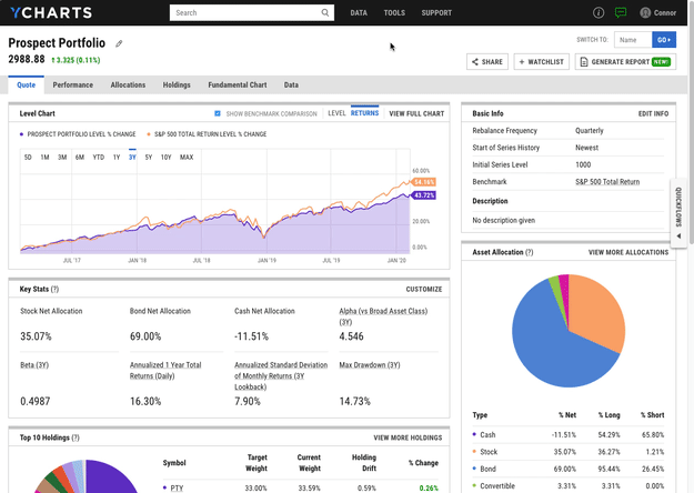
Efficiently compare prospect portfolios against your model strategies
When meeting with a prospect to discuss the status of their investments, a comparison between their current portfolio and one you’d recommend calls out deficiencies in their old strategy while also helping to position your strategy as a better option.
Quickflows are the fastest way to make portfolio comparisons on the fly while meeting with a prospect or client.
With your firm’s models and the prospect’s portfolio loaded into the Model Portfolios tool, click the Quickflows tab (on the right edge of your browser) to open the Quickflows Menu. Next, click Comparison and type-search to find the portfolio(s) you’re recommending to the prospect. Select Performance Chart to view a fully pre-built, visual portfolio comparison.
Click to learn more about Model Portfolios
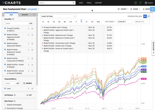
After reviewing the performance chart, dig further into more portfolio metrics by re-opening the Quickflows Menu from the page you’re on. (One of the biggest benefits of Quickflows is that securities lists are maintained in the menu as you navigate from tool to tool within YCharts, saving you time and keeping you organized.)
Click the Quickflows Menu again and select Sector Exposures. If your strategy overweights any sectors you’re bullish on, this view highlights that tilt by comparing sector exposures for the prospect’s portfolio and your recommendations, shedding more light on how and why your strategy outperforms.
Click to learn more about Comp Tables
In just a few clicks, Quickflows start conversations about how your strategy outperforms across returns, exposures, risk metrics, and more. The ease-of-use makes Quickflows the perfect tool for answering questions on the fly during prospect or client meetings.
Identify problems in a portfolio and find suitable replacement holdings
Whether answering a client request, meeting with your investment committee, or performing annual tax loss harvesting, it’s likely that your portfolios require regular upkeep over time.
Quickflows help you locate which securities are causing issues like high volatility, low returns, over exposure, or tax inefficiencies in your portfolio.
Read More: How YCharts enables better Tax-Loss Harvesting
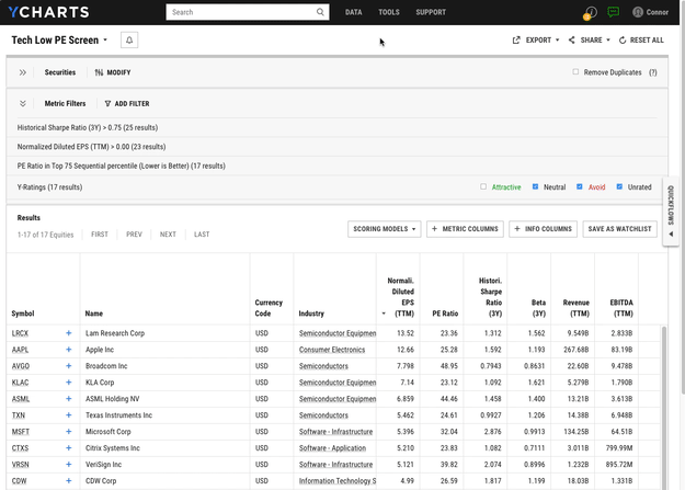
When looking at a portfolio in need of a holdings change, open the Quickflows Menu (right edge of your browser) and find Holdings Analysis under the Single Quickflow type.
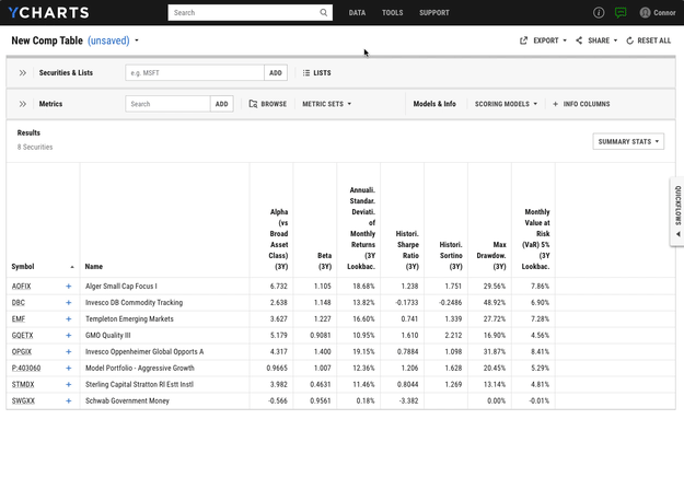
First, click Holdings Risk Metrics to compare fund holdings based on risk metrics like alpha, beta, standard deviation, drawdowns, and more. Which portfolio holdings stand out as being relatively risky yet aren’t providing adequate returns?
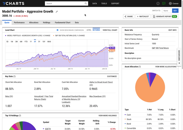
In the example above, Alger Small Cap Focus (AOFIX) stands out as a holding with a relatively high standard deviation and below average returns. Enter “AOFIX” into the Quickflows Menu, choose Single and click Find Funds Ranked in Category.
Quickflows takes you to the Fund Screener to compare multiple mutual funds and ETFs in the Small Growth category (like AOFIX) that are well-ranked within the category for high returns and low fees (unlike AOFIX). This list is a great place to start when looking for a suitable fund to swap into your portfolio. As a comprehensive mutual fund comparison tool, this Quickflow evaluates mutual fund fees, performance, drawdowns, and more.
Learn more about the YCharts Fund Screener
Dig deeper on top results from a stock screen
For generating new investment ideas, YCharts features one of the best stock screeners available. After running a screen, Quickflows becomes an additional stock comparison tool that helps you further evaluate results while staying organized.
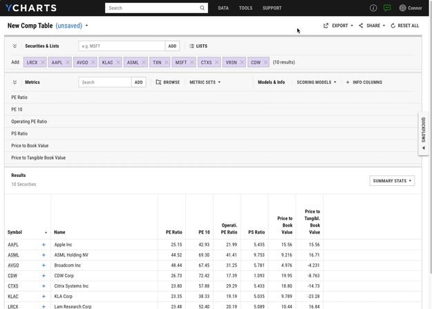
Add up to 12 tickers from your stock screen to the Quickflows Comparison list and select Stock Ratios Comparison. You’re taken to Comp Tables to compare each stock’s price-to-earnings, price-to-sales, and price-to-book ratios. How do the screen results stack up in terms of key valuation metrics?
Click to learn more about the YCharts Stock Screener
From here, select Margin & Valuation Chart to capture changes in profit margin and revenue growth, both of which are important indicators for future stock performance. Does the stock comparison chart reveal trends in revenue and profit that help further narrow the list of stocks you’re considering?
Learn more about Fundamental Charts
Analyze securities with a more organized and complete process
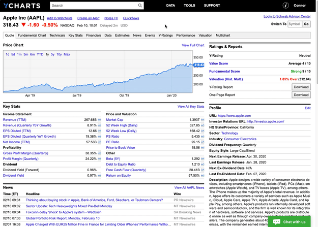
If you’re performing due diligence on a stock, ETF, or mutual fund, the Quickflows Menu is found next to the Notes hyperlink on the security’s quote page. For example, leverage Quickflows from Apple (AAPL)’s quote page to analyze company dividends, cash flow, earnings, and more.
Shown below, select Earnings Chart to visualize how a company’s actual earnings releases have fared versus analyst estimates. From that chart, open the Quickflows Menu again and click Valuation to Market to see how Apple and several key comparables are valued relative to their industry, sector, and the market as a whole.
Click to learn more about Comp Tables
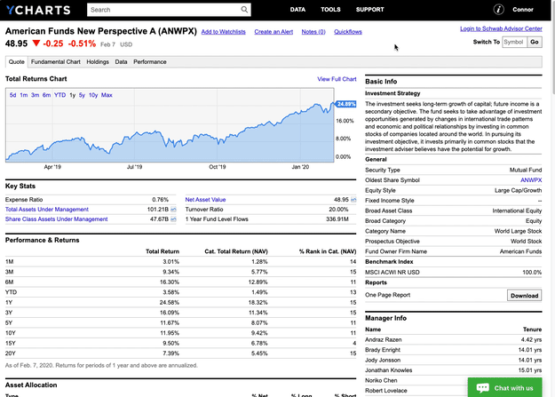
Quickflows also serves as a mutual fund comparison tool. Open the Quickflows Menu and click Return vs Market to generate a fund comparison chart and see how the fund has kept pace with its benchmark. The example below shows American Funds New Perspective (ANWPX).
To further evaluate ANWPX against its peers, click Find Similar Mutual Fund (or Find Similar ETF for an ETF performance comparison) to compare fund performance and relative category ranks. Do rankings within the World Large Stock category reveal anything about the fund or its peers that warrants a deeper look?
Click to view ANWPX in YCharts
Make the complex easy, and the easy fast
High quality investment research that enables smarter decisions doesn’t have to be time consuming nor difficult. Quickflows take the industry-best tools and high quality data already available on YCharts and put them to work to meet your needs.
Quickflows were built from the insights and workflows of YCharts customers, and user input will continue to drive new features, platform enhancements, and user interface redesigns.
Stay tuned for more Quickflows functionality, and please let us know if you have burdensome,
repetitious workflows that YCharts can automate.
Connect with YCharts
Contact YCharts via email at hello@ycharts.com or by phone at (866) 965-7552.
Interested in adding YCharts to your technology stack? Sign up for a 7-Day Free Trial.
Disclaimer
©2020 YCharts, Inc. All Rights Reserved. YCharts, Inc. (“YCharts”) is not registered with the U.S. Securities and Exchange Commission (or with the securities regulatory authority or body of any state or any other jurisdiction) as an investment adviser, broker-dealer or in any other capacity, and does not purport to provide investment advice or make investment recommendations. This report has been generated through application of the analytical tools and data provided through ycharts.com and is intended solely to assist you or your investment or other adviser(s) in conducting investment research. You should not construe this report as an offer to buy or sell, as a solicitation of an offer to buy or sell, or as a recommendation to buy, sell, hold or trade, any security or other financial instrument. For further information regarding your use of this report, please go to: ycharts.com/about/disclosure
Next Article
How To Create Better Touchpoints with ClientsRead More →