Higher for Longer? Why CPI Data May Delay Fed Rate Cuts
Inflation Stays Above Target: What the Latest CPI and PPI Data Means
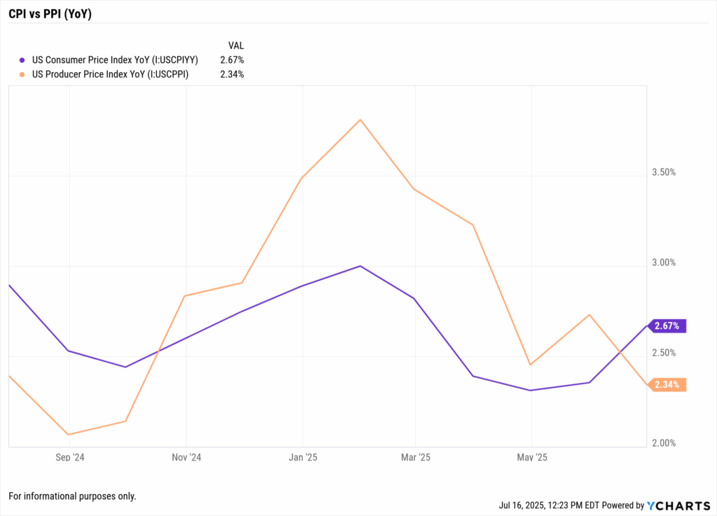
Higher-for-longer inflation concerns are in focus as mid-2025 data showed both US CPI and PPI running above 2%. June’s CPI came in at 2.7% and PPI at about 2.3% YoY. These US CPI trends keep inflation above the Fed’s 2% target. As long as prices remain sticky, advisors should explain that Fed rate cuts will likely be pushed out.
Financial markets had expected rate cuts in 2025, but hotter inflation data is changing that outlook. By mid-July, futures put low odds on a rate cut, reflecting Fed caution. Analysts note that even as data shows some cooling, tariffs may delay Fed cuts by keeping inflation elevated. Advisors should be ready for a “higher for longer” rate environment.
Advisors should emphasize data context in client meetings. For example, our June CPI Preview highlights why even modest CPI upticks can alter Fed forecasts. For deeper context, our Inflation Week 2025 blog shows how renewed tariffs and sticky service costs can keep inflation higher for longer. These YCharts resources help advisors frame conversations effectively.
Table of Contents
Why PPI Trends Matter More Than You Think
Headline CPI is only part of the story. Producer prices (PPI) often lead consumer prices, making US PPI a key indicator. In June 2025, PPI was about 2.3% YoY, indicating upstream cost pressure. A gap between still-high PPI and moderating CPI suggests consumer inflation may not fall quickly. Advisors can use YCharts to chart both series, highlighting how producer-price strength can foreshadow future CPI.
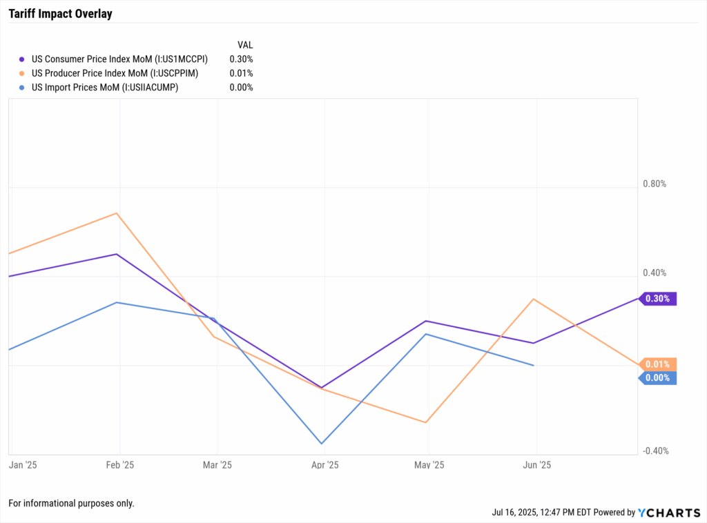
Tariffs can drive inflation higher by raising input costs. New US tariffs on imported goods raise producer costs that later pass into consumer prices. Advisors can chart tariff rates or import price indexes alongside PPI and CPI in YCharts. Clearly showing these effects helps clients understand why inflation might stay elevated despite other cooling factors.
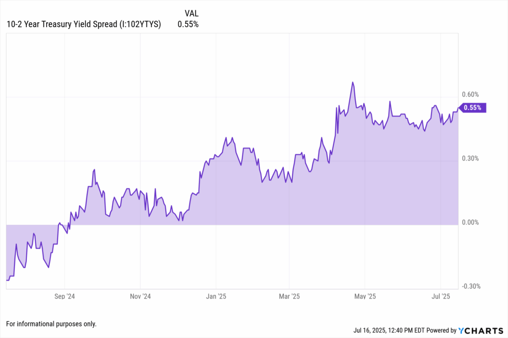
Meanwhile, bond markets are hinting at future Fed moves. By mid-June, the 10-year Treasury yield climbed to ~4.4% while the 2-year was ~3.9%. This modest yield-curve inversion implies markets still expect rate cuts by 2026. Advisors should chart the 2s/10s spread in YCharts to illustrate how bond investors view the Fed’s timeline.
Fed Outlook: ‘Higher for Longer’?
As inflation cools from 40-year highs, it’s still above target. The Fed paused rate hikes in June, but officials emphasize that tariffs and labor costs could reignite inflation. If CPI surprises to the upside, the Fed is likely to remain cautious. Thus markets see low odds of any near-term cut.
At its last meeting, the Fed left rates at 5.25–5.50%, viewing policy as restrictive. Advisors should note that officials will scrutinize core PCE and upcoming CPI reports for guidance. YCharts makes it easy to compare core PCE data with CPI trends, illustrating why the Fed may hold rates longer. If the updated dot plot still shows policy at 4%+ in late 2025, it implies cuts are further out.
Q: Will recent CPI increases change the Fed’s rate path?
A: Possibly. A higher-than-expected CPI makes cuts less likely. If PPI and CPI remain above target, the Fed will say it’s “data-dependent” and likely delay cutting rates. Advisors can chart CPI against the Fed Funds rate or core PCE in YCharts to illustrate this. Seeing inflation exceed projections explains why markets pushed out expected cuts.
Communicating with Clients
Use clear data graphics to guide clients. Explain that while inflation has eased from peaks, price pressures persist. YCharts visuals – such as overlaying PPI vs CPI or CPI vs Fed Funds – put this in perspective. For example, showing US PPI and CPI side by side helps clients grasp why prices may stay elevated. If inflation stays near 2–3%, advisors might tilt toward short-duration bonds or inflation-linked assets. YCharts tools (e.g. Holdings Overlap, Dashboard) can illustrate how different strategies have performed in high-inflation scenarios, building confidence.
Advisors often tilt portfolios toward inflation hedges. TIPS adjust principal with CPI, offering direct protection. Using YCharts, advisors can chart a TIPS fund versus a regular Treasury fund to illustrate this benefit. Commodities or sectors like energy and staples often perform well under inflation; highlighting these in YCharts supports strategic shifts.
Leverage YCharts features beyond charts. The YCharts Report Builder lets advisors insert live charts and commentary into client reports. YCharts dashboards can track new inflation data daily. The Fund Screener can quickly surface funds suited for inflationary periods, and the Holdings Overlap helps identify inflation-risk concentrations in a portfolio.
For example, advisors might:
- Build short-maturity bond ladders to reduce duration risk.
- Add TIPS or inflation-protected ETFs to guard against rising prices.
- Monitor bond duration risk, since extended high rates hurt long-duration bonds.
- Favor sectors like energy and consumer staples that historically outpace inflation.
- Implement barbell strategies blending high-yield bonds with cash or short-term funds.
Q: How should advisors explain ‘higher for longer’ to clients?
A: Clarify that “higher for longer” means the Fed needs more evidence inflation is controlled before cutting rates. Show historical charts of CPI and interest rates. Using YCharts’ Dashboard, advisors can overlay these trends and annotate Fed communications. This visual context helps clients see why the Fed waits for sustained improvement in inflation data.
Prepare Clients for Sticky Inflation and Delayed Rate Cuts
As the latest CPI and PPI data suggest, inflation is far from fully subdued, and that means the Fed’s rate cut timeline may be pushed well into late 2025 or beyond. Advisors who lean into these trends now can help clients manage expectations and stay invested with confidence.
Sticky services inflation, tariff pressures, and resilient producer pricing signal that “higher for longer” isn’t just a phrase, it’s the current playbook. This environment demands more than passive updates. It requires data-backed conversations, portfolio stress testing, and a proactive communication strategy.
With YCharts, advisors can visualize these inflationary pressures, compare economic indicators over time, and integrate them into proposal templates and custom reports. Those who embrace these tools can turn volatility into value, and position themselves as indispensable client partners in a rapidly shifting macro landscape.
Whenever you’re ready, here’s how YCharts can help you:
1. Looking to Move On From Your Investment Research and Analytics Platform?
2. Want to test out YCharts for free?
Start a no-risk 7-Day Free Trial.
Disclaimer
©2025 YCharts, Inc. All Rights Reserved. YCharts, Inc. (“YCharts”) is not registered with the U.S. Securities and Exchange Commission (or with the securities regulatory authority or body of any state or any other jurisdiction) as an investment adviser, broker-dealer or in any other capacity, and does not purport to provide investment advice or make investment recommendations. This report has been generated through application of the analytical tools and data provided through ycharts.com and is intended solely to assist you or your investment or other adviser(s) in conducting investment research. You should not construe this report as an offer to buy or sell, as a solicitation of an offer to buy or sell, or as a recommendation to buy, sell, hold or trade, any security or other financial instrument. For further information regarding your use of this report, please go to: ycharts.com/about/disclosure
Next Article
June CPI Preview: Is the US Inflation Rate Heating Up?Read More →