Use Holdings Overlap to Answer, “What Makes You Different?”
“What distinguishes your strategy from the benchmark or XYZ’s approach?”
If you’ve heard this question in an advisor meeting, YCharts now equips you to answer it with compelling visuals and metrics, right at the point of sale.
Distribution teams use YCharts to differentiate strategies, lead more impactful conversations, and ultimately win AUM.
With Holdings Overlap, your team has one more visual arrow in the quiver to stand out in competitive comparisons.
Why Differentiation Matters in the “Year of the Active ETF”
More investors are turning to active strategies within the ETF wrapper, seeking greater transparency, tax efficiency, and the potential for outperformance.
According to Brown Brothers Harriman’s 2025 Global ETF Investor Survey, 97% of investors plan to increase their exposure to active ETFs over the next 12 months. At the same time, more than half of the survey respondents indicated they plan to reduce allocations to index-based ETFs as they ramp up their active ETF exposure.
This rapid acceleration highlights the urgency for asset managers to clearly articulate how their strategies differ from passive benchmarks or similar competitors. One way to make these differences tangible is through Holdings Overlap.
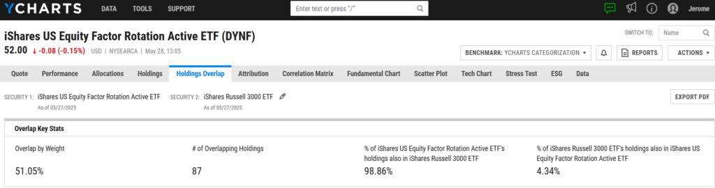
Take the iShares US Equity Factor Rotation Active ETF (DYNF), one of the fastest-growing active strategies. On the surface, it shares 87 holdings with the iShares Russell 3000 ETF (IWV)—a market-cap weighted strategy representing the total U.S. equity market—but the overlap by weight is only 51%. That means nearly half the portfolio reflects active decisions to deviate from the benchmark.
That differentiation extends well beyond common holdings. The sector exposure chart shows how DYNF diverges from the benchmark on a broader scale. It overweights technology by 7.8% and financials by 5.8%, while underweighting healthcare and industrials by 9.5% and 4.3%, respectively.
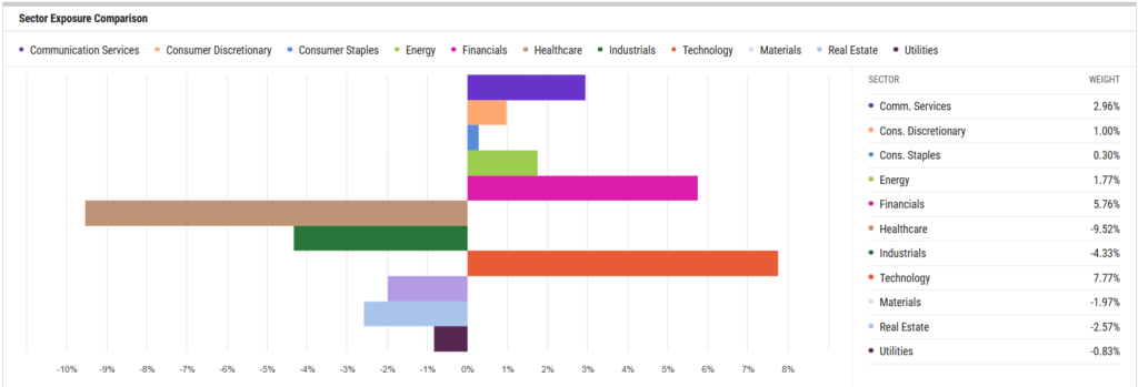
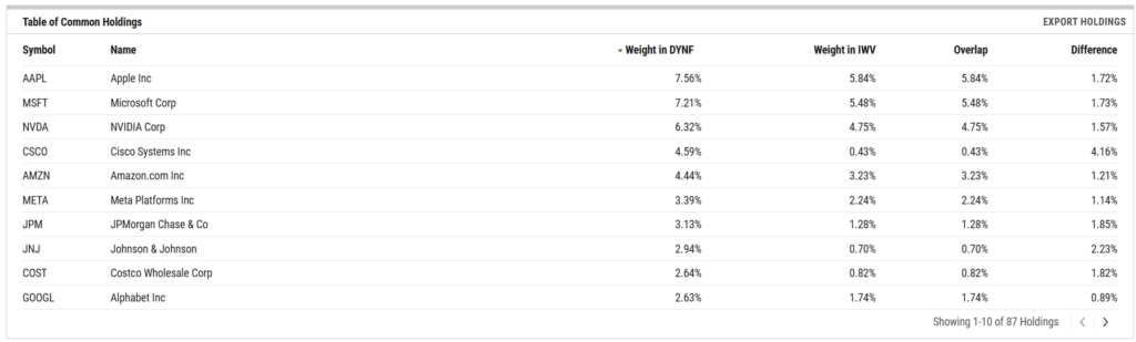
Holdings Overlap also quantifies these differences at the individual security level, allowing distribution teams to discuss single stock stories with advisors in greater depth. For instance, DYNF overweights Apple (AAPL) by 1.72%, Microsoft (MSFT) by 1.73%, and Cisco Systems (CSCO) by a striking 4.16% compared to IWV. These security-level allocations illustrate conviction and help advisors evaluate what makes an active ETF like DYNF stand apart in real time.
Using Holdings Overlap for Team Alignment
Whether preparing for a meeting or following up after one, a Holdings Overlap analysis can be easily exported as a PDF and shared across your distribution team.
It’s an effective tool when positioning against a common competitor or reinforcing your strategy’s differentiators with an advisor. Sharing a visual, data-backed comparison gives teams and advisors something tangible to reference, making your differences clear and memorable.
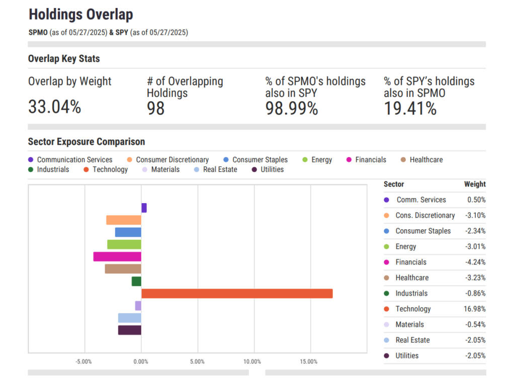
For a factor-based strategy like the Invesco S&P 500 Momentum ETF (SPMO), Holdings Overlap provides a quick snapshot of how sector allocations differ from broad benchmarks. These visuals can help explain where tailwinds may exist and why factor exposure deserves a place in client portfolios, especially for those seeking sustained alpha or tactical diversification.
You can pair this with a Comp Table analysis to reinforce the case further. Whether you’re comparing SPMO to other Invesco factor ETFs like SPHQ, SPLV, and SPHD, or evaluating SPMO alongside momentum peers like MTUM, FDMO, and QMOM, YCharts enables you to surface key differentiators advisors care about: 3-year alpha, upside/downside capture, drawdown, volatility, R-squared, and expenses.
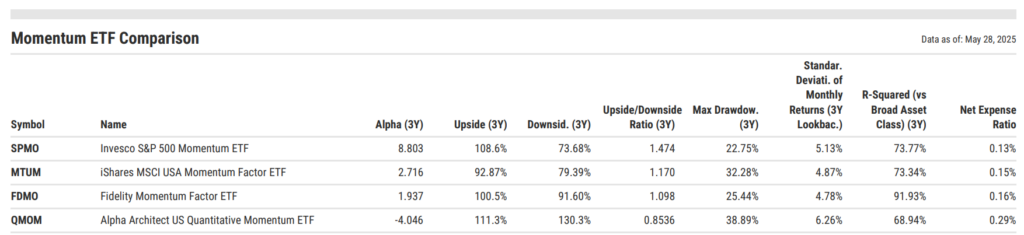
National, divisional, or channel sales leaders can share the Comp Tables on a team dashboard or export as PDFs, keeping everyone aligned on the most compelling talking points ahead of advisor meetings.
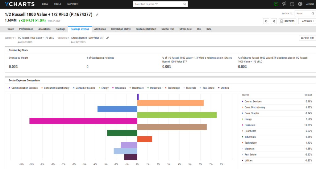
Highlight Sector Insights Using a Split Allocation
Holdings Overlap can also be a powerful tool when presenting allocation ideas.
In today’s post-ZIRP environment, equity allocators are increasingly drawn to free cash flow–generating businesses. These companies are less reliant on external financing and better positioned to return capital to shareholders through dividends, buybacks, or strategic acquisitions.
To illustrate how incorporating this approach could reshape a portfolio’s value sleeve, you can quickly model a 50/50 allocation between IWD, a traditional Russell 1000 Value index fund, and the VictoryShares Free Cash Flow ETF (VFLO), a strategy that emphasizes free cash flow. Holdings Overlap will instantly show how this blend alters sector exposures, helping advisors visualize a different approach to value investing.
Visualizing the Shift: What International Allocation Looks Like
With geopolitical tension dominating headlines and U.S. equities enjoying a historic stretch of outperformance, some advisors may be questioning whether it’s time to revisit international diversification or rebalance portfolios to reduce home country bias.
Holdings Overlap can help illustrate what that shift might look like in practice, whether comparing passive international ETFs or active strategies like the MFS International Equity Fund (MIEIX). When paired against SPY, the contrast is striking.
This minimal overlap underscores the diversification potential of adding an international strategy to a U.S.-centric portfolio. Sector exposure also shifts meaningfully: MIEIX leans more heavily into industrials (+11.9%), financials (+7.6%), and materials (+5.1%), while significantly underweighting technology (-20.9%) and communication services (-6.9%) compared to SPY.
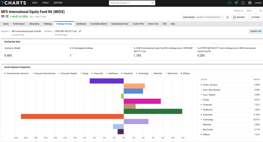
These visuals simplify the conversation around international investing, showing how it reduces redundancy and reshapes sector exposure.
Holdings Overlap makes portfolio theory tangible and timely for advisors looking to spark new conversations or justify reallocation.
As teams look to sharpen their messaging and differentiate in a crowded market, YCharts provides the clarity and flexibility needed to stand out. Book time with our asset management specialists to see why leading firms rely on YCharts to equip their teams with the tools and visuals that drive meaningful advisor conversations.
Whenever you’re ready, here’s how YCharts can help you:
1. Book time with our asset management specialists
2. Want to test out YCharts for free?
Start a no-risk 7-Day Free Trial.
3. Sign up for a copy of our Fund Flows Report and Visual Deck to stay on top of ETF trends:
Sign up to recieve a copy of our monthly Fund Flows Report:Disclaimer
©2025 YCharts, Inc. All Rights Reserved. YCharts, Inc. (“YCharts”) is not registered with the U.S. Securities and Exchange Commission (or with the securities regulatory authority or body of any state or any other jurisdiction) as an investment adviser, broker-dealer or in any other capacity, and does not purport to provide investment advice or make investment recommendations. This report has been generated through application of the analytical tools and data provided through ycharts.com and is intended solely to assist you or your investment or other adviser(s) in conducting investment research. You should not construe this report as an offer to buy or sell, as a solicitation of an offer to buy or sell, or as a recommendation to buy, sell, hold or trade, any security or other financial instrument. For further information regarding your use of this report, please go to: ycharts.com/about/disclosure.
Next Article
Why Treasury Yields Are Spiking and What It Means for Your PortfolioRead More →