Winners & Losers from the Dot Com Bubble Rate Hike Cycle
Recent Consumer Price Index (CPI) and Core CPI data indicate that the Federal Reserve’s battle with inflation is entering its later stages. June CPI came in at 3%, a third of what it was at the same time last year. Additionally, Core CPI reached 4.8%, marking the slowest pace since October 2021.
The Federal Reserve paused its rate hikes in June, but still plans to implement two more during this period. If this plan materializes, the Fed would have raised rates 12 times during this cycle.
How does this sequence of rate hikes compare to cycles of past? In our recent white paper, “Managing Rising Rate Environments: Which Portfolios and Asset Classes Perform Best?,” we examined the four most recent Fed rate hike cycles, including the current one spanning 2022-2023, with an aim to identify the asset classes and portfolio allocations that perform best in each cycle.
The last time the Fed Funds rate went above 5.25% was during the 1999-2000 rate hike cycle. Read on to find out which asset classes performed best during and after that cycle, and if there’s any similarities to today.
Download the free White Paper to see our full findings:Which Asset Classes Performed Best During the 1999-2000 Cycle?
The dot-com bubble was at its peak during the turn of the millenium, with all eyes fixed on the Nasdaq. The tech-heavy index soared over 500% from 1995 to March 2000. The Fed, then led by Alan Greenspan, wanted to tap the brakes on inflationary pressure hitting the economy, so over an 11-month period, Greenspan raised the Fed Funds rate by 150 basis points.
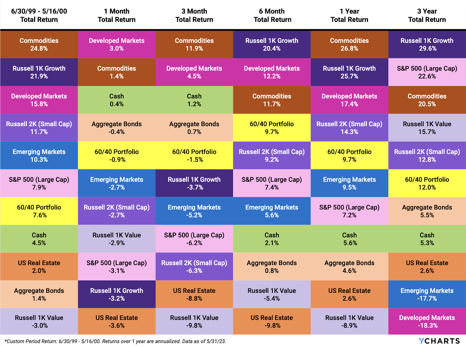
During this cycle, the top-performing assets were Commodities, followed by Growth and Developed Markets. Conversely, it was a challenging time for Value stocks, Bonds, and Real Estate.
Download the Free White Paper + Supplemental Slide Deck
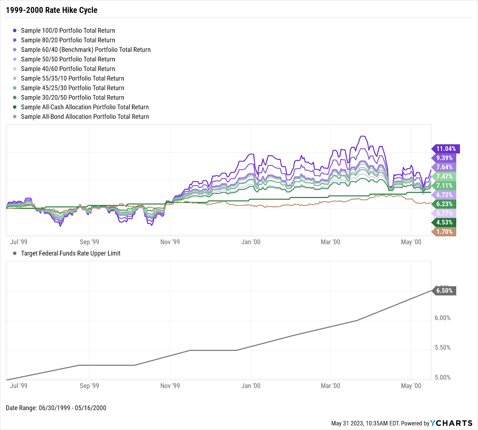
Which Allocations Performed Best During and After the 1999-2000 Cycle?
Generally speaking, having greater exposure to stocks from the first to last rate hikes of the 1999-2000 cycle resulted in better performance. An all-stock portfolio during this period saw a gain of 11.04%, while a 60/40 portfolio experienced a rise of 7.64%.
Download the Free White Paper + Supplemental Slide Deck
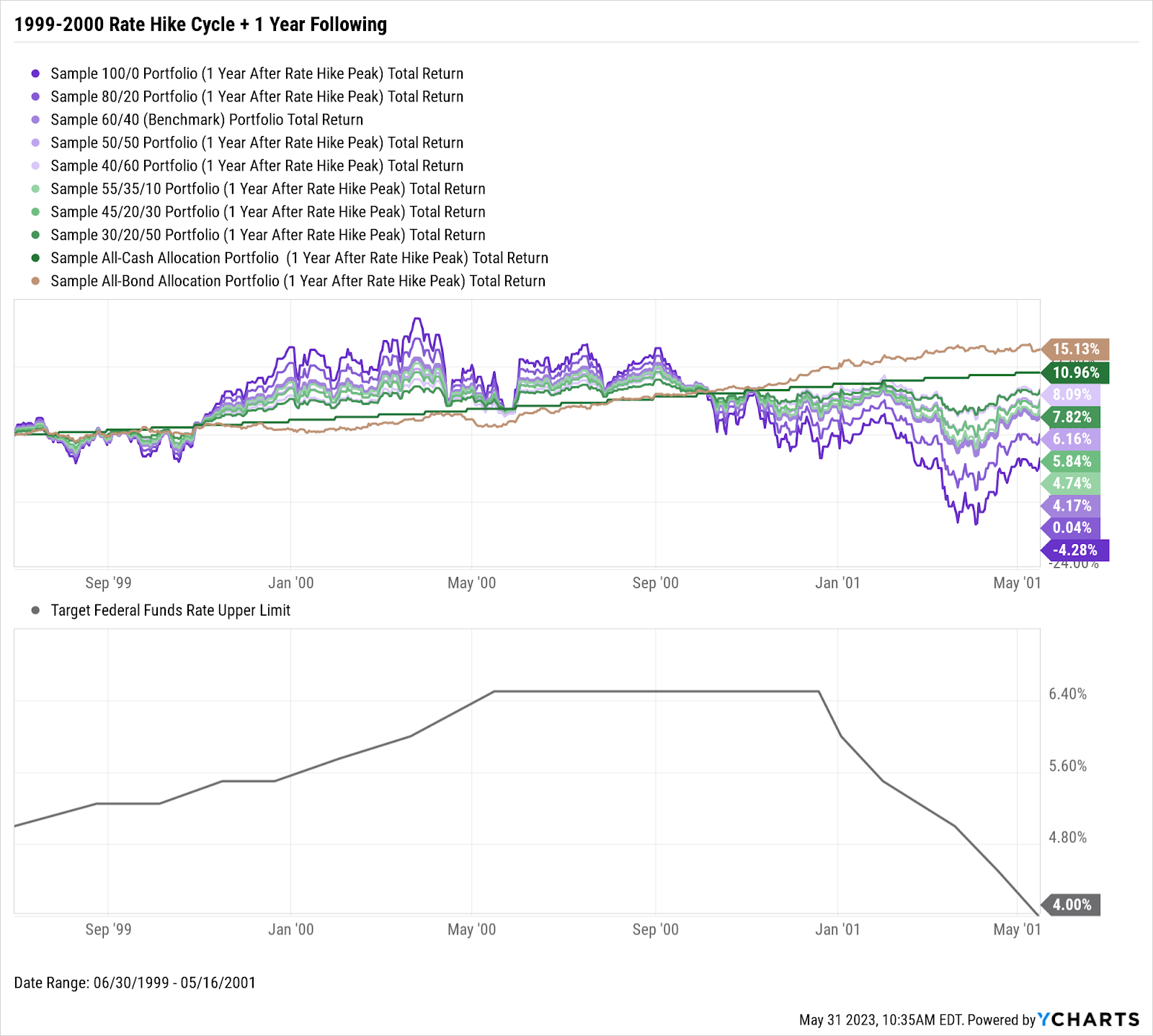
But the situation reversed when the dot-com bubble burst and the Fed began cutting rates a year later. A portfolio consisting entirely of bonds experienced a remarkable surge of 15.13% through the first year after the last rate hike. In contrast, an all-stock portfolio became the laggard, declining by 4.28%.
Download the Free White Paper + Supplemental Slide Deck
The dot-com rate hike era highlights the importance of having a diversified portfolio that can adapt to changing economic conditions. This is just one of the four scenarios highlighted in the latest white paper, demonstrating that not all rate hike cycles are equal. Download the White Paper to gain additional insights into how different asset classes and portfolios have performed during past rate hike cycles.
Download the free White Paper to see our full findings:Connect with YCharts
To get in touch, contact YCharts via email at hello@ycharts.com or by phone at (866) 965-7552
Interested in adding YCharts to your technology stack? Sign up for a 7-Day Free Trial.
Disclaimer
©2023 YCharts, Inc. All Rights Reserved. YCharts, Inc. (“YCharts”) is not registered with the U.S. Securities and Exchange Commission (or with the securities regulatory authority or body of any state or any other jurisdiction) as an investment adviser, broker-dealer, or in any other capacity, and does not purport to provide investment advice or make investment recommendations. This report has been generated through application of the analytical tools and data provided through ycharts.com and is intended solely to assist you or your investment or other adviser(s) in conducting investment research. You should not construe this report as an offer to buy or sell, as a solicitation of an offer to buy or sell, or as a recommendation to buy, sell, hold or trade, any security or other financial instrument. For further information regarding your use of this report, please go to: ycharts.com/about/disclosure
Next Article
Wholesalers' Playbook: Maximize AUM Growth with Scenarios (aka Hypos)Read More →