June 2025 Jobs Report: Advisors Brace for Yield Curve Steepening

Introduction
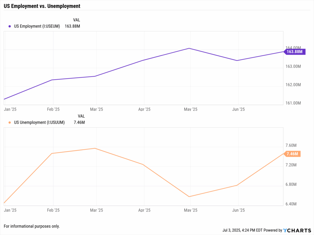
The June 2025 jobs report delivered a jolt to markets and portfolios, underscoring why financial advisors must pay attention. U.S. payrolls rose by 147,000 in June, handily topping consensus for 110,000, while unemployment dipped to 4.1%, defying expectations of an uptick. Coming just a day after ADP’s shocking -33,000 private payroll reading, the stronger official report eased recession fears and shifted interest rate expectations.
In particular, advisors are watching for yield curve steepening 2025 scenarios, as the gap between long and short-term Treasury yields may widen if the Federal Reserve delays rate cuts. The immediate market impact? Bond yields jumped and equity futures signaled a modest relief rally as investors recalibrated for a “higher for longer” rate environment.
See our full breakdown of the June jobs report, ISM data, and Powell’s comments for advisors here: “June Jobs Report, ISM & Powell: What Financial Advisors Must Watch This Week”.
Why This Topic Matters Now
A whirlwind of data and policy signals hit advisors at once. The June jobs report outperformed expectations, confirming that the labor market remains resilient despite tariff pressures and decelerating growth in other segments. Markets had bet the Federal Reserve might cut rates as early as July, especially after the weak ADP number, but that view reversed sharply after the official payrolls beat.
Fed policymakers are now “much less likely to cut rates this month,” instead eyeing Q3 or Q4 for easing. Short-term bond yields, which had dipped on recession speculation, climbed again as investors priced out a July cut. Long-end yields also stayed elevated, setting the stage for a potential yield curve steepening if front-end rates drop later.
For advisors, this means recalibrating positioning: the labor market’s strength challenges assumptions of a cooling economy and shifts the Fed’s timing—impacting bonds, sector tilts, and client expectations.
Q: Why did the June jobs report jolt markets this week?
A: Because it beat expectations across the board. Payrolls rose by 147,000 versus 110,000 expected, while unemployment ticked down to 4.1%. That strength reversed market expectations for a July rate cut. Two-year Treasury yields jumped, futures repriced Fed timelines, and advisors were forced to reassess allocation plans and communication strategy.
Market Reactions: Equities and Bonds Respond
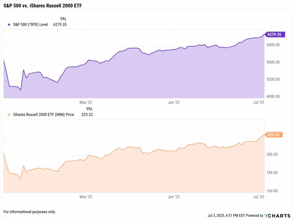
Equities welcomed the labor strength. The S&P 500 rose by 0.89% on the news, reflecting growing investor confidence in economic durability. Small-cap stocks, via the iShares Russell 2000 ETF (IWM), rallied 0.85%, suggesting broader participation and a possible rotation toward domestic cyclicals.
Bond markets told a different story. The 10-year Treasury yield climbed, reacting to lower odds of near-term cuts and potential inflation stickiness. Shorter-duration yields spiked more sharply, hinting at rate hike fatigue giving way to a “higher for longer” mindset. Advisors must adjust income strategies accordingly.
Read: June ADP Report vs. Jobs Report: How Advisors Reconcile Conflicting Jobs Data
Implications for Federal Reserve Policy
The Fed’s data dependency was on full display. Chair Jerome Powell’s “wait and learn” approach now feels justified. The June jobs data gives the central bank air cover to delay action, especially as wage growth stabilizes and inflation expectations remain anchored.
July rate cut odds faded fast. After the jobs release, Fed futures dropped the probability of a July cut to under 10%, with September or November now in focus. This delay buys time but complicates guidance for advisors structuring bond ladders or hedging rate risk.
Yield Curve Dynamics: Steepening Trends
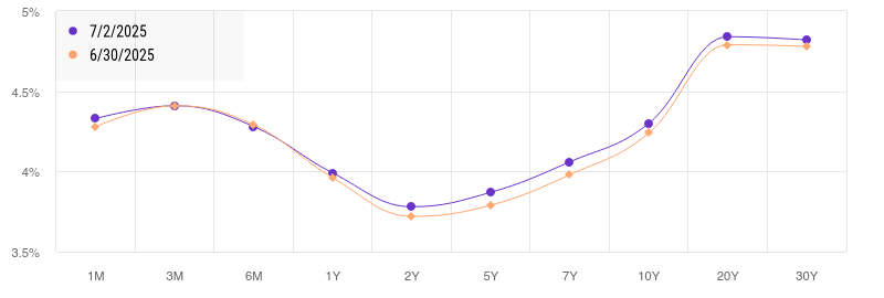
The jobs report is nudging the curve toward steepening. Short-term yields rebounded sharply, but long-term yields held firm, preserving a positive slope between 2- and 10-year maturities. A sustained steepening could signal confidence in long-term growth or a pivot away from recession fears.
For advisors, this shift matters. A steeper curve often benefits financials, pressures duration-heavy assets, and may signal opportunity in barbell fixed-income strategies. Using tools like the YCharts Yield Curve Visualizer can help advisors assess curve shape and plan reallocations accordingly.
To compare the current and past yield curve, view our Yield Curve Tool.
How to Analyze This Using YCharts
Advisors can use YCharts to transform complex labor market data into actionable insights and clear client communication. With just a few tools, you can track employment trends, visualize the Fed’s impact on rates, and anticipate portfolio adjustments as the macro narrative evolves.
Monitor Key Labor Indicators in Real Time
Start by pinning core labor metrics to your YCharts Dashboard. Add US Total Nonfarm Payrolls alongside the US Unemployment Rate for instant visual context. This dashboard view answers the essential client question: Are we still adding jobs, and is joblessness rising?
Toggle between 1m and 3m views to smooth out noise and highlight turning points.
Build a Dual-Axis Chart to Visualize Inflection Points

Use the Fundamental Chart tool to plot Total Nonfarm Payrolls and the Unemployment Rate from early 2023 through today.
Annotation Tip: Flag June 2025’s data point (+147k payrolls, 4.1% unemployment) to capture this month’s market-moving surprise.
This visualization helps clients understand that one strong month isn’t a trend, advisors often wait for a 3-month rolling average of job growth below +75k and rising unemployment before shifting allocations.
Q: How do I track yield curve steepening as the Fed outlook evolves?
A: Use the YCharts Yield Curve Tool to compare snapshots across key dates. For example, chart the curve from May 1, 2025 and June 30, 2025, bracketing the jobs report impact. You’ll likely notice short-term yields falling slightly on rate-cut speculation, while long-term rates remain elevated, creating a modest steepening.
This chart makes it simple to explain to clients how Fed expectations are shifting borrowing costs across maturities and impacting bond allocation strategies.
Automate Insights with Custom Alerts
Stay ahead of labor market inflection points using YCharts Alerts. Set automated triggers for key thresholds:
- Unemployment Rate > 4.3%
- Monthly Payroll Gains < +75,000
When either is breached, you’ll receive instant notifications, allowing you to adjust positioning or communicate proactively, before clients reach out with questions.
Connect Labor Trends to Portfolio Strategy
Finally, translate economic shifts into portfolio moves using the Fund Screener and Holdings Overlap tools. For instance:
- Screen equity ETFs with exposure to cyclical sectors like Financials or Industrials, which often benefit from a steeper yield curve and resilient hiring.
- Alternatively, identify defensive sectors like Utilities and Healthcare, which may outperform if job growth weakens.
Then, use Holdings Overlap to prevent concentration across your client portfolios. This ensures tactical tilts remain diversified—especially important when adjusting sector weightings after a major macro event.
Q: How do I explain these moves to clients without overwhelming them?
A: Use YCharts visualizations, like labor charts or before/after yield curves, in your Proposal PDFs. They’re branded, client-ready, and help translate macro shifts into digestible portfolio narratives. When clients ask “Why are we shifting?” you’ve got the data to show why.
Conclusion: Turning the June 2025 Jobs Report Into Advisor Advantage
The June 2025 jobs report delivered a strong signal: the U.S. labor market remains resilient, with 147,000 new jobs added and unemployment edging lower to 4.1%. This beat on both fronts forced markets to quickly rethink the Fed’s timeline for cuts and shifted investor sentiment toward a “soft landing” scenario. For financial advisors, this isn’t just a macro headline, it’s a call to re-evaluate rate expectations, sector exposure, and client messaging.
Whether you’re assessing bond laddering strategies, explaining the steepening yield curve, or gauging which equity sectors may lead in Q3, YCharts equips you with the tools to move from data to decisions. Visualize trends, automate alerts, and package proposals that help clients see the “why” behind each move, not just the outcome.
Advisors who stay ahead of labor market shifts and Fed narratives will be best positioned to lead through volatility. The June 2025 jobs report reminds us that strong employment doesn’t just impact Wall Street, it drives household confidence, Fed policy, and portfolio performance. With YCharts, you turn each data point into actionable insight, on your dashboard, in your proposals, and in every client conversation.
Whenever you’re ready, here’s how YCharts can help you:
1. Looking to Move On From Your Investment Research and Analytics Platform?
2. Want to test out YCharts for free?
Start a no-risk 7-Day Free Trial.
Disclaimer
©2025 YCharts, Inc. All Rights Reserved. YCharts, Inc. (“YCharts”) is not registered with the U.S. Securities and Exchange Commission (or with the securities regulatory authority or body of any state or any other jurisdiction) as an investment adviser, broker-dealer or in any other capacity, and does not purport to provide investment advice or make investment recommendations. This report has been generated through application of the analytical tools and data provided through ycharts.com and is intended solely to assist you or your investment or other adviser(s) in conducting investment research. You should not construe this report as an offer to buy or sell, as a solicitation of an offer to buy or sell, or as a recommendation to buy, sell, hold or trade, any security or other financial instrument. For further information regarding your use of this report, please go to: ycharts.com/about/disclosure
Next Article
June ADP Report vs. Jobs Report: How Advisors Reconcile Conflicting Jobs DataRead More →