Economic Update: Reviewing Q3 2024

Below is a sneak peek of insights from the YCharts Q3 2024 Economic Summary Deck. This quarter saw broader market participation in equities, while the 10-2 Treasury Yield spread finally normalized after over two years of inversion, which coincided with elevated recession concerns.
The deck, published quarterly, provides advisors and investors with key insights from the previous quarter to help you make smarter investment decisions going forward.
For a deeper dive into these trends, be sure to watch our 5-minute Q3 Economic Update recap video:
Market and Asset Class Update
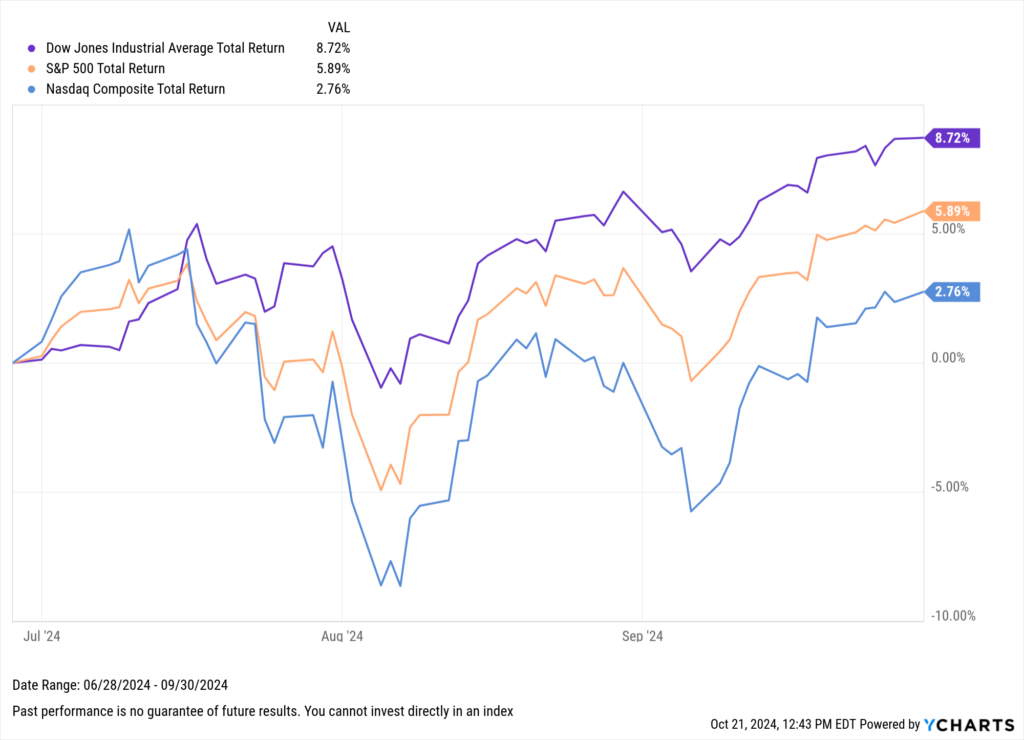
All three major U.S. indices posted gains in Q3 2024. After being the only laggard in Q2, the less tech-heavy and blue-chip Dow Jones Industrial Average led the way in Q3 with an 8.7% total return, highlighting a shift in market leadership during the quarter. The S&P 500 followed with a 5.9% gain, while the NASDAQ advanced 2.8%.
Download Visual | Modify in YCharts
Despite its strong performance in Q3, the Dow’s 13.9% total return through the first nine months of the year still trails the other two major U.S. indices. The S&P 500 posted a 22.1% gain in 2024 through September, and the Nasdaq was close behind with a 21.8% return.
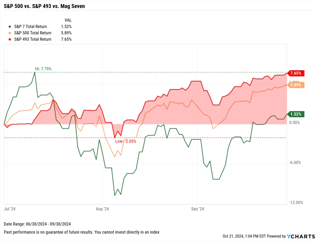
After a year and a half of dominance by a concentrated group of big tech companies, often referred to as the “Magnificent Seven” or “S&P 7,” this cohort took a breather in Q3. This shift allowed the remaining constituents of the S&P 500 to drive the market forward. The “S&P 493” advanced 7.7% during the quarter, contributing to the broader S&P 500’s overall 5.9% gain in Q3.
Download Visual | Modify in YCharts | Get in Touch to Access Chart
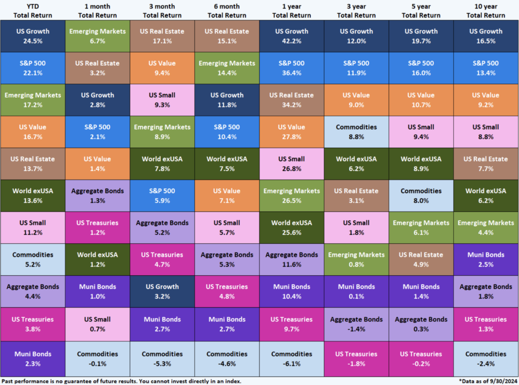
This trend—which could be viewed optimistically as a much-needed broadening of market participation or pessimistically as a rotation into more defensive stocks—played out across asset class pass performance on a trailing three-month basis.
After leading the market in Q1 and Q2, U.S. Growth stocks took a back seat in Q3. US Growth was outpaced by eight other asset classes, including Aggregate Bonds, Emerging Markets, U.S. Value stocks, and the quarter’s top performer, U.S. Real Estate.
Download Visual | Contact Us to Access This Quilt
10-2 Spread Normalizes & Elevated Recession Probability
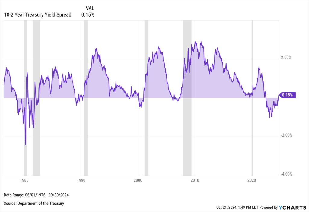
Yield spreads are important because they are often used as a recession indicator. A negative 10-2 spread has preceded each of the last six recessions. Notably, the 10-2 Treasury Yield Spread turned positive on August 28th, 2024, marking the first normalization of this crucial indicator since July 2022. This ended the longest “underwater” period since at least 1978.
Download Visual | Modify in YCharts
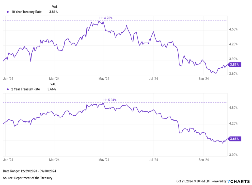
Yield curve inversions often occur during periods of monetary tightening, when central banks raise interest rates to control inflation and prevent the economy from overheating. The recent shift toward a “normal” 10-2 curve coincided with the FOMC’s 50 basis point rate cut in September, creating what experts describe as “bull steepening.”
In this scenario, both the 10-year and 2-year Treasury yields have declined, but the short end of the curve experienced a sharper drop. Specifically, the 10-year yield has decreased by 89 basis points from its peak on April 30th, while the 2-year yield has fallen by 138 basis points from the same high.
Download Visual | Modify in YCharts
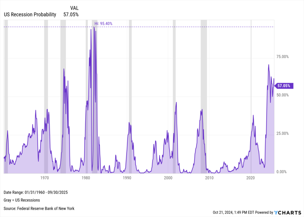
This trend suggests that investors expect further rate cuts and are optimistic about a soft landing, anticipating inflation will ease without leading to long-term deflation. However, history urges caution, as prolonged yield curve inversions have often preceded recessions, such as in 1990, 2001, 2007, and 2020.
The current inversion has elevated the yield curve-based Estrella & Mishkin U.S. Recession Probability indicator to 57.05% for September 30, 2025—down from its recent high of 70.85%, but still higher than levels seen before many past recessions, including the periods mentioned above.
Download Visual | Modify in YCharts
The normalization of the yield curve offers a hopeful sign for easing inflation, but the historical link between prolonged inversions and recessions remains troubling. As with many economic signals, the outlook is mixed, leaving investors to ponder a pressing question: is a recession around the corner, or will the U.S. stave off an economic downturn?
Whenever you’re ready, there are 3 ways YCharts can help you:
1. Looking to better communicate the importance of economic events to clients?
Send us an email at hello@ycharts.com or call (866) 965-7552. You’ll be directly in touch with one of our Chicago-based team members.
2. Want to test out YCharts for free?
Start a no-risk 7-Day Free Trial.
3. Download a copy of the Quarterly Economic Update slide deck:
Download the Economic Summary Deck:Disclaimer
©2024 YCharts, Inc. All Rights Reserved. YCharts, Inc. (“YCharts”) is not registered with the U.S. Securities and Exchange Commission (or with the securities regulatory authority or body of any state or any other jurisdiction) as an investment adviser, broker-dealer or in any other capacity, and does not purport to provide investment advice or make investment recommendations. This report has been generated through application of the analytical tools and data provided through ycharts.com and is intended solely to assist you or your investment or other adviser(s) in conducting investment research. You should not construe this report as an offer to buy or sell, as a solicitation of an offer to buy or sell, or as a recommendation to buy, sell, hold or trade, any security or other financial instrument. For further information regarding your use of this report, please go to: ycharts.com/about/disclosure
Next Article
Transform Portfolio Discussions with YCharts’ Interactive Analysis ToolRead More →
