
How Does the Market Historically Respond to Fed Rate Hikes?
Interested in testing out YCharts for free?
Start 7-Day Free TrialThe Federal Reserve just raised its benchmark rate by 25 basis points, marking the first hike since 2023 and Kevin Warsh’s first move as Fed Chairman. Arguably, the most notable factor was the 12-0 unanimous decision, just over a month after July’s 9-3 vote to hold rates steady.
Sticky inflation and elevated energy prices tied to the conflict in the Middle East ultimately drove the committee to unanimity, a far cry from when Warsh inherited the highest level of internal dissent since 1992.
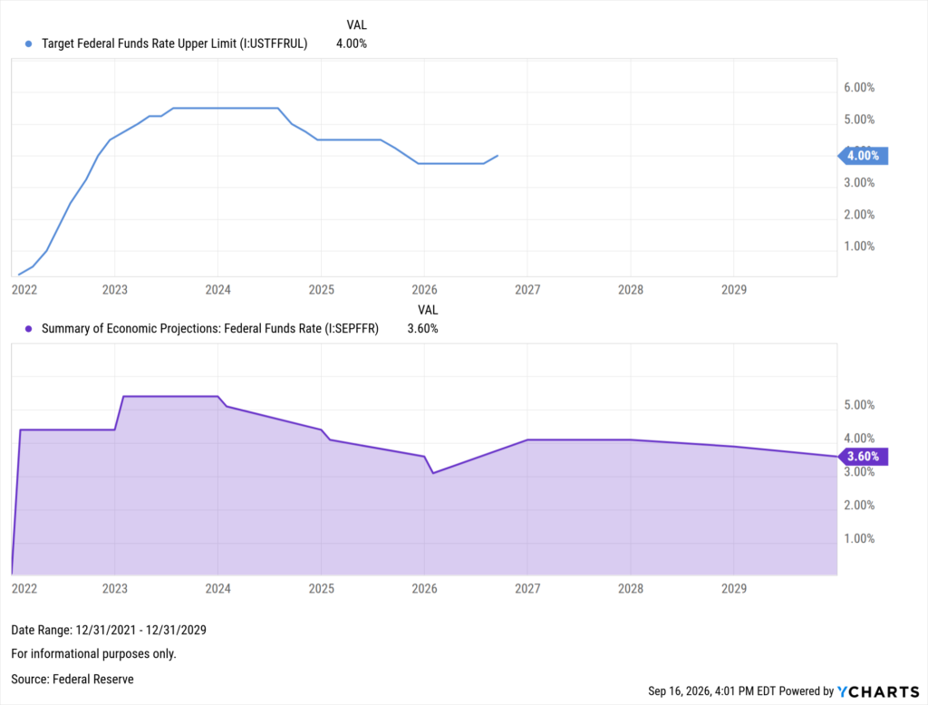
Put simply by Warsh himself, “the plain fact is that inflation is too high and has been for too long,” though the central bank does not anticipate reaching its 2% mandate until 2029.
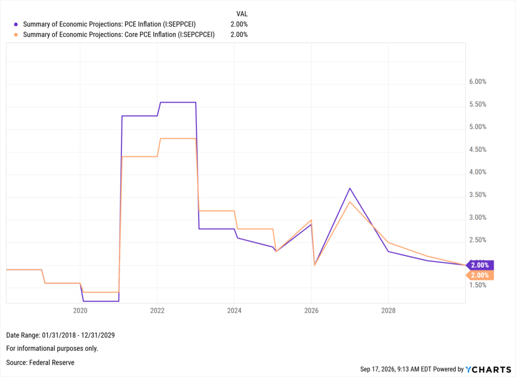
None of this came as a surprise, however, as the backdrop of mounting uncertainty grew harder to ignore for yet another meeting. In the lead-up to the decision, markets had anticipated a 92% chance of this move, showing similar expectations for at least one more hike in 2026.
Table of Contents
How Markets Have Historically Responded
Since 1990, the Fed has induced seven rate hiking cycles, including yesterday’s decision. While each of these stemmed from various economic conditions and market environments, it’s worth taking a look at how they played out for investors.
The below table tracks the S&P 500 close on the day that each cycle’s first-hike was announced, and where the market stood one month, six months, and one year later.
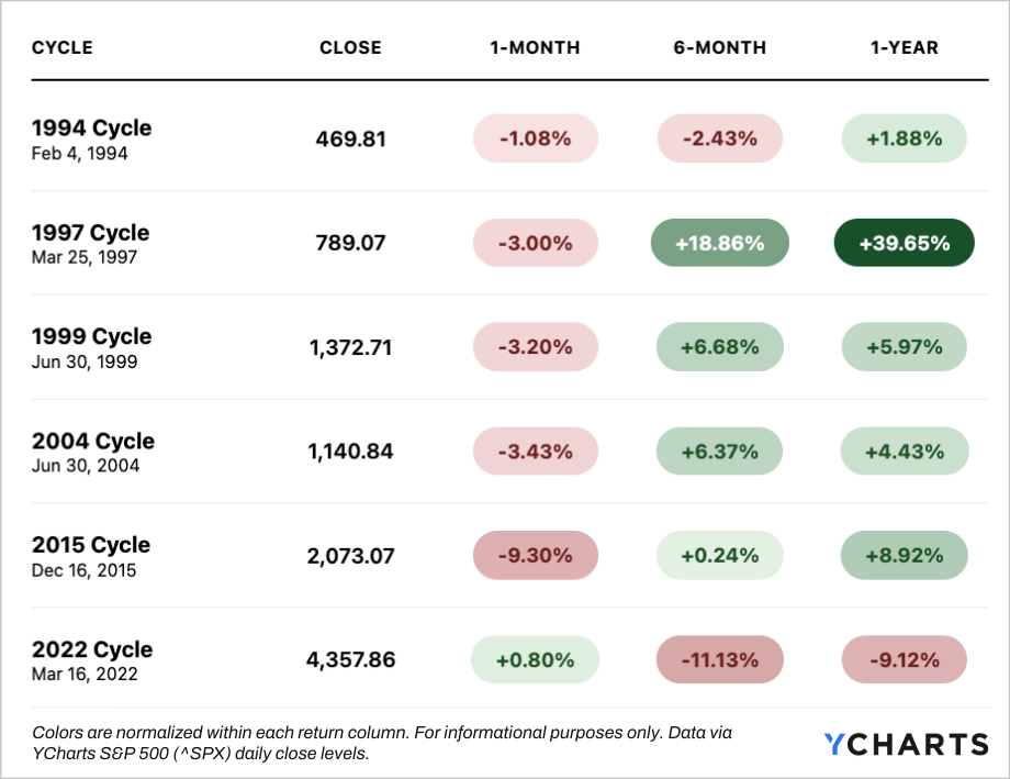
In the very short term, the market has almost always been lower as tightened rates threaten to slow economic growth, with 2022 being the only exception. Zooming out, the spread of returns begins to widen significantly.
The longest of these cycles began in 2004, when the Fed hiked 17 times for a total of 425 basis points. At that time, the market was more than 25% off dot-com era all-time highs. The shortest came in 1997, which was not really a “cycle” at all.
History’s only one-and-done hike of 25 basis points was not enough to stop markets from near 40% returns one year later. This level of growth, however, was largely down to the aforementioned dot-com era rather than the Fed’s decision to get ahead of inflation.
Yesterday’s hike came at 2.73% off highs, the third closest since 1990, as markets wait to see the length and rate at which any subsequent moves play out.
A Word on Fixed Income
The updated dot plot suggests more hikes ahead, which keeps duration front and center for the bond sleeve. How much further the long end moves from here depends largely on how prolonged geopolitical conflicts prove to be and where inflation stands over the next few readings.
In the same week that the 10-year reached levels not seen since before the 2008 financial crisis, fixed-income conversations once again deserve a closer look.
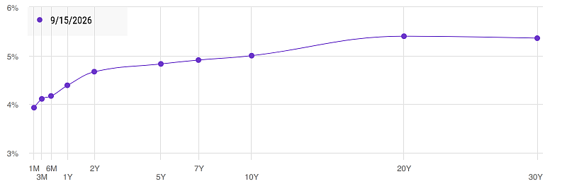
Explore the Yield Curve in YCharts →
Echoes of 1999?
Of the cycles outlined above, 1999 offers the closest read on today’s setup. Both moves came with markets in touching distance of all-time highs, surging energy prices, uncomfortable inflation, and stable employment.
In fact, both hikes followed almost the exact same pattern from the Fed. Rates had just been cut on both occasions, three times each for a total of 75 basis points. In 1999, rates were then held steady for four FOMC meetings before reversing course, while in 2026 it took five meetings.
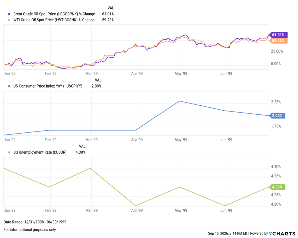
Parallels extend beyond economic conditions. In both periods, technology was driving an outsized weight of market performance and equity momentum, with AI today playing the role that dot-com played then.
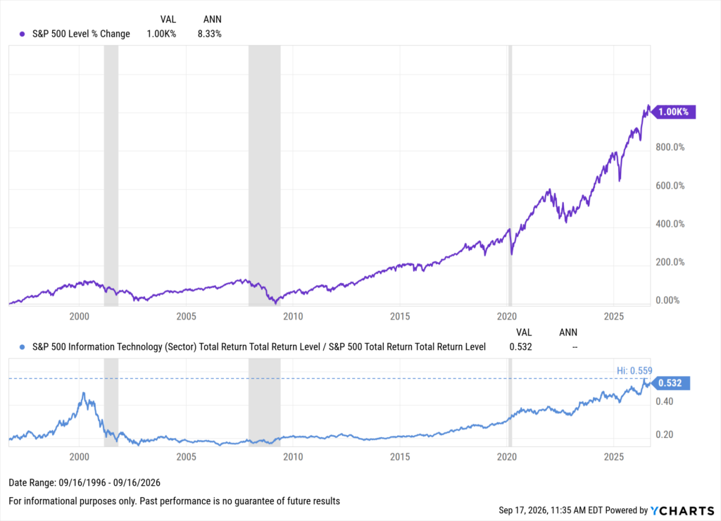
While thematically similar, the foundation of today’s companies is backed by real earnings and revenue growth, rather than speculation. Continued hikes will test that growth, but the panel advisors should gravitate toward is the 1,000% return over 30 years, despite every hurdle along the way.
The Bigger Picture for Advisors
A single 25 basis point move is rarely enough to define a cycle on its own. What is more important here is how many additional hikes follow, if any, and at what pace they arrive. Conflict in the Middle East remains the wildcard, as the Fed navigates lowering inflation without disrupting labor markets.
Advisor conversations should center less around the Fed’s actual move, and more on informing and positioning clients on what is ahead: revisiting duration, rebalancing concentrated holdings that have run, and setting expectations for the path forward from here.
Ready to Move On From Your Investment Research and Analytics Platform?
Follow YCharts Social Media to Unlock More Content!
Next Article
How Does Portfolio Drift Erode Client Trust?Read More →