What Happens After the Market’s Strongest Runs?
Executive Summary: March 2026 brought one of the most emotionally charged stretches in recent memory, yet what followed was a recovery few saw coming. This edition examines the data behind the selloff and the reversal, the historical rarity of what the market just produced, and why the cost of reacting when fear peaks has consistently outweighed the cost of staying the course.
Interested in testing out YCharts for free?
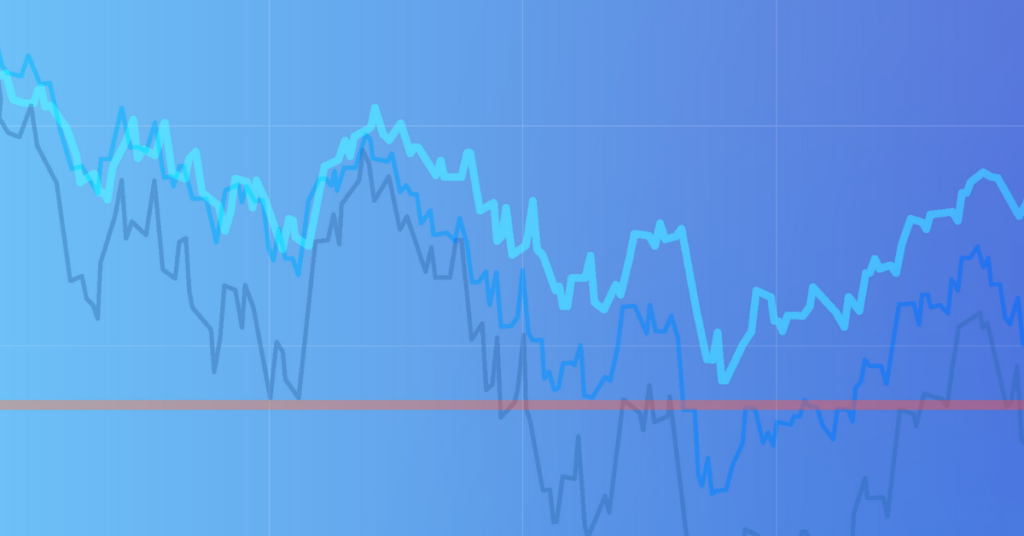
Start 7-Day Free TrialThis past March delivered one of the most uncomfortable stretches investors have experienced in recent years. The escalation of conflict in the Middle East rattled global markets, sending the S&P 500 into a five-week losing streak and down 5.09% for the month. Headlines cycled faster than fundamentals could respond, and investor sentiment deteriorated quickly.
Table of Contents
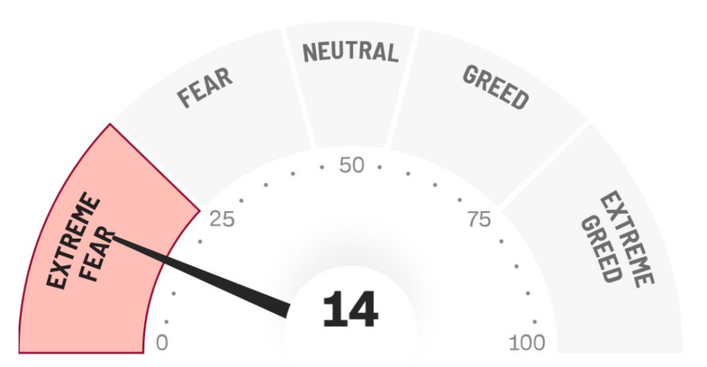
The Fear and Greed Index hit a low of 14 on March 18th, signaling extreme fear, and the instinct to reduce exposure and move to cash increasingly seemed the rational decision. This is not the only turbulent March in recent memory, however.
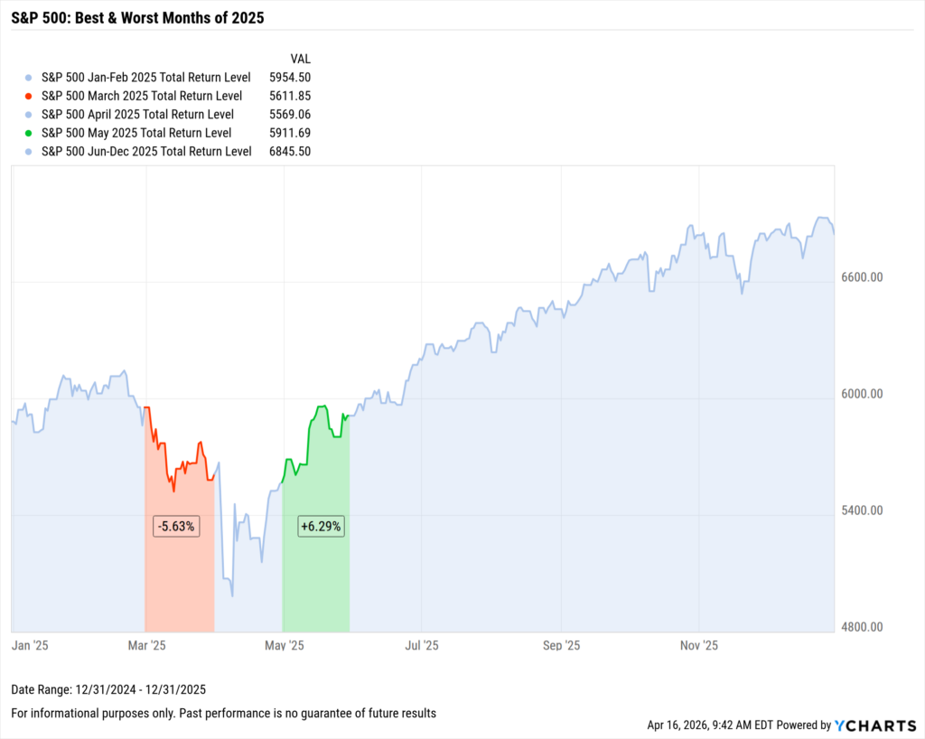
In 2025, March was the single worst-performing month of the year, ending down 5.67% amid fears of the newly proposed US tariff policy, and it feels like we are watching an adjacent story unfold.
A Quarter-Ending Statement
With sentiment at its lowest and a difficult quarter drawing to a close, the final day of the month produced a result few investors saw coming. On March 31st, the S&P 500 advanced 2.91% on the promise of the de-escalation of conflict in the Middle East.
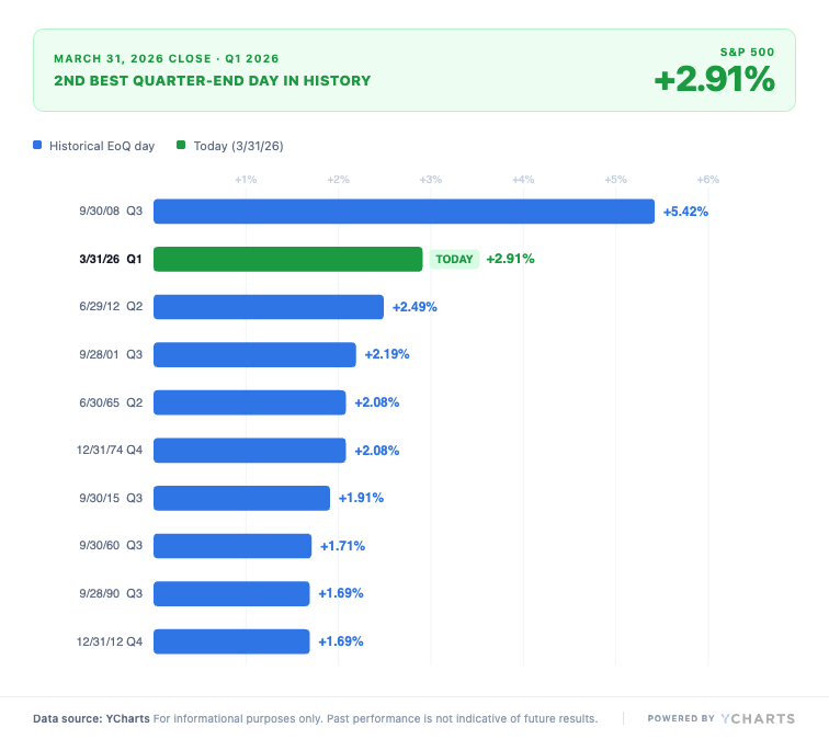
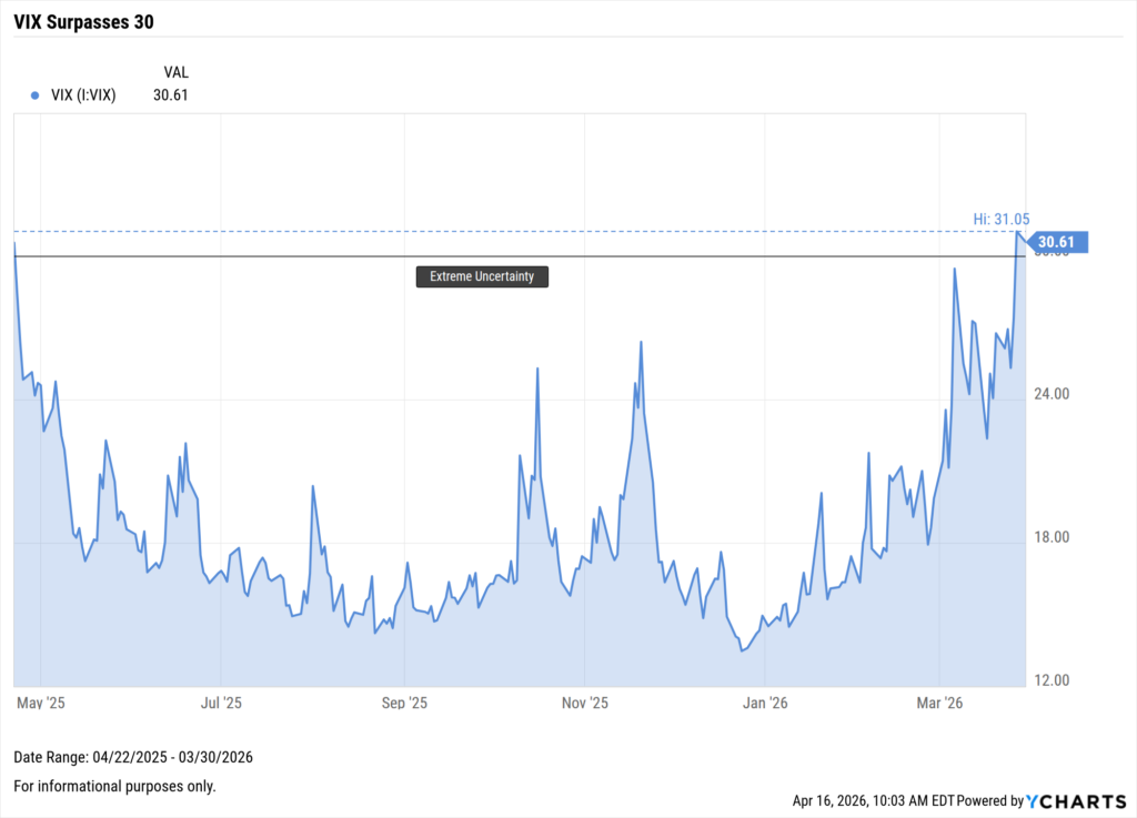
Only September 2008, during the height of the financial crisis, saw a greater quarter-end day. This came at an important time for a market that entered the final trading day of Q1 2026 negative by more than 7%, and a VIX that had run up more than 100% year-to-date.
The Historic Run That Followed
This kick-started what has been a historically strong run to begin Q2, including seven consecutive positive closes on the S&P 500, ultimately erasing the losses the market had suffered in the entire quarter prior.
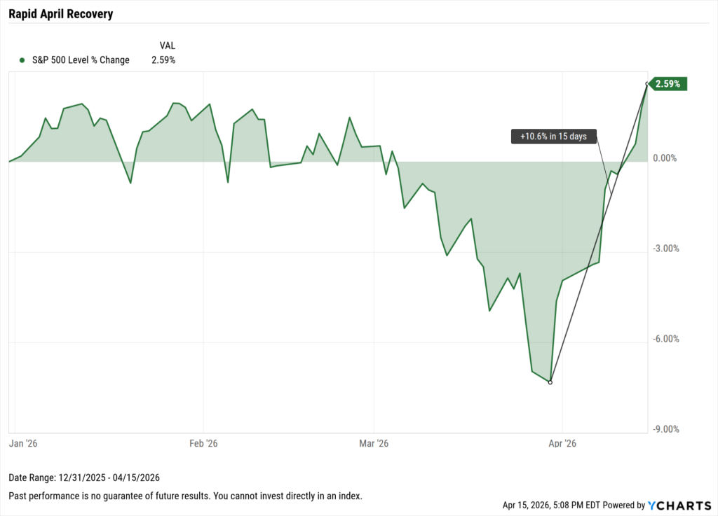
During this run, the market posted daily returns of more than 2.50% two separate times within six days, something not seen since October 2022. The streak eventually concluded up 7.6%, on April 10th (-0.11%), which remains the only negative day of the month so far.
For context, runs of seven or more consecutive positive trading days have only happened 23 times in total since 2000. Of these instances, only the 2025 Tariff rally (+10.3%) and the 2003 Iraq Invasion (+11.9%) have posted greater cumulative returns than this one.
In this modern market, where sentiment is driven by algorithms and instant access to information, these types of runs are becoming more atypical.
Volatility, or the Perception of It?
Throughout this year, the prevailing narrative has described the market as a roller coaster of volatility and difficult to navigate. In terms of significant daily moves, the data tells a slightly different story.
Looking at the frequency of ±1% and ±2% daily moves on the S&P 500, 2026 has had fewer than the average year since 2000. What has occurred, though, is a series of highly concentrated bursts of momentum, surrounded by periods of relative calm.
The same occurred last year, when tariffs manufactured a brief bear market, and even then, outside of a short period, the market was tame. It did not feel that way at the time, yet ultimately the 16.4% gain felt straightforward by year-end.
A market that moves dramatically on a handful of days feels volatile in a way that is difficult to separate from a market that is structurally volatile.
The Cost of Selling
The most expensive decision an investor could have made since the beginning of March was leaving. Since then, the market has reached new all-time highs and pushed further into positive territory year-to-date.
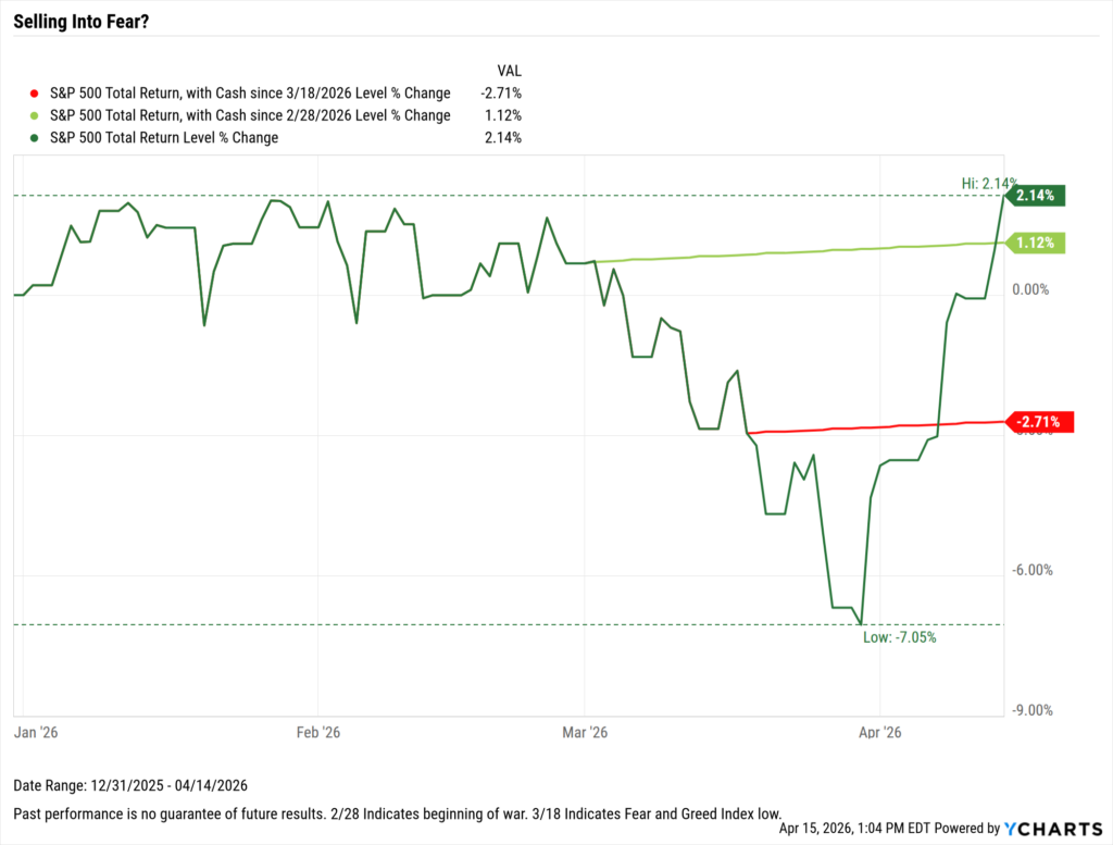
For those who sold into fear, especially when investor sentiment reached its lowest, this historic recovery has happened without them. Of the previously mentioned seven-day positive runs, markets have been higher one year later 80% of the time, by an average of 11.1%.
History tells us that in times of uncertainty, no matter how extreme, the market eventually recovers 100% of the time. Doing nothing can be a rewarding discipline, and this period serves as a reminder of that.
An Advisor’s Discipline
Understanding the data behind moments like this is what separates reactive decision-making from informed, long-term investing. Geopolitical uncertainty remains, but abandoning a long-term strategy in response to short-term fear has historically done more damage than good.
YCharts gives advisors the tools to build these visuals, surface historical context, and turn market complexity into client conversations that build lasting trust.
Ready to Move On From Your Investment Research and Analytics Platform?
Follow YCharts Social Media to Unlock More Content!
Next Article
The Best Performing Tech Stocks over the Last 10 YearsRead More →