Under the Hood of January’s Active Fixed Income ETF Explosion
To say that the first month of 2025 was a big one for fixed income hardly does it justice.
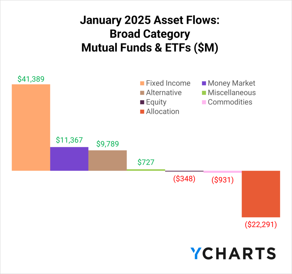
US-domiciled bond-based mutual funds and ETFs drew an impressive $41.4 billion in net new assets, surpassing money market funds by over $30 billion.
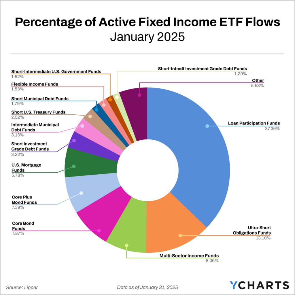
Overview of January Fixed Income ETF Flows
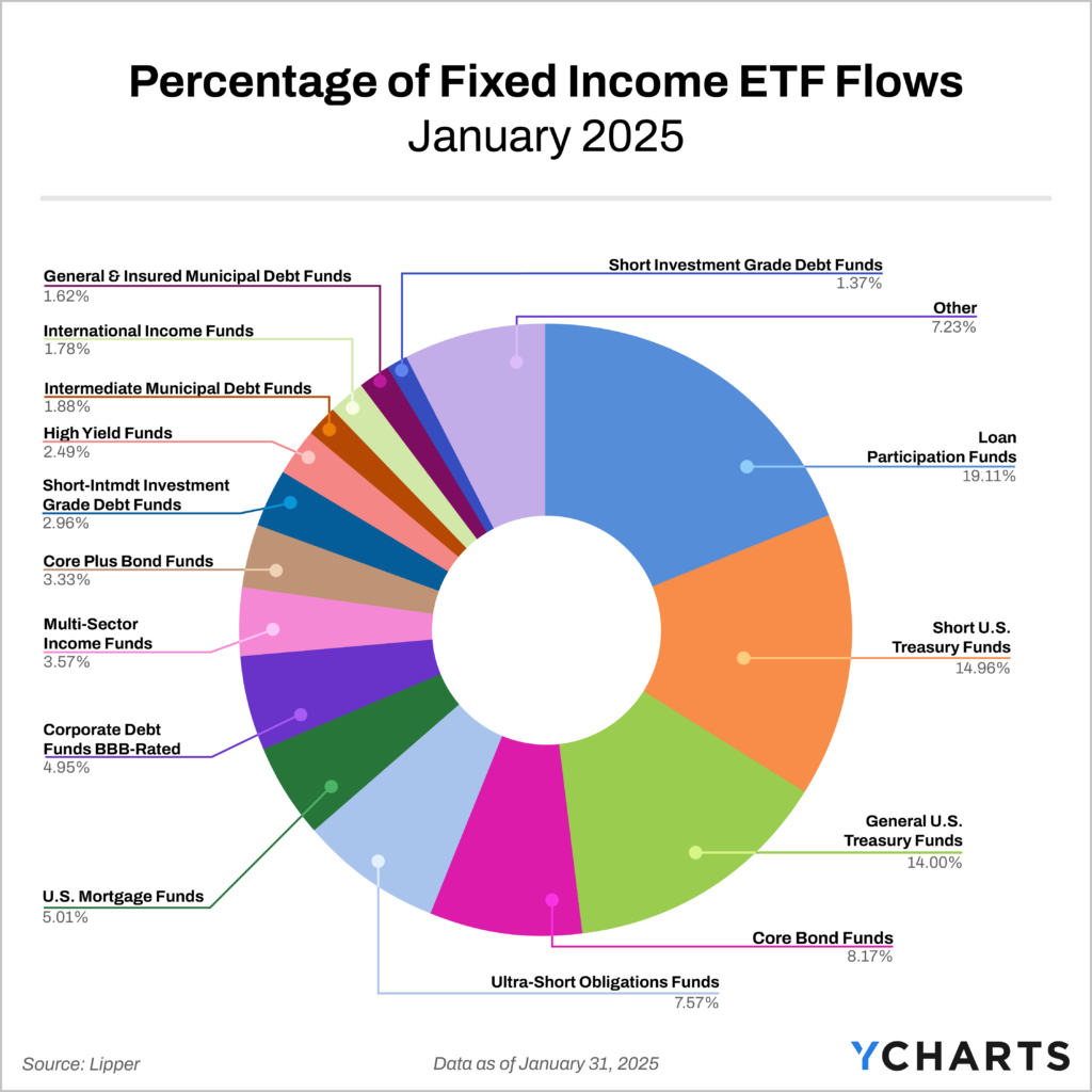
As you might expect, ETFs carried the bulk of the momentum. Across all peer groups, ETFs amassed $37.5 billion in net new assets, with Loan Participation, Short U.S. Treasury, and General U.S. Treasury ETFs accounting for nearly half of all fixed income ETF flows (48.1%).
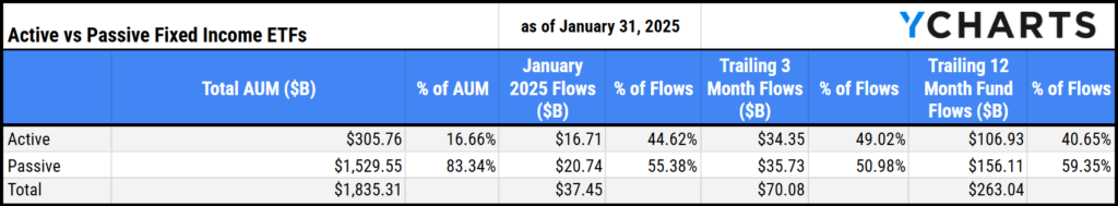
The appeal of active management within the fixed income space persisted in January, with active fixed income ETFs capturing $16.7 billion in net new assets. Despite only making up over 15% of total assets, active inflows represented 44.6% of all fixed income ETF flows for the month.
The distribution of flows within active products was particularly concentrated, with Loan Participation, Ultra-Short Obligations, and Multi-Sector Income ETFs comprising nearly 60% (58.6%) of all active fixed income ETF flows. Notably, Loan Participation strategies alone accounted for over a third of these flows.
Below, we explore the most popular active fixed income ETFs in January, examining their allocation across fixed income sectors, credit quality, and geography.
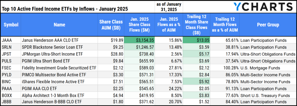
Fastest Growing Active Fixed Income ETFs in January 2025
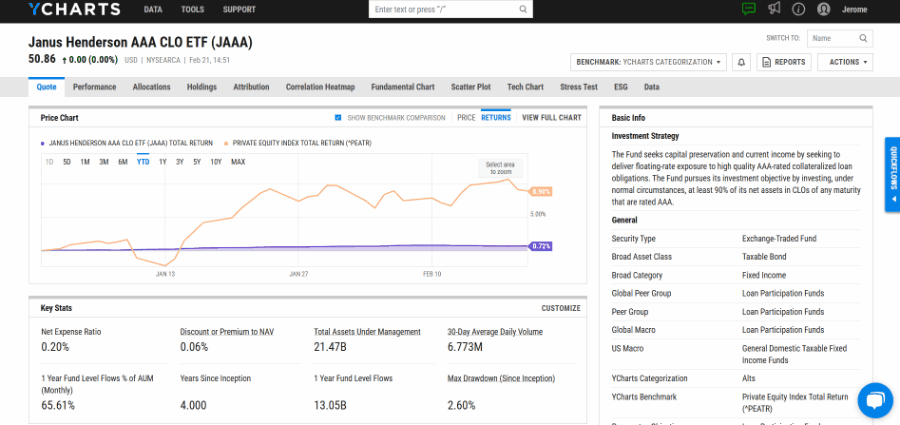
The Janus Henderson AAA CLO ETF (JAAA) led the pack by attracting $3.2 billion in net new assets in January, more than doubling the inflows of the second fastest-growing active fixed income strategy, the SPDR Blackstone Senior Loan ETF (SRLN), which secured $1.2 billion.
The JPMorgan Ultra-Short Income ETF (JPST) rounded out the top three, bringing in $738 million in inflows.

Download Visual | View the Active Fixed Income Fund Flow Table
All ten strategies on this list have crossed the billion-dollar AUM milestone, with each experiencing at least 10% of their end-of-January AUM from inflows over the past year. Impressively, nine of these have seen more than a third of their assets accumulate in the last 12 months alone, highlighting the rapid growth of the active ETF market.
A critical aspect for all investment strategies, especially active ones, is how their underlying holdings set them apart from competitors or benchmarks. Using Quickflows in YCharts enables distribution teams to easily demonstrate their unique value with just a few clicks.
Using Quickflows To Analyze Active Fixed Income ETFs
Unsurprisingly, using the “FI Sector Exposure” Quickflow for these ten strategies reveals that loan participation or CLO-based products, like JAAA or the PGIM AAA CLO ETF (PAAA), have substantial exposure to securitized fixed income.
View & Modify the Comp Table in YCharts
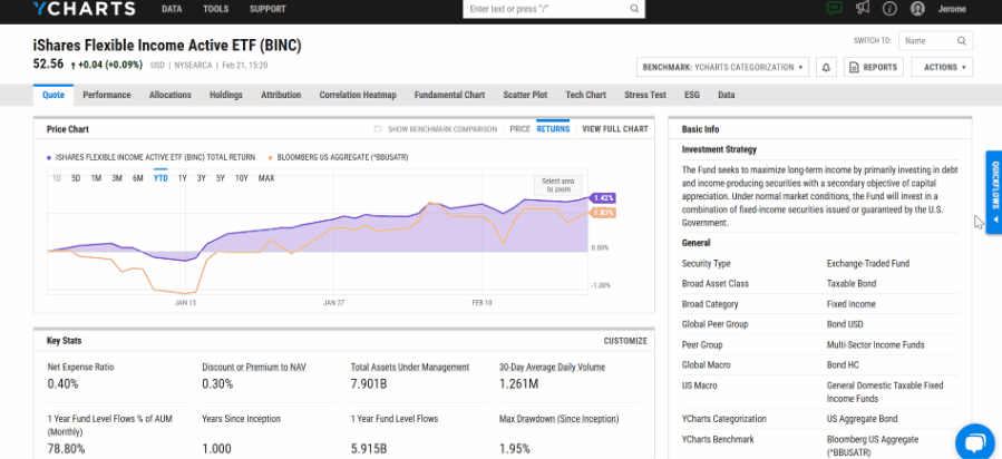
Meanwhile, multi-sector income strategies, like the iShares Flexible Income Active ETF (BINC), have more diversified exposure to fixed-income sectors. The final comp table could be further customized to show exposure to Bank Loans, Asset Backed Securities (ABS), Commercial Mortgage Backed Securities (CMBS), and more.
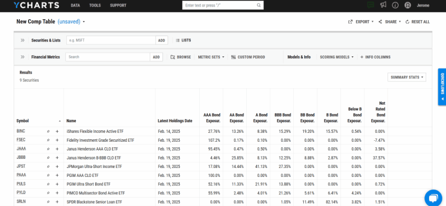
For advisors focused on managing credit risk, the “Credit Quality Exposure” Quickflow can be employed to efficiently assess the credit quality across up to 12 funds.
View & Modify the Comp Table in YCharts
This Quickflow indicates that among the ten active fixed income strategies discussed, the funds with the highest BBB credit exposure are JPST, the PIMCO Multisector Bond Active ETF (PYLD), and BINC.
The last Quickflow, “Geographic Exposure,” offers insights into the regions where these fund managers see the most promising opportunities.
View & Modify the Comp Table in YCharts
This Quickflow shows that PAAA, JAAA, and the Janus Henderson B-BBB CLO ETF (JBBB) have the highest exposure to Latin America, while the Fidelity Investment Grade Securitized ETF (FSEC) and Alpha Architect 1-3 Month Box ETF (BOXX) are predominantly focused on North America.
Substantial inflows into active fixed-income ETFs in January highlight their growing market appeal. Quickflows help quickly identify the sophisticated strategies fund managers are using to attract and manage capital.
Whenever you’re ready, there are three ways YCharts can help you:
Have questions about how YCharts can help you grow AUM and prepare for meetings?
Email us at hello@ycharts.com or call (866) 965-7552. You’ll get a response from one of our Chicago-based team members.
Unlock access to our Fund Flows Report and Visual Deck by becoming a client.
Dive into YCharts with a no-obligation 7-Day Free Trial now.
Sign up for a copy of our Fund Flows Report and Visual Deck:
Disclaimer
©2025 YCharts, Inc. All Rights Reserved. YCharts, Inc. (“YCharts”) is not registered with the U.S. Securities and Exchange Commission (or with the securities regulatory authority or body of any state or any other jurisdiction) as an investment adviser, broker-dealer or in any other capacity, and does not purport to provide investment advice or make investment recommendations. This report has been generated through application of the analytical tools and data provided through ycharts.com and is intended solely to assist you or your investment or other adviser(s) in conducting investment research. You should not construe this report as an offer to buy or sell, as a solicitation of an offer to buy or sell, or as a recommendation to buy, sell, hold or trade, any security or other financial instrument. For further information regarding your use of this report, please go to: ycharts.com/about/disclosure
Next Article
The Top Metrics Advisors Used in Portfolio Reports Last YearRead More →