Winners & Losers from the Fed’s Last Rate Hike Cycle
It appears the Federal Reserve is done raising rates for the time being.
The Fed recently hiked its key Fed Funds Rate by 500 basis points in just a little over a year. This is one of the most rapid hike cycles on record, consisting of eleven rate hikes in which four of them were 75 basis point raises and two of them were 50 bps.
After a long period of little activity from the Fed in the 2010s, advisors and clients are now concerned with the effect rising rates will have on their portfolios.
In our new white paper, “Managing Rising Rate Environments: Which Portfolios and Asset Classes Perform Best?”, we looked at the four most recent Fed rate hike cycles–including the current one spanning 2022-2023–to identify which asset classes and portfolio allocations perform best in each cycle. Read on to see, from our research, what performed best in the Fed’s 2015-2018 rate hike cycle.
Download the free White Paper to see our full findings: (Supplemental slide deck included!)Which Asset Classes Performed Best in the 2015-2018 Cycle?
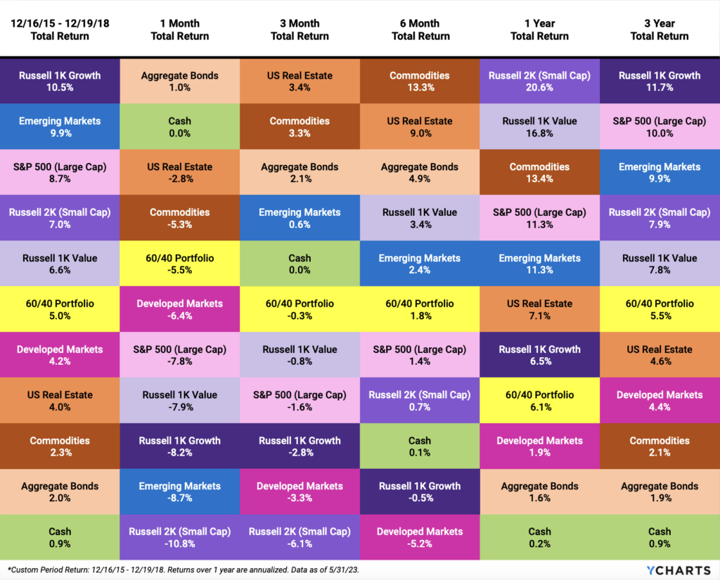
Before 2022-2023, the Fed raised rates a total of 225 basis points between December 2015 and December 2018.
In those three years, Growth was the leading asset class, followed by Emerging Markets and the S&P 500. In short, equities were the place to be from 2015-2018, even during a rate hike cycle.
Cash was certainly not king for the three-year period, and neither were Aggregate Bonds nor Commodities.
Download the Free White Paper + Supplemental Slide Deck
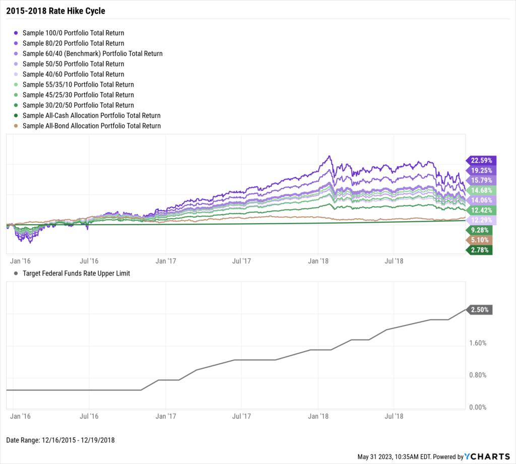
Which Allocations Performed Best in the 2015-2018 Cycle?
Fitting the same narrative as mentioned above, portfolios with a higher equity allocation delivered higher returns across the three-year rate hike cycle. However, markets corrected sharply at the start of 2018 and toward the end of the cycle, causing equity-heavy portfolios to be hit harder than those with a larger bond or cash concentration.
A cash position mixed with stocks and bonds held up pretty well. The 55/35/10 Portfolio was the fourth-best performer throughout the rate hike cycle and endured less standard deviation along the way.
Download the Free White Paper + Supplemental Slide Deck
But how did these portfolios hold up after the Fed stopped hiking rates? We also reviewed how these allocations performed one year following the last rate hike. Download the White Paper to learn more.
Download the free White Paper to see our full findings: (Supplemental slide deck included!)Connect with YCharts
To get in touch, contact YCharts via email at hello@ycharts.com or by phone at (866) 965-7552
Interested in adding YCharts to your technology stack? Sign up for a 7-Day Free Trial.
Disclaimer
©2023 YCharts, Inc. All Rights Reserved. YCharts, Inc. (“YCharts”) is not registered with the U.S. Securities and Exchange Commission (or with the securities regulatory authority or body of any state or any other jurisdiction) as an investment adviser, broker-dealer, or in any other capacity, and does not purport to provide investment advice or make investment recommendations. This report has been generated through application of the analytical tools and data provided through ycharts.com and is intended solely to assist you or your investment or other adviser(s) in conducting investment research. You should not construe this report as an offer to buy or sell, as a solicitation of an offer to buy or sell, or as a recommendation to buy, sell, hold or trade, any security or other financial instrument. For further information regarding your use of this report, please go to: ycharts.com/about/disclosure
Next Article
Could You Have Hedged Inflation in 2022 with an ETF?Read More →