Using Scatter Plots in Client Communications
We’re excited to share that a new tool, Scatter Plot, has been added to YCharts as another way to visualize and share security, portfolio, and market data.
Available to YCharts Professional users, Scatter Plot enables you to illustrate risk vs. reward for different securities, plot your portfolios against an efficient frontier, and understand how individual holdings are affecting portfolio-level metrics.
This capability enhances and expands upon the many ways advisors and asset managers use YCharts to research, visualize, and communicate with their clients about portfolios and investment strategies.
This five-minute video provides a quick “How To” to get you started. Included are valuable tips for making the most of powerful Scatter Plot features, such as customizing data point flags and pinch-to-zoom:
Scatter Plot Step-by-Step
Similar to our Fundamental Charts tool, Scatter Plots are driven by the selections you make using the left-hand side menu. For reference: Scatter Plot FAQs.
1. Use the Securities & Lists search bar, or click List to pull in your own Watchlists, portfolio holdings, sector groupings, or index constituents.
2. Select either Point in Time or Timeseries as your Scatter Plot Type to view data as of a specific date or over the course of a period, respectively.
3. Choose your X-Axis and Y-Axis metrics using the search bars, or click the “Browse” folder icon to see all metrics available within the Scatter Plot. (For example, add Annualized Standard Deviation (5Y) to the X-Axis and Annualized 5 Year Total Returns to the Y-Axis)
4. Optional: Point in Time Scatter Plots show the latest data available by default. Use the date selection search bars to plot data as of a specific date.
5. For Timeseries Scatter Plots: The Time Range & Options menu lets you select a date range, frequency, and aggregation and fill methods to better organize data, such as monthly or quarterly performance metrics.
6. Click the Share dropdown on the upper-right of the Scatter Plot to create a shareable link or share with colleagues using YCharts. To create an image, use a screenshot tool of your choice to capture the Scatter Plot field. (A Presentation View feature is already in the works!)
4 Impactful Ways to Use Scatter Plots on YCharts
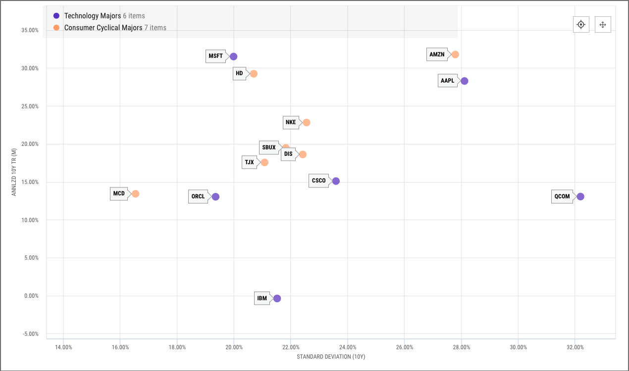
#1 — Visualize the Risk Vs. Reward Relationship for a Group of Securities
To better understand the risk and potential reward of different securities, add them to your Scatter Plot along with a performance metric on the X-Axis and risk metric on the Y-Axis. The visual representation of returns and risk tradeoffs for each security—individual stocks, ETFs, portfolios, or otherwise—makes for an intuitive conversation point.
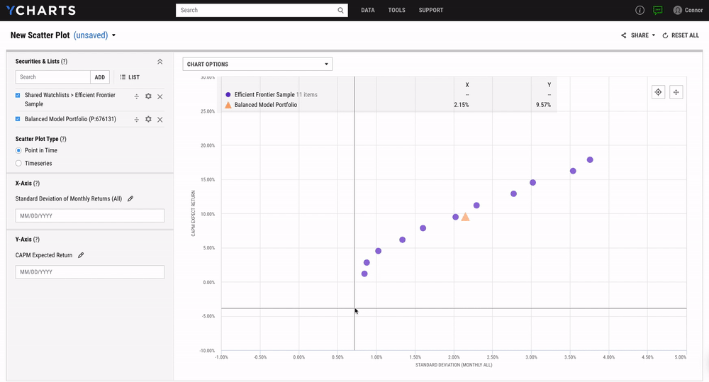
#2 — Plot an Efficient Frontier Proxy and See How Your Portfolios Compare
The efficient frontier is a set of optimal portfolios that offer the highest expected return for a defined level of risk. To identify where your portfolios and model strategies lie relative to the efficient frontier, add a series of passive allocation funds along with a portfolio of your choosing.
An illustration of a client’s portfolio vs. the efficient frontier can inform discussions and ensure a portfolio is optimized for risk relative to the returns it offers. Scatter Plots can also be leveraged when prospecting new clients by showing how your portfolio strategies outperform those of competitors on the efficient frontier.
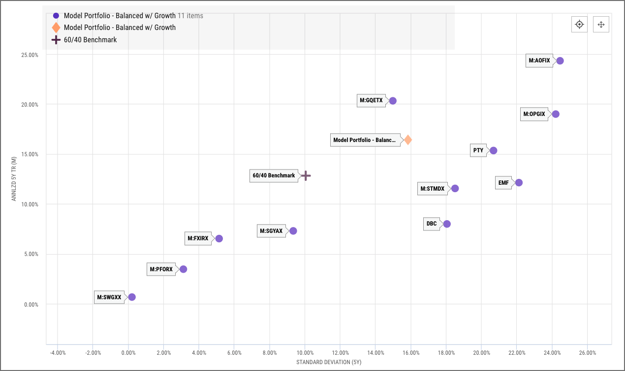
#3 — Understand How Individual Holdings Affect Portfolio-level Metrics
Add a Model Portfolio, its holdings, and benchmark to a Scatter Plot to analyze how the underlying holdings are contributing to, or detracting from, overall performance and risk. When optimizing portfolios or trying to identify the best securities to use in a strategy, Scatter Plots paint a clear picture of each fund’s pros and cons.
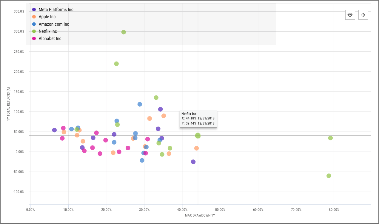
#4 — Analyze Performance and Volatility Over Time with Timeseries
Here, a Timeseries Scatter Plot is used to compare the annual performance and max drawdowns of Meta Platforms (FB), Apple (AAPL), Amazon (AMZN), Netflix (NFLX), and Alphabet (GOOGL) over the last ten years.
The tidy clustering of some securities contrasts with more dispersed data for others to provide insight into which of these stocks are consistent in terms of performance and drawdowns, while others are more sporadic.
Connect with YCharts And Share Your Feedback
Much like the advisors and asset managers we serve, we pride ourselves on listening to and understanding our clients’ needs.
Scatter Plot is available to YCharts Professional users only. For questions or feedback, reach out to your account manager.
Not a YCharts user? Sign up for a 7-Day Free Trial or contact us via email at hello@ycharts.com and by phone at (866) 965-7552 to learn more.
Next Article
How Wholesalers Gain an Edge with YCharts SMA, Portfolio DataRead More →