What 5 Measures of Market Valuation Are Saying Right Now
With the notable exceptions of Q4 2018 and March 2020, US equities have enjoyed a largely uninterrupted bull market since the Financial Crisis bottom in early 2009.
However, equities have descended deep into a valley since peaking in January of 2022.
June 2022 marked just the 11th time since 1950 that the S&P 500 drew down 20% or more from its most recent all-time high. This is widely considered an entrance into bear market territory, and has market participants wondering: what is the current state of the market’s valuation? Have equities already been brought down to fair value? Or is there further pain ahead?
To offer perspective on life’s—well, maybe just the market’s—big questions, here are five measures that illustrate where market valuations currently stand, plus a bonus indicator from our new white paper, Which Leading Indicators Best Predict Market Declines?
How well do leading valuation indicators predict market declines? Download the new White Paper for our full findings:
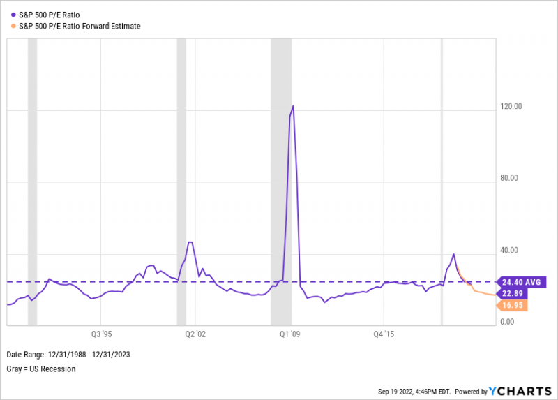
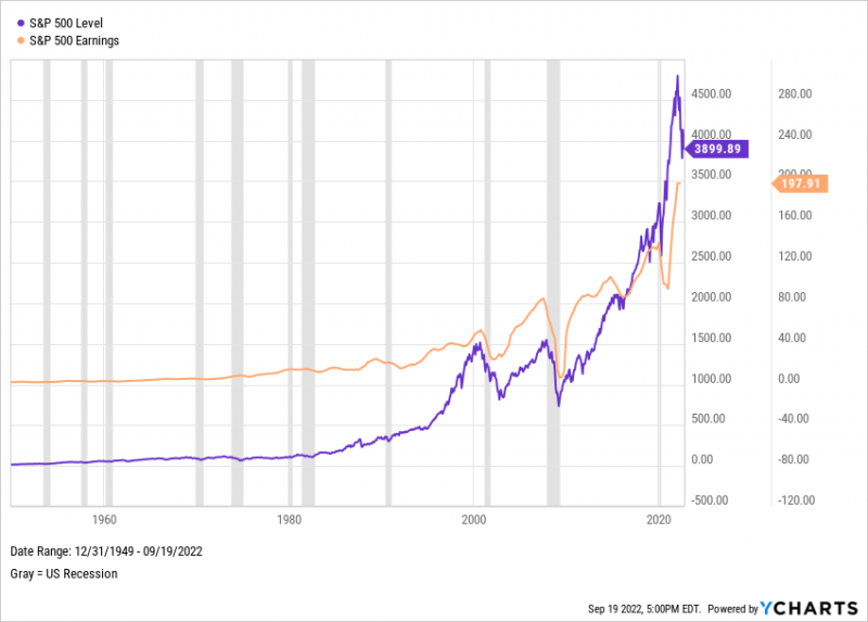
1. S&P 500 Price to Earnings Ratio
The S&P 500 P/E Ratio measures the combined price of the index’s 500 constituents against their aggregate earnings-per-share. Its latest reading from Standard & Poors, 22.89 as of Q1 2022, means investors are paying about $23 for every dollar of earnings from all S&P 500 stocks.
Download Visual | Modify in YCharts
Compared with a historical average of 24.4, the S&P 500 would be considered about fairly valued on the basis of its P/E ratio. However, it’s worth noting the S&P 500 earnings per share forward estimate is projected to grow 27% through Q4 of 2023, thereby reducing expectations for the S&P 500’s forward P/E ratio. Projections indicate an index P/E ratio of 18.6 in Q4 of 2022, and 17.0 for Q4 of 2023. If price growth were to slow or remain flat, could the S&P 500 actually trade at a discount to historical averages in the next year? If prices run away, well…
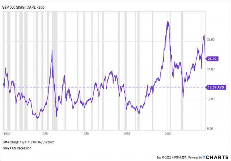
2. S&P 500 Shiller CAPE Ratio
Similar to the P/E ratio, the S&P 500 Shiller Cyclically Adjusted Price-to-Earnings (CAPE) ratio divides the S&P 500’s current price by its 10-year moving average of inflation-adjusted earnings. Followers of CAPE anticipate a higher ratio could reflect lower returns over the next couple of decades, whereas a lower figure would indicate higher returns over the same period.
Download Visual | Modify in YCharts
Formerly, when the CAPE ratio went above its historical average, it didn’t stay there for long — but since the 1990s, that trend has reversed. Spikes in the CAPE ratio have often preceded recessions. With recession chatter forming the backdrop to CAPE’s sharp fall in 2022, those who abide by the metric will be watching closely for any further reversion to the mean.
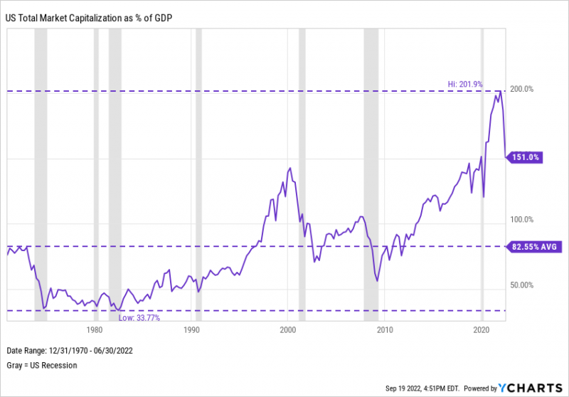
3. The Buffett Indicator
US Market Capitalization as a percentage of GDP is “probably the best single measure of where valuations stand at any given moment,” according to the indicator’s namesake, Warren Buffett.
Download Visual | Modify in YCharts
The ratio measures the aggregate value of the US stock market relative to the country’s economic output. A “Buffett Indicator” of 100% typically means the market is considered fairly valued, though investors were paying twice that at the end of 2021. That record-high figure dropped sharply to 151% just two quarters later. Nonetheless, the ‘Buffett Indicator” remains well above its historical average of 82.6%, meaning that the Oracle of Omaha is probably not going all-in on equity positions right now.
How well do leading valuation indicators predict market declines? Download the new White Paper for our full findings:
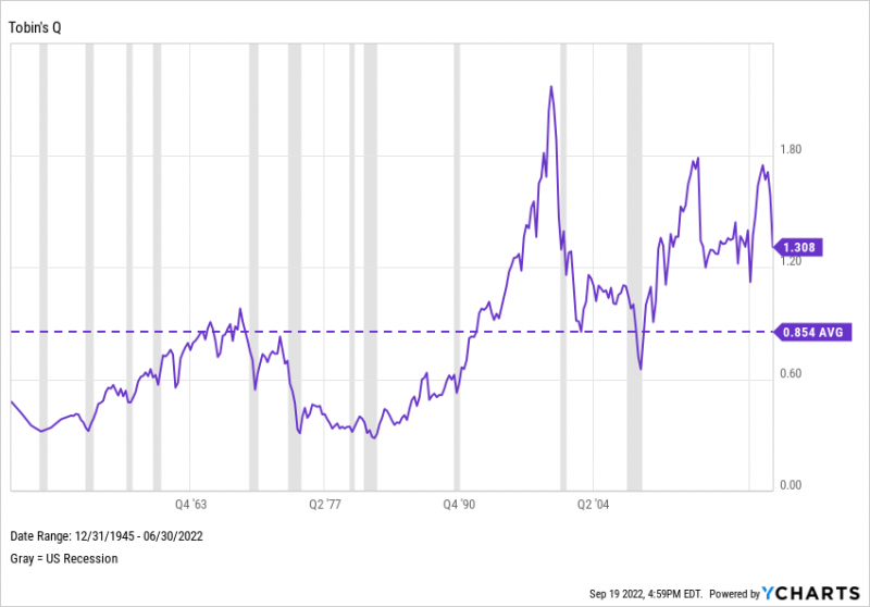
4. Tobin’s Q
Tobin’s Q measures the market value of one or all public companies in the US, divided by their combined, total replacement cost. A reading above 1 would mean a company’s stock is more expensive than the replacement cost of its physical assets, implying that the stock is overvalued.
Download Visual | Modify in YCharts
Tobin’s Q has been above 1 since Q3 2010 and in 2021 soared to its third-highest level on record. Tobin’s Q has sharply reversed direction since then, reflecting similar moves made by the S&P 500 PE Ratio, CAPE Ratio, and the “Buffett Indicator”. How much lower will valuations go?
5. The Yield Curve
Long-term treasury rates are almost always higher than those of shorter-term instruments. When the reverse happens, however, it signals shaky confidence in the economy, and typically leads investors to shift from stocks to bonds. This phenomenon, known as an inverted yield curve, has consistently foreshadowed recessions and market downturns.
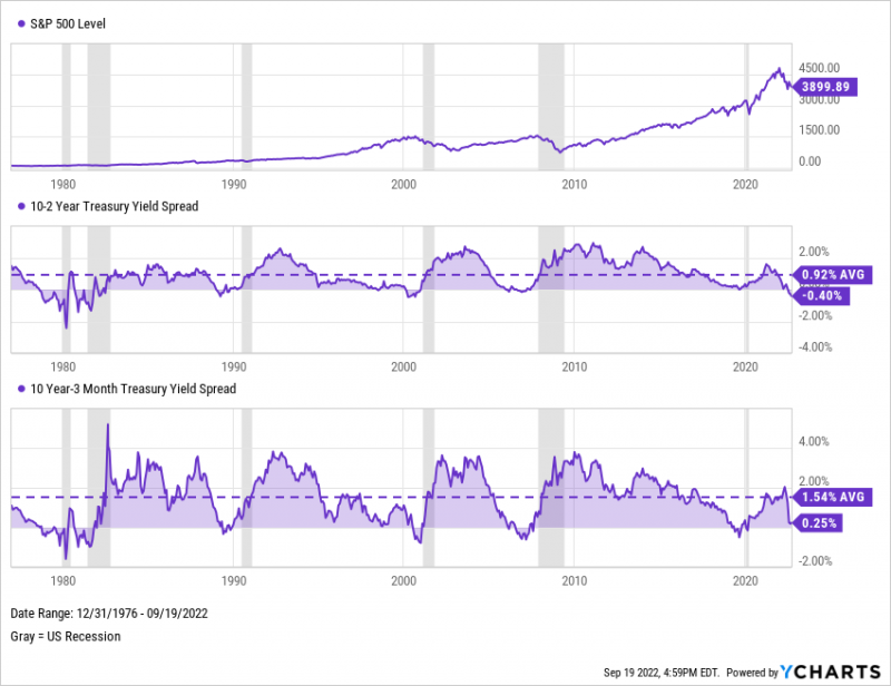
Download Visual | Modify in YCharts
The 10-2 Year and 10 Year-3 Month Treasury Yield spreads became inverted right before each of the six recession periods shown above. As for the S&P 500? The index turned negative following each yield spread inversion. In a loss for the bulls, the 10-2 Year Spread is currently negative, and the 10 Year-3 Month Spread is hovering near inverted territory as of September 2022.
Bonus: Negative S&P 500 Earnings
In our latest white paper, Which Leading Indicators Best Predict Market Declines?, we looked at how often and accurately Negative YoY S&P 500 Earnings preceded a list of 21 major market declines since 1950. Download your free copy now to read the full findings:
How well do leading valuation indicators predict market declines? Download the new White Paper for our full findings:
Download Visual | Modify in YCharts
As would be expected, S&P 500 earnings and the index itself have tended to move in tandem with each other. Of the S&P 500’s 21 major declines since 1950, in which the index fell 10% or more from its recent all-time high, Negative S&P 500 YoY Earnings preceded 9. In addition, S&P 500 YoY Earnings also turned red after three separate declines—warnings that came late for anyone trying to time those actions.
Is the Market Correction Here to Stay?
Corrections can occur in different ways. Most people think of price corrections, such as the S&P 500 falling 10% as a reversion to its long-term mean. But there can also be periods of time where prices stay flat despite company growth—rising earnings, sales, book value, etc.—causing valuation corrections. (See: the S&P 500’s forward P/E ratio.) Valuation metrics such as the “Buffett Indicator”, CAPE Ratio, and Tobin’s Q have fallen precipitously in 2022, yet remain in overvalued territory or above their long-term averages. The average max drawdown of the 11 S&P 500 bear market declines is 34.3%. Whether or not this drawdown will extend beyond 30% remains to be seen, but long-term investors nevertheless might view the correction as an opportunity to shop for equities at discounted prices.
Connect With YCharts
To get in touch, contact YCharts via email at hello@ycharts.com or by phone at (866) 965-7552
Interested in adding YCharts to your technology stack? Sign up for a 7-Day Free Trial.
Disclaimer
©2022 YCharts, Inc. All Rights Reserved. YCharts, Inc. (“YCharts”) is not registered with the U.S. Securities and Exchange Commission (or with the securities regulatory authority or body of any state or any other jurisdiction) as an investment adviser, broker-dealer or in any other capacity, and does not purport to provide investment advice or make investment recommendations. This report has been generated through application of the analytical tools and data provided through ycharts.com and is intended solely to assist you or your investment or other adviser(s) in conducting investment research. You should not construe this report as an offer to buy or sell, as a solicitation of an offer to buy or sell, or as a recommendation to buy, sell, hold or trade, any security or other financial instrument. For further information regarding your use of this report, please go to: ycharts.com/about/disclosure
Next Article
How Well Does the “Buffett Indicator” Predict Market Crashes?Read More →