Winning AUM in Active Fixed Income: 3 Tools for Distribution Teams

Spreads are tight.
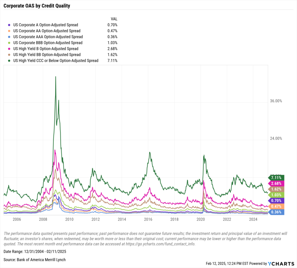
Download Visual | View & Modify in YCharts
Yields are high.

Download Visual | View & Modify in YCharts
That’s partly why investors are saying bond funds are a buy.
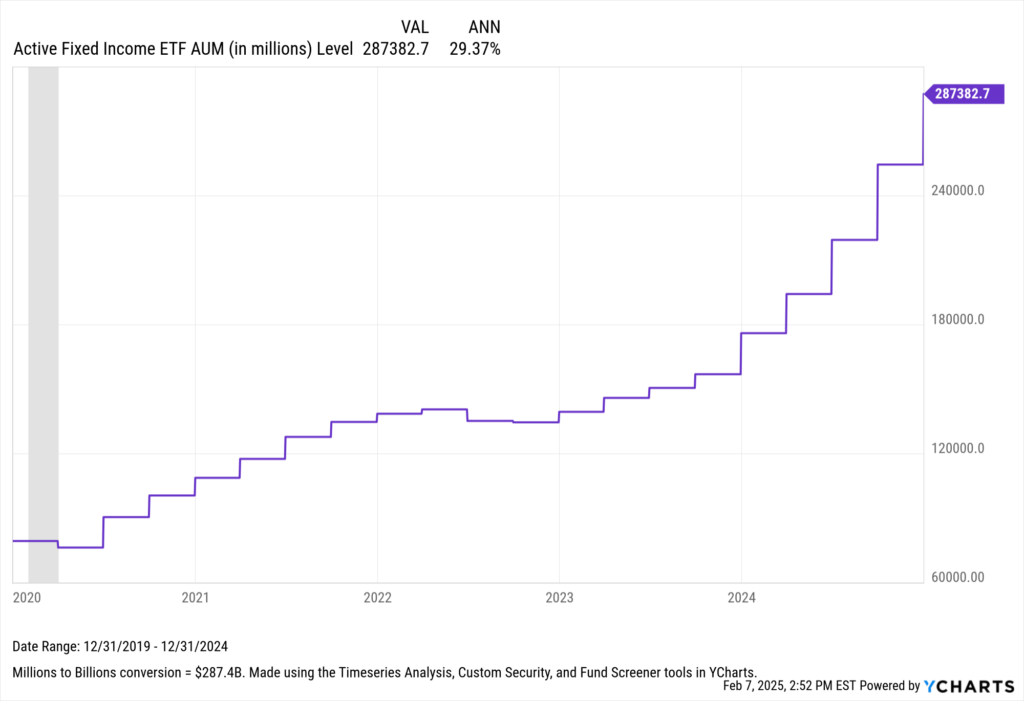
Why Active Fixed Income ETFs Are Surging in Popularity
In 2024, fixed-income funds attracted a remarkable $428 billion in net new assets, while active fixed-income ETFs saw their assets under management surge to over $287 billion. This growth represents a significant increase from the $79.3 billion recorded at the end of 2019, making a compelling case that active fixed-income ETFs have benefited most from the 2019 ETF Rule.
For those keeping score, that’s a 29% CAGR over those five years.
Currently, the spread between BBB-rated bonds and Treasury bonds of comparable maturity stands at just 1.04%, nearly half the average seen since 2005 and only slightly above the historic low of 0.97. Spreads this tight can serve as a green light for bond investors, and as evidenced by fund flows late last year, some of those investors were tapping the accelerator.
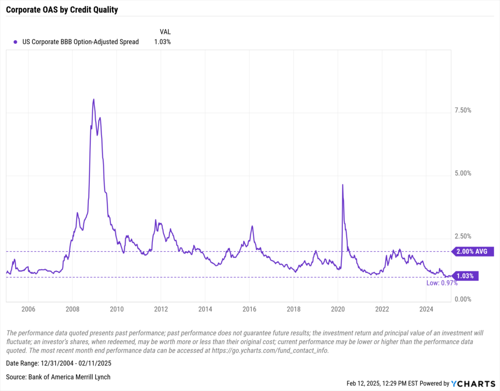
Download Visual | View & Modify in YCharts
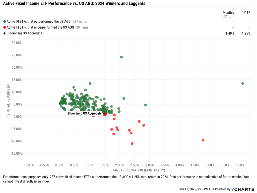
Opportunities like this across the credit and yield curve are one reason active fixed income in the ETF wrapper is only becoming more popular. Active fixed-income managers can effectively position and rebalance fixed-income portfolios as the economic environment evolves.
This proved true in 2024 when nearly 84% of US-domiciled active fixed-income ETFs outperformed the Bloomberg US Aggregate Bond Index.
While that performance is impressive, one of the most common reasons advisors opt for active management in their fixed-income sleeve is that active managers can more aptly adapt to changing monetary policy.
In 2024, monetary policy was largely predictable in terms of the Federal Open Market Committee (FOMC) cutting rates. While many expect rates to be cut in 2025, those cuts are expected to occur at a slower pace this year.
Currently, the CME FedWatch tool indicates that nearly half of investors anticipate the Fed Funds Rate will remain unchanged by June, with no clear consensus for its trajectory in December. This uncertainty underscores the value of active fixed-income managers, whose adaptability leads to consideration in any advisor’s fixed-income sleeve, whether as a core or complementary component.
Three YCharts tools—the Dashboard, Comp Tables, and Scenarios—can help distribution teams present these active fixed-income solutions to advisors.
Adding Portfolio Manager Notes to the Fixed Income Dashboard
The Dashboard is the most widely used tool in YCharts, and when used effectively, it becomes a formidable asset for both sales leaders and research teams. It serves as a centralized hub, allowing various roles within a distribution team to coordinate their sales strategies.
The notes module, in particular, is one of the most powerful tools a distribution team can use to facilitate alignment around an active fixed-income strategy.
Sales directors or designated team members can add detailed notes directly to the team’s dashboard. These notes can include a manager’s insights on market conditions, rebalance notes, and links to essential internal resources like pitchbooks, quarterly recaps, or market outlooks.
All of this can be added side-by-side to a powerful visual like this one, illustrating the income-driven returns of one of the most popular active loan participation funds of 2024, the SPDR Blackstone Senior Loan ETF (SRLN).
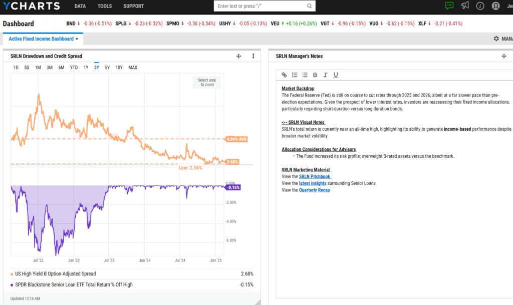
A dashboard like this can also include a comp table, enabling the entire distribution team to grasp the unique narrative and differentiated value of your fund more clearly. The comp table can also contextualize your strategy’s relative strengths by comparing it directly with competitors or benchmarks.
Using Comp Tables to Differentiate Multi-Sector Income Funds
Like all strategies, being able to differentiate yourself from your competitors is paramount to winning an allocation in an advisor’s models. In YCharts, one of the easiest ways to prove your fund’s differentiated value is with Comp Tables.
When it comes to active management in fixed income, one peer group that will likely find the most benefit from using these comp tables is multi-sector income funds. As the name suggests, these strategies allocate across fixed-income sectors, making it easy for an active manager to highlight the differences in their holdings from a competitor.
Let’s take the iShares Flexible Income Active ETF (BINC) for example. Running a “Fixed Income Sector Exposure” Quickflow against three comparable multi-sector ETFs and AGG as a benchmark, you can quickly see that BINC is overweight in corporate bonds and derivatives relative to its peers and the benchmark.
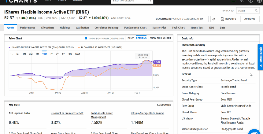
In addition to the sector exposure Quickflow, during meetings with advisors, you can also run Quickflows for geographic and credit quality exposure and enrich the comp table with additional metrics such as yield, maturity, volatility, and risk-adjusted returns.
Whether the comp table is updated following the Quickflow or remains unchanged, it can be added to a dashboard. This setup allows the iShares fixed income team to annotate it with notes and market commentary, explaining why, in their view, this allocation strategy is particularly advantageous in the current market environment.
Building Systematic Withdrawal Plan Using Scenarios
Fixed income plays a crucial role in most portfolios, particularly for clients in the wealth preservation stage of their financial journey. In retirement planning, advisors focus on minimizing risk and volatility to ensure stable financial support for retirees.
Using Scenarios in YCharts, advisors can effectively demonstrate how different strategies perform under a Systematic Withdrawal Plan (SWP). Consider a scenario with a starting balance of $100,000, where annual withdrawals of $4,000 increase by 2% annually from April 1, 2016, to December 31, 2024. By comparing two distinct funds, this tool can illustrate which strategy optimally preserves a client’s nest egg.
In this scenario, the active strategy—Vanguard Core Bond Fund Admiral Shares (VCOBX)—effectively preserves wealth, outperforming the passive Vanguard Total Bond Market Index Fund ETF (BND) by approximately $5,000 over the period examined. This significant difference can prompt further discussions with advisors considering adding an active bond strategy as a complementary position in the fixed income portion of their portfolios.
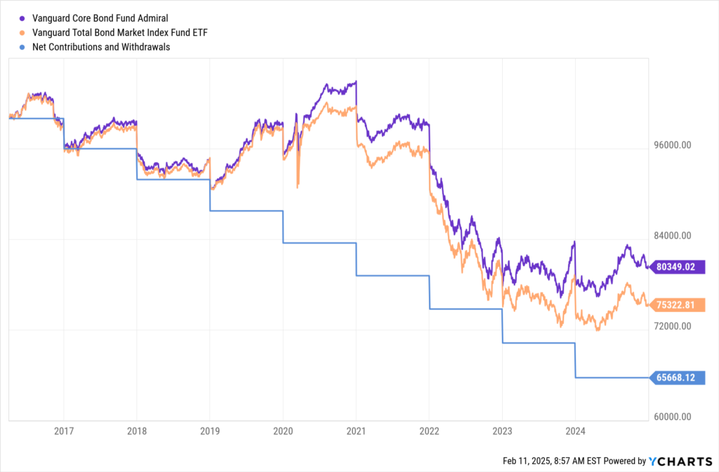
Using Scenarios in meetings with advisors enables you to dynamically adjust contribution tables, initial balances, withdrawal and contribution rates, and the timelines of scenarios. This flexibility aids in crafting personalized strategies that align closely with their clients’ needs.
As the fixed-income landscape evolves, tools like the Dashboard, Comp Tables, and Scenarios become invaluable for distribution teams when supporting advisors. The insights and synergy provided by these tools help facilitate engaged conversations and ensure that portfolios are not only tailored to current economic conditions but also positioned to adapt to future changes.
Whenever you’re ready, there are three ways YCharts can help you:
Have questions about how YCharts can help you grow AUM and prepare for meetings?
Email us at hello@ycharts.com or call (866) 965-7552. You’ll get a response from one of our Chicago-based team members.
Unlock access to all three tools by becoming a client.
Dive into YCharts with a no-obligation 7-Day Free Trial now.
Sign up for a copy of our Fund Flows Report and Visual Deck:
Disclaimer
©2025 YCharts, Inc. All Rights Reserved. YCharts, Inc. (“YCharts”) is not registered with the U.S. Securities and Exchange Commission (or with the securities regulatory authority or body of any state or any other jurisdiction) as an investment adviser, broker-dealer or in any other capacity, and does not purport to provide investment advice or make investment recommendations. This report has been generated through application of the analytical tools and data provided through ycharts.com and is intended solely to assist you or your investment or other adviser(s) in conducting investment research. You should not construe this report as an offer to buy or sell, as a solicitation of an offer to buy or sell, or as a recommendation to buy, sell, hold or trade, any security or other financial instrument. For further information regarding your use of this report, please go to: ycharts.com/about/disclosure
Next Article
Breaking Down the January 2025 CPI Report: Inflation Trends & Investment ImplicationsRead More →