YCharts Monthly Product Update: June 2025
At YCharts, we strive to be best-in-class when it comes to providing the tools wealth management professionals need to deliver great results for their clients. YCharts has grown into an all-in-one platform for investment research and client communication. Our guiding principle has always been to create software that elevates and enables our clients’ goals – tools that are easy to use, data that is reliable and timely, and customer service that stands head and shoulders above the industry.
Here’s a look at YCharts’ most recent feature releases.
June 2025 Summary
Guided Workflows
Guided Workflows are now available throughout the platform, offering step-by-step instructions for completing key tasks. These workflows help streamline actions like creating Dashboards, navigating tools, and setting up portfolio views. This update supports onboarding and improves efficiency across common advisor workflows.
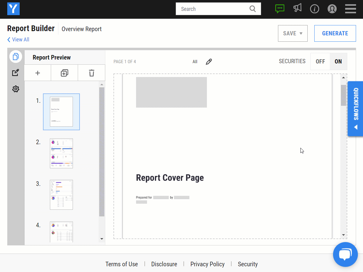
Interactive Analysis Tool: Disclosure Updates
Interactive Analysis Tool now includes disclosure elements that highlight key settings, providing added transparency in proposal outputs. These updates ensure clear, accurate reporting for client-facing materials.
May 2025 Summary
AI Market Commentary Dashboard Module
The new AI Market Commentary module delivers timely market insights directly within your Dashboard. It automatically updates with premarket summaries, intraday news, notable stock movements, and key economic data releases. Add it to any Dashboard to keep important market information centralized and continuously refreshed throughout the day.
Holdings Overlap
Holdings Overlap enhances YCharts’ visual toolkit, empowering distribution teams to differentiate strategies at the point of sale. Use intuitive, data-driven visuals to highlight deviations from benchmarks or competitors across holdings, sector weights, or security exposures. Advisors can also analyze peer funds, evaluate models, or assess a prospect’s portfolio to uncover overlap and identify what sets a strategy apart.
Folder for Workflow Organization
Folders are now available, offering a centralized way to organize Portfolios, Custom Securities, Fund Charts, Risk Profiles, and Reports into Public or Private folders. This structure simplifies meeting prep, enhances consistency across teams, and makes it easier to manage saved work. Additional tools will be supported in future updates.
April 2025 Summary
Risk Profiles
Risk Profiles enhance the proposal workflow by aligning investment recommendations with a client’s risk preferences. Advisors can use plug-and-play public profiles or customize their own to reflect firm-specific methodologies. Risk Profiles integrate seamlessly into PDF reports, with visuals that clearly explain the “why” behind every portfolio strategy.
Monte Carlo Analysis
Monte Carlo Analysis is now available in Scenarios and Interactive Analysis. This forecasting method runs thousands of return simulations to model potential risk and reward outcomes over a custom time horizon. Results can be added to proposal reports, supporting deeper client conversations around uncertainty and performance expectations.
Household Portfolios: Overview & Reporting Enhancements
New enhancements to Household Portfolios improve organization and client reporting. A streamlined overview page provides a clear view of household-level accounts, and proposal reports now include key household statistics for easier client communication. Alongside the recently released Transition Analysis, these updates deliver a more complete picture of household investment strategies.
March 2025 Summary
AI Chat
AI Chat is now available on the platform. Accessible from the Tools dropdown or the search bar on any page, AI Chat helps streamline workflows by generating charts, summarizing SEC filings, researching securities, and more. This release enhances productivity across portfolio analysis, research, and content creation.
Household Portfolios: Transition Analysis
A new Transition Analysis tab is available for Household Portfolio types. This enhancement allows an entire household to be transitioned into a single portfolio or a group of portfolios aligned with a target allocation. Cost basis is automatically analyzed to provide the most tax-efficient way to transition over the portfolio, helping advisors optimize reallocation planning.
Custom Performance Disclosure
PDF Reports now support a custom performance disclosure, allowing compliance-approved language to appear on any page that includes performance metrics. This update helps standardize reporting and supports firm-specific compliance requirements.
February 2025 Summary
Household Portfolio Types
A new Household Portfolio type is now available, allowing multiple client portfolios to be grouped under a single household. This portfolio type holds only portfolios—not individual securities—providing a consolidated view of household-level asset allocation and performance.
Integration Auto-Refresh
Imported portfolios and Custom Securities can now update automatically with Integration Auto-Refresh. Refresh frequencies—Daily, Weekly, or Monthly—can be set for individual portfolios and securities or applied as a default across all integrations. This update reduces manual updates and improves efficiency when managing multiple integrations.
New Stone Ridge Funds Available
Stone Ridge funds SRRIX and LENDX are now available on the platform, providing new options for modeling alternative investments. SRRIX focuses on reinsurance-related securities, while LENDX invests in alternative lending strategies. This integration supports deeper portfolio analysis and helps advisors incorporate alternative assets into client solutions.
January 2025 Summary
Enhanced Sharing Across Groups
Saved assets—including charts, tables, portfolios, and dashboards—can now be shared across multiple Share Groups. This enhancement allows specific assets to be shared with any number of select groups while others are shared more broadly, simplifying collaboration and improving sharing within complex organizational structures, such as OCIOs, asset managers, and large firms with affiliate advisors.
Updated Search Bar
The Search Bar now includes quick access to recently viewed pages and activities, making it easier to revisit important content. The intuitive auto-complete functionality remains, allowing for quick searches of securities, portfolios, indexes, and indicators. This update enhances search efficiency and supports upcoming AI-powered search capabilities.
Relative Attribution Update
A deeper view of portfolio performance is now available with the enhanced Relative Attribution analysis. This update provides insight into how individual holdings impact overall performance relative to sector or asset class allocation, making it easier to identify investments driving gains or losses.
Export Data from Dashboard Modules
Data can now be exported directly from dashboard modules using the three-dot menu in the upper right corner of each module. This update streamlines workflows by providing faster and easier access to extracted data for reports and external analyses.
Daily Rebalance Option
An additional rebalance frequency option—Daily—is now available for Portfolios. The available options now include yearly, quarterly, monthly, never, or daily rebalancing. The daily option helps maintain constant portfolio weights for modeling purposes or can be used for report generation with holdings displayed at target weights without any drift.
Expanded Net of Max Fee Display Options
New display options have been added for firms using a Net of Max Fee approach to meet SEC Marketing Rule requirements. These options provide flexibility in where and how net returns are shown, both on the platform and in reports. This update is particularly useful for SMAs and portfolios holding SMAs, supporting compliance workflows and performance reporting.
December 2024 Summary
Custom Securities Allocation Tab: Alternative Asset Allocation Breakdown
Custom Securities now include an Alternative Asset Allocation breakdown within the Allocations tab. This breakdown categorizes alternative assets across groups such as Derivatives, Hedge Funds, Private Equity, Art, and Other. This enhancement provides a clearer view of alternative asset exposure within portfolios, ensuring accurate and detailed allocation insights.
New Portfolio Metric: Potential Risk
The Potential Risk metric offers a new way to evaluate portfolio downside exposure. By analyzing downside capture against a benchmark, this metric estimates the potential risk a portfolio may face under various market scenarios. This forward-looking risk score helps advisors better understand and communicate portfolio risk, enhancing client discussions and investment planning.
November 2024 Summary
Nested Sharing
YCharts’ enhanced sharing capabilities enable Large RIAs and Independent Broker Dealers to share affiliate-specific models, dashboards, and reports with affiliate advisors, facilitating a consistent proposal process across the firm while preserving the autonomy valued by affiliate advisors. Additionally, asset managers and Outsourced Chief Investment Officers (OCIOs) can now provide bespoke solutions directly to advisors or firms already using YCharts. To set up your first share group, reach out to your YCharts representative or support@ycharts.com.
New Household Modules in Report Builder
Our PDF Report Builder now includes two modules to enhance household-level analysis. The Household Overview module provides a detailed breakdown of all underlying accounts, offering a clear view of the entire household portfolio. The Household Asset Allocation module visualizes how assets are allocated across the household and highlights differences in asset breakdowns within each account, giving a complete picture of your client’s investments.
Custom Security sFTP Upload
The sFTP upload feature simplifies the creation and management of Custom Securities. Use this tool to batch-update multiple securities, such as alternative assets or international holdings, in one streamlined process. The YCharts team will work with you to set up and optimize this solution for your portfolio needs.
Month- and Quarter-End Tearsheets
YCharts now supports generating tearsheets as of the last month or quarter end. These standardized reports update all performance and risk metrics to reflect the selected historical period, providing consistent, accurate data for client discussions.
October 2024 Summary
Interactive Analysis Tool
YCharts’ Interactive Analysis Tool enhances client conversations with a scenario-based experience. Guide clients through hypothetical investment scenarios, analyzing whether a portfolio—with planned contributions and withdrawals—aligns with their investment objectives. The tool’s capital market assumptions bring future market projections into focus, helping illustrate potential outcomes and enrich storytelling around financial goals.
Alternative Investments: Custom Security Asset Classifications
With YCharts’ Custom Securities tool, users can now create alternative investments by uploading return data at any frequency, such as daily or monthly. These custom securities can be categorized into alternative asset classes such as Private Equity, Hedge Funds, or Real Estate. Once added to a portfolio, these custom securities enable detailed asset classification breakdowns and performance tracking.
Passkeys for Login
YCharts now supports Passkeys, providing a seamless and secure login with biometric authentication. Log into YCharts with your fingerprint or other biometrics, replacing traditional passwords.
September 2024 Summary
Quick Extract
YChart’s new Quick Extract feature is a game changer that helps eliminate one of the most time-consuming challenges in wealth management: importing prospect and client portfolio data. With seamless support for .PDF, .PNG, .JPG, .CSV, and .XLSX files, our tool leverages multimodal AI technology to read and extract information from documents and images, allowing users to jumpstart portfolio creation in our platform. Once uploads are complete and checked, you can transition quickly to performing analysis, optimizing portfolios, and generating reports in an integrated workflow.
By reducing the time needed to upload holdings and create portfolios, you can focus on higher-value analysis work sooner, empowering more efficient, effective client engagements to accelerate AUM growth.
Correlation Matrix Tab
Fund or portfolio quote pages now have a new Correlation Matrix tab that helps you quickly visualize the holdings correlations of a fund or portfolio’s underlying positions, or compare correlations for a fund or portfolio across a set of peers. Users will be able to define peers for both fund and portfolio view, with the ability to start from a pre-populated peer universe when using fund pages. Designed in an easy-to-read “heat map” view, users have the ability to toggle on or off actual correlation numbers in the table.
Report Builder: Upside/Downside Capture Ratio Module
Expanding our available risk metric universe in reports, we’ve added the Upside/Downside Capture Ratio module for the Overview, Comparison, and Multi-Comparison reports. This module illustrates the ratio of upside and downside performance an investment has historically captured relative to a benchmark’s performance, with data across 1-year, 3-year, 5-year, 10-year, and 15-year lookback periods.
August 2024 Summary
Batting Average Metric
Now available across YCharts, the Batting Average metric helps gauge how frequently a security outperforms an index or the broader market. This metric is calculated by dividing the number of months a security’s returns exceed its benchmark by the total number of months in the selected period: (# of Months Returns > Benchmark Returns) / Total # of Months. Users can apply this calculation over various lookback periods, including 1-year, 3-year, 5-year, 10-year, 15-year, and since inception.
Report Builder
YCharts’ Custom Tearsheets now include the option to add a Custom Disclosure module that automatically populates with your firm’s specific disclosure, drawing from the language previously added to your team’s account settings.
Portfolio Optimizer
Users can now share previously performed portfolio optimizations, enabling collaboration across teams. As with other YCharts tools, users can control access by designating permissions for team members to view or edit the shared optimizations.
Share Groups
YCharts’ new Admin Share Groups feature gives designated Account Admins full control to independently create and manage Share Groups. This added flexibility empowers Admins to oversee their Share Groups without needing to contact YCharts customer support, streamlining the sharing process.
Account Admins can create and manage Share Groups, add or remove users, set user permissions, and assign Admin roles within the groups.
July 2024 Summary
Attribution
The Relative subtab now includes new attribution views for Broad Asset Class, Bond Sector, and Bond Maturity. These updates provide users with deeper insights into how each specific category contributes to a portfolio or fund’s overall performance.
Additionally, users can now utilize the “As-of-Date” functionality to perform point-in-time analyses. Options include Daily (latest data), Month End, Quarter End, or a custom date selection, allowing for more precise and tailored evaluations.
Report Builder
Updates to the Report Builder include:
Orientation Switch: Whether starting from scratch or using one of YCharts’ templates, users now have the option to switch reports from portrait to landscape or vice versa. This added customization allows wealth management professionals to tailor their reports or proposals to suit any situation perfectly.
Tearsheet Builder Modules: Users can enhance their custom tearsheets with new modules, including a one-eighth-page pie chart for displaying allocation, sector exposure, and other data. Additionally, quarter-page and one-eighth-page bar chart modules are now available to visualize datasets such as performance and risk.
Transition Analysis: A new full-page Transition Analysis module allows users to incorporate previously archived transition recommendations into any Overview or Comparison custom report. This feature strengthens proposals by providing prospective clients with clear insights into potential tax implications when transitioning to a new advisor.
Addepar Custom Securities Integration
YCharts users who custody with Addepar can now seamlessly import custom securities data into YCharts. By linking their Addepar account, users can import securities data, including alternatives not readily available on YCharts. Once imported, these securities can be used throughout the YCharts platform just like any other security.
Watch the short video below to learn more:
Dashboard
You can now build custom data tables on your Dashboard more efficiently by adding previously saved metric sets. This enhancement allows you to monitor the data you’re most interested in quicker.
June 2024 Summary
Transition Analysis
YCharts’ new Transition Analysis tool is a game-changer for financial advisors, simplifying the often complex and time-consuming process of client portfolio transitions. With this tool, users can effortlessly compare current and target portfolios side-by-side, tailoring the transition process to minimize their clients’ tax liability while aligning with their preferred portfolio allocation. This means advisors can make more informed decisions, enhance client communication, and execute transitions with greater confidence and efficiency. By streamlining portfolio transitions, the Transition Analysis Tool not only saves time but also improves the overall client experience, while helping you win new business faster.
Broadridge Investigo Integration
Similar to YCharts’ other available holdings integrations, the Broadridge Investigo integration allows users to seamlessly import account holdings, by weight or cost basis, build client portfolios, perform in-depth portfolio analysis, and streamline the creation & sharing of client communication and prospecting materials across your team.
Report Builder
New updates to YCharts Reports include the addition of:
Custom Tearsheet module: With the introduction of the Tearsheet Builder last month, users can now incorporate previously saved tearsheets into a custom report. This module adds an at-a-glance overview of selected securities, helping to highlight specific metrics or datasets for your next meeting.
Common Holdings module: When creating a custom Side-by-Side report or Multi-Comparison report, users can now include identified common holdings into a custom report with the “Top 25 Common Holdings” module.
Compliance Admin Capabilities
The addition of Compliance Admin Groups allows compliance teams to review all created and generated reports by their teams. This feature is ideal for maintaining an audit trail and tracking report history, ensuring adherence to your practice’s compliance policies.
Multi-factor Authentication (MFA)
The newly added MFA feature enhances the security of your YCharts account by requiring an additional verification step during login. This not only makes it easier and more secure to access your account but also provides peace of mind by safeguarding your data and your firm’s data against unauthorized access.
May 2024 Summary
Tearsheet Builder
Use YCharts’ Tearsheet Builder to create a fully customized one-pager that tells the investment narrative you want for a given strategy. Located within the Report Builder, you’ll be able to select relevant modules and choose between portrait or landscape orientation for both single security and multi-comparison reports. Add up to 16 different modules to a single page, including returns data, asset allocation, user-defined data tables, scatter plot charts, exposure, top holdings, relevant disclosures, and custom text fields for personalized commentary.
Additionally, Multi-comparison Tearsheet Reports equip wealth management professionals with tools for seamless head-to-head analysis, enabling effortless comparison of three to six different securities or portfolios. These concise one-pagers are also perfect for wholesalers, allowing you to highlight the key value propositions of specific funds or ETFs.
Tax Analysis for Client Portfolios
A new “Potential Tax” column has been added to the “Holdings – Account View” tab in YCharts’ Client Portfolios. This column provides insights into the potential tax implications of selling a position. The default tax rate is set at 15%, but users can adjust this rate based on their account access level.
Common & Unique Holdings
Users can now access a holdings dropdown menu in the “Comparables” section of the “Holdings” and “Holdings Overlap” tabs for funds and portfolios. This feature allows users to identify Common Holdings and Unique Holdings when comparing up to three different user-defined comparables.
April 2024 Summary
Dashboard
Users now have the ability to seamlessly integrate Technical Chart modules into their YCharts Dashboard. Whether crafting a new chart from the ground up or opting for a pre-saved one from their account, they can effortlessly incorporate it into a dedicated dashboard. This empowers them to monitor price trends for any tracked security or index with ease.
Portfolio Optimizer
After running an analysis within the YCharts Portfolio Optimizer, users can now compare up to six static portfolios directly against the optimized one generated on the efficient frontier view. This feature enhances their ability to evaluate and compare the risk and reward profiles of each portfolio, providing deeper insights into their investment strategies or other model strategies all in one view.
Custom Text
Within YCharts’ Portfolios and Custom Securities, descriptions can now be effortlessly updated using an intuitive WYSIWYG (What You See Is What You Get) editor. Users can easily format text by bolding, italicizing, or underlining, and even include hyperlinks for added functionality.
Holdings Integrations
Available for YCharts’ Addepar, Black Diamond, and Orion portfolio integrations, users now have the option to import holdings using cost basis data instead of portfolio weights. This feature is particularly valuable when importing Client Portfolios, as it ensures a more precise reflection of the portfolio’s value and investments. By incorporating cost basis data, users gain enhanced context behind total gains/losses per position, leading to a more comprehensive understanding of their portfolios.
Draft Reports
When creating a report, either directly from a security or portfolio’s quote page or through YCharts’ Report Builder, you can now generate a draft version in PDF format that includes a “DRAFT” watermark on every page of the report. This new functionality promotes transparent collaboration by clearly indicating to your team when a document is ready for sharing with clients or external stakeholders and when it’s still a work in progress.
March 2024 Summary
Reports
The YCharts Report Builder now offers users the ability to choose between displaying values as percentages (%) or dollar amounts ($). This enhanced feature is accessible across all report modules related to asset allocation, exposure, and holdings. By default, modules will still show percent weights, but users can toggle between the two options for each module. This new functionality empowers client-facing professionals to provide better context during client meetings by presenting data in actual dollar values, making the information more digestible for clients.
February 2024 Summary
iRebal Integration
YCharts proudly announces the new two-way data flow integration with iRebal, marking a significant enhancement over previous integrations. This feature allows for a seamless transfer of portfolio holdings between YCharts and iRebal, empowering advisors to refine investment strategies with our advanced analysis tools. The Portfolio Optimizer, for instance, enables portfolio managers to fine-tune models for maximum return while aligning with client objectives and effectively managing risks.
Watch our video walkthrough for a detailed demonstration of the iRebal integration.
Portfolio Optimizer
The latest update to our Portfolio Optimizer introduces the ability to set minimum or maximum holding weights, or to apply weight bands based on a security’s target weight. This flexibility ensures wealth management professionals can tailor portfolio optimization without straying from established client allocation targets. Moreover, the new feature allows for the generation of comprehensive PDF reports, including efficient frontier charts and correlation matrices, readily available for inclusion in custom reports and presentations through the Report Builder.
Enhanced Multi-Comp Reports
Our Multi-Comp reports, ideal for analyzing both funds and portfolios, now automatically include advisory and maximum fees in the “Cumulative Return” and “Basic Info” sections by default. This update provides wealth management professionals with vital fee information at a glance, further enhancing the utility and comprehensiveness of YCharts’ reporting capabilities.
January 2024 Summary
Reports
New updates to YCharts Reports include the addition of:
Landscape Overview & Comparison Reports: Within YCharts’ Report Builder, users will now be able to create landscape formatted reports for Overview and Comparison reports, in addition to previously available multi-comparison reports and presentations, which default to landscape view. This new report orientation is ideal for combining YCharts report outputs with other general presentation materials or for presentation screenshares for virtual meetings with your teams and clients alike.
PDF Reports for Security Lists: Users can now select a watchlist, in lieu of individual securities or portfolios, when generating a report within the Report Builder for a more efficient workflow. This will allow for a combined report that includes all the securities in your list. Note that this is currently limited to any watchlists made up of 25 or fewer portfolios or securities.
Custom Report Footers: You can further personalize their PDF reports with tailored footers to ensure they meet any necessary firm-specific compliance requirements.
Email Reports
YCharts recently revamped its Email Reports functionality, mirroring the drag-and-drop capabilities from YCharts’ popular Report Builder to make it easy for users to customize and organize modules as they see fit. Users can add modules for securities and economic performance, market update calendars, previously created charts, and market commentary. Check out the video below, which highlights some of the new features:
Additionally, users will be able to designate the send frequency between daily, weekly, monthly, or quarterly.
Scenarios
A template library has now been added to YCharts’ Scenarios tool to help users quickly visualize withdrawal and contribution hypotheticals for their clients. Templates range from projecting the implications of retirement withdrawals, the impact of dollar cost averaging, and performance during recessionary periods and volatility.
Additionally, YCharts users can now download a created scenario as a .PNG image file using the export function within the tool and incorporate it into their reports or upcoming client presentations.
December 2023 Summary
Dashboard
New updates to the YCharts Dashboard include the addition of:
Heatmap Module: Users can now build a custom heatmap view of a security list, saved watchlist, or a portfolio’s (or fund’s) holdings using performance and valuation metrics. Users will be able to view on a “Market Cap”, “AUM” (funds only), or “Price” level with the option to draw comparisons across various performance and fundamental metrics.
Hyperlink Capabilities: Within the Custom Text module, users can add hyperlinks linking their dashboard notes to other web pages as needed.
Scatter Plot
Additional Share Capabilities: Users now have the ability to share created Scatter Plot charts directly to X (formerly known as Twitter) as well as generate an embed code to include within a blog or other media.
November 2023 Summary
Portfolios
In addition to Model Portfolios, YCharts has added two new portfolio types:
Benchmark Portfolios: Create custom blended benchmarks to compare other portfolios or investments against. Benchmark Portfolios are specialized for users who want to assign a benchmark to another Model Portfolio or use it for comparison purposes against other portfolios or securities.
Client Portfolios: Client Portfolios provide a client-centric perspective, excluding certain options to enhance the focus on actual holdings and facilitate more detailed insights into client-specific accounts to ensure more personalized financial insights.
Additional advanced features now available within YCharts portfolios include:
- – Exposure Proxy (applicable to Model Portfolios & Benchmarks): Allows users to assign a security as an exposure proxy to a holding, providing a more accurate representation of their portfolio’s allocation and exposure.
- – Performance Proxy (applicable to Model Portfolios, Client Portfolios & Benchmarks): Enhances historical performance accuracy by enabling users to assign a performance proxy to a holding, ensuring precise calculations for periods with limited or no performance data.
- – Performance Backfill (applicable to Model Portfolios, Client Portfolios & Benchmarks): Enables users to enhance portfolio analysis by incorporating performance data by uploading a file of historical returns.
- – Cost Basis (applicable to Client Portfolios): Allows users to enter Average Cost Basis values for each holding, contributing to a more precise dollar-centric view of client portfolios. This information enhances the understanding of the actual cost and profits of assets held in a portfolio.
Technical Charts
New annotation capabilities within YCharts’ Technical Charts empower investors to highlight insights into price patterns for a security or index. Users can now add shapes, lines, text boxes, counters, and more to highlight specific timeframes or significant price points and draw attention to noteworthy historical price shifts. Some advanced indicators investors can use to perform in-depth analysis include:
- – Pitchfork Bands: Used to identify potential levels of support and resistance for an asset. It is drawn using three parallel trendlines that help determine the general direction of the trend and possible areas where the price may reverse or continue.
- – Parallel Channel: A technical pattern formed by drawing two parallel trendlines: one connecting the highs and another connecting the lows of price movements. This channel helps traders identify potential buying and selling opportunities based on the price oscillating between these parallel lines.
- – Fibonacci Retracements: Horizontal lines on a chart that indicate potential levels of support or resistance based on ratios derived from the Fibonacci sequence. Typical retracement levels are 23.6%, 38.2%, 50%, 61.8%, and 78.6%. Traders use these levels to identify potential entry or exit points for trades based on the observed price movements.
Stress Test
Users can now create custom stress tests within a security, portfolio, or index’s data page. Add a new stress test modal by designating a custom time frame. Pull in any saved stress tests into a report using the “Stress Test” module within Report Builder.
AI News Module
Available for all S&P 500 and NASDAQ 100 stocks, users can now ask six pre-defined questions that will be answered by OpenAI. YCharts will select the ten most relevant articles from the past 20 days based on OpenAI’s embedding model to generate a summary that provides useful news and information regarding a particular stock. The six available questions are:
1. What’s happening with [Stock Name]?
2. How’s [Stock Name] performing?
3. What’s happening with the [Stock’s Sector]?
4. How’s [Stock’s Index] performing?
5. What’s the market sentiment of [Stock Name]?
6. What’s happening with the peers of [Stock Name]?
Report Builder
The NEW “Holdings by Category” PDF module allows users to assign a specific categorization type, including Broad Asset Class, Fund Category, Equity Style, and Sector, for a designated fund or portfolio. You’ll also have the ability to choose which module metrics (e.g. Close Price, Annualized 1-Year Total Returns, Distribution Yield) and info fields (e.g. Dividend Frequency, Industry, Inception Date) to include on that report’s page.
October 2023 Summary
Attribution
Available for portfolios and funds, the Attribution tab provides users with a deeper understanding of the holdings that drive overall performance. This includes:
Absolute Attribution Analysis: This sub-tab includes a “Heatmap Module”, that provides a visual representation of the top 8 contributors and top 8 detractors of a portfolio or fund’s holdings and a “Contribution / Detraction Table” which shows the contribution and detraction of all holdings over a specific timeframe (e.g. 1-month, 3-month, 6-month, YTD, and 1-year).
Relative Attribution Analysis: Users can use this sub-tab to understand the sources of performance (or underperformance) in a portfolio relative to a benchmark. This includes:
- – Attribution Table: Displays the respective sector (or category) weights and returns for the portfolio or fund and the respective benchmark. The attribution score is calculated based on allocation, selection, and interaction.
- – Bar Chart Visualization: Visualizes the calculated attribution score to quickly identify which sectors (or categories) contribute or detract the most.
- – Returns Comparison: Visualizes the Return for the portfolio (or fund) compared to its benchmark for each sector or category.
Dashboard
A new “Custom Text” module can now be added to the Dashboard, allowing users to create notes alongside other chart, list, and news modules. Use this new feature to provide additional narratives for securities or portfolios you’re tracking, talking points that your team should be aware of on any shared dashboards, or other insights that would be valuable to you and your team.
Report Builder
Updates to the Report Builder include:
Bar Chart module: Use the “Bar Chart” module to draw direct comparisons between securities or portfolios for any user-defined metric. Users will also be able to edit the module name, frequency, and the option to include a benchmark for a more personalized report. This visual displays as a ¼ page module.
Reorganized Report Builder menu: In addition to being organized by size, modules are now categorized based on the metric type and information shown, including “Basic Info & Performance”, “Risk”, “Allocations”, “Holdings”, “Proposals & Scenarios”, “Charts & Tables”, “Disclosures & Definitions”, and “Other”.
Custom Securities
Updates to Custom Securities include:
Custom Security Performance Metrics: Expense ratio and yield metrics have been added, allowing for custom securities to be included in weighted average performance metrics within a model portfolio.
Level Continuation: Continuation settings put you in control of how the custom security is updated in the future. Choose to let the security update with the last level input or add a specified return instead.
September 2023 Summary
Talking Points
With YCharts Talking Points, users can customize text and images to elaborate on their investment recommendations, and make meetings count by sharing personalized proposals that foster engaging conversations about a client’s most important financial goals. Leverage the full library of metrics available within the platform to highlight what’s most relevant to your clients. Options include:
- – Number with Text: Best used for metrics that do not have historical data and are not calculated as a percentage (e.g. expense ratio).
- – Number with Line Chart: Best used for metrics with historical data where a line chart would provide additional context (e.g. max drawdown).
- – Donut Chart: Best used for metrics that are calculated as a percentage (e.g. allocation data)
Additionally, you’ll be able to save the most commonly used investment narratives to your account and share them with your team. Add these talking points to a report by using the “Proposals” modules found within the Report Builder, where users can choose between a full-page module that can include up to four talking points or a half-page module with up to two.
Updated Subscription Plans
YCharts’ subscription plans have been updated to offer a tailored experience for every member of your team, ensuring optimal effectiveness and efficiency based on their specific role and day-to-day responsibilities. These new tiers include:
- – Analyst: Built for individuals and professionals who focus on investment research and analysis.
- – Presenter: Built for client-facing professionals with an emphasis on proposal generation and client communication
- – Professional: Includes all the benefits of Analyst & Presenter as well as YCharts’ full suite of investment analysis, proposal tools, and comprehensive datasets.
To learn more about the specific tools and features available for each tier, check out YCharts’ Plans page.
*Note that updated subscription tiers are not available for wholesalers or asset manager clients at this time.
Report Builder
New and improved “Dynamic Disclosure” and “Security Type Disclosures” modules have been added as inputs in YCharts’ Report Builder. These modules will populate based on the assets utilized in a created report and update for necessary definitions for relevant security types, risk & performance metrics, and more.
Technical Charts
“Presentation View” has been added to YCharts’ Technical Charts. Similar to the functionality found within Fundamental Charts, users have the ability toggle on and off Presentation View for a cleaner visual output. Dynamic capabilities are maintained in this view as well when adding a new security or indicator, switching between chart styles, and updating for chart frequency.
Updated Navigation Menu
YCharts’ in-tool dropdown menus and Support Center have been updated with a new layout for more intuitive navigation and additional content to stay up-to-date on the latest market trends as well as customer support materials to help you get the most out of your subscription.
August 2023 Summary
Technical Charts
Technical Charts has been revamped with an updated look & feel similar to YCharts’ well-established Fundamental Charts tool to provide a more visually appealing design and enhanced user experience. The same robust features and visualization options from the previous iteration are maintained in this update including the ability for users to choose between line, OHLC, and candlestick chart styles and overlay price action with technical indicators & custom views.
Report Builder
Updates to the Report Builder include:
Increased PDF Image Upload Limit: Users can now include a PDF file up to a total of 30 pages within their personalized reports using the “Full Page Image” module. Popular use cases include Investment Policy Statements (IPS), proprietary research materials, firm investment objectives, team bios, and investment policies.
Comp Table and Timeseries Analysis modules: Available in the Overview and Comparison reports, users can drag and drop these new modules into their personalized reports to analyze portfolio holdings & securities head-to-head utilizing YCharts’ 4,000+ available financial metrics for a specific point in time or historically.
Scenarios
Updates to the Scenarios Builder include:
Share Capabilities: Foster further collaboration by sharing insights with your teams, generate embed codes for external media, and even directly via a “tinyurl” link to other YCharts users.
Show Base Case Option: Once a scenario has been built out, users have the ability to “Show Base Case” in the Scenario Chart alongside the options to show standard deviation, net contributions & withdrawals, and benchmark comparison.
Comp Tables
Draw direct comparisons for any type of security leveraging the new best/worst returns and up/down months risk metrics. Lookback periods for both include: 3-month, 6-month, 1-year, 3-year, 5-year, 7-year, 10-year, and since inception. Additionally, you can utilize these metric sets within YCharts’ Stock & Fund Screener too.
July 2023 Summary
Portfolio Optimizer
Build the optimal allocation strategy to mitigate exposure to risk, maximize portfolio performance, and enhance data-driven decision-making for portfolio management using YCharts’ Portfolio Optimizer. This powerful tool perfectly complements YCharts’ Model Portfolios tool, offering an additional layer of analysis that focuses on risk and performance metrics to help streamline the development of the ideal asset allocation for your clients.
Available Strategies
Advisors will be able to develop an allocation strategy based on a client’s risk tolerance and long-term return goals in a matter of clicks. Select from four different strategies, including:
– Maximize Sharpe Ratio: This strategy aims to identify the portfolio allocation with the highest risk-adjusted return, also known as the tangency portfolio. The Sharpe ratio measures the return earned per unit of risk taken, allowing investors to find investments with the best risk-return tradeoff.
– Minimize Standard Deviation: This strategy aims to optimize the portfolio by minimizing its overall risk and reducing volatility to create a more stable and predictable portfolio.
– Target Return: This strategy aims to minimize portfolio performance volatility for a user-defined target return.
– Target Standard Deviation: This strategy aims to maximize portfolio return for a user-defined target risk.
After running a strategy, advisors can analyze the optimized portfolio along an efficient frontier, enabling them to recommend the optimal security weights tailored to their client’s risk-reward preferences.
Correlation Matrix
The Correlation Matrix uses correlation coefficients ranging from -1.0 to 1.0. A correlation coefficient of 1.0 indicates a perfect positive linear relationship between two holdings, while -1.0 signifies a perfect negative linear relationship. A correlation coefficient of zero suggests no linear relationship between the portfolio holdings. By utilizing the Correlation Matrix, users can assess the degree of performance similarity among securities and make informed decisions to maintain a diversified portfolio.
Scenarios Future Dates
Users can now build out a hypothetical scenario that includes an end date that goes into the future. Using either CAPM Expected Return, 10-year Total Return, or a custom percentage rate of return, the Scenarios Builder is able to project future anticipated returns for any given strategy. See how to use this new feature:
Navigation Bar
The YCharts navigation menu has been reorganized to better group investment data types, frequently used tool workflows, and customer support resources. Note that “Sectors”, “Investment Strategies”, and “News” can now be found within the Tools section. Additionally, Model Portfolios is now listed as “Portfolios”.
June 2023 Summary
Pershing Integration
The integration between YCharts and BNY Pershing, which includes access to data via Pershing Advisory Solutions, lets users seamlessly import account holdings and weights to build model portfolios, create visually compelling comparison reports, perform in-depth portfolio analysis, and streamline the creation & sharing of client communication and prospecting materials across your team. Get started here.
Watchlist Manager
YCharters can now view all their watchlists on one page. Our Watchlist Manager tool allows you to create, edit, filter, share, and delete watchlists.
Report Builder
Updates to the Report Builder include:
Stress Test Modules: Gain insights into the performance of a security or model during the market’s most turbulent periods of time. Users can choose up to six different time periods for this full-page module, including the Financial Crisis (10/15/2007 – 3/2/2009), Real Estate Crisis (9/25/2006 – 3/31/2011), Coronavirus Crisis (2/20/2020 – 12/31/2020), and more.
Granular KPI Data
YCharts now offers granular KPI data for stocks, seamlessly integrated from stratosphere.io, throughout the platform. Pull in data points like Amazon’s “Advertising Revenue” or even “Paid Subscriber” numbers from Netflix or Disney+ into YCharts’ charting tools to provide a holistic view of a company’s performance for a more accurate analysis of its business operations. Not a particular dataset you’re interested in? Reach out to our Support Team to see if that information is available to be added to the platform.
Dark Mode
Instead of YCharts’ default dark text against a light background view, users can turn on Dark Mode to update their settings to display light color text presented against a darker backdrop, reducing the amount of light emitted from their computer screen. Navigate to your account’s User Preferences section to enable this feature.
May 2023 Summary
Report Builder
Updates to the Report Builder include:
Live Preview: When building an investment report or presentation template, users will now see the visuals and data they’ll be adding in real-time and up-to-date with the latest information. Previously, placeholder images were used until users generated the report.
Custom Text Modules: Users can now provide additional commentary tailored for their upcoming client or prospect conversations. Highlight any key metrics or insights to personalize reports even further. Additionally, users can use this module to add any additional disclosures not already automatically generated.
Scenarios
To streamline meeting prep for an upcoming prospect or client check-in, users can now download a PDF Report of any built Scenario. The report includes a Portfolio Summary, Net Contributions/ Withdrawals, and a Contribution/Withdrawals Table to cover all your bases. Additionally, Scenario modules of these same sections have been added to YCharts’ Report Builder to further customize your investment reports.
Alerts Manager
Users now have more control over their account’s notification preferences Update and share Alerts with your teams to monitor any important securities or portfolios you’re tracking. Additionally, users will be able to mute any previously shared alerts that aren’t of interest to them.
Data
A new set of Bloomberg Indices, including Municipal Bond Short 1-5 Year and Municipal Bond 1-10 Year Blend are now available. Browse all available Bloomberg indices on the platform here.
Stress Test Tab
Available for any security or previously created Model Portfolio, users can now perform a direct comparison against another security or portfolio of interest within their respective Stress Test Tab. Additionally, users will be able to download a PDF report that consolidates all of the modules within this tab, which will include any user-defined security comparisons and associated benchmarks to ensure a complete investment narrative.
Integrations
Users can now import Portfolio Groups through the Orion integration in addition to Client, Account, Model, or Model Aggregate data into YCharts, which were previously available, to power their report and proposal generation, as well as portfolio research and analysis.
April 2023 Summary
Report Builder
Updates to the Report Builder include:
Saved Asset Modules: Users will now be able to pull in previously saved charts and data tables to further customize their reports. This includes previously created investment insights from Fundamental Charts, Comp Tables, Scatter Plot, and Timeseries Analysis.
Tearsheet Modules: Four tearsheet modules are now available, including:
– Security Tearsheets (targets securities within the report)
– Fixed Security (targets any security)
– Holdings (targets holdings of the securities within the report)
– Top Ten Underlying Holdings (targets the top ten overlapping holdings of the securities within the report)
Presentation Reports: A new report type to view information in landscape view that is ideal for presentations and for creating chart decks. A popular use case is for teams to create monthly (or quarterly) chart books that summarize market conditions and review recent economic trends.
Y-Rating Reports
The proprietary Y-Rating is calculated using a combination of the security’s Value score, Fundamental score, and Valuation from Historical Multiples score. The updated Y-Ratings report consolidates a security’s key stats, company information, financial statements, and a breakdown of the three noted criteria that make up the Y-Rating.
Holdings Data
The Holdings Overlap tab is now calculated using all stock and bond holdings that are held in a portfolio or fund that have a weight >0.001%. Additionally, the Holdings Comparables tab now displays all of a fund and portfolio’s individual holdings.
Enhanced Benchmark Drop Down
Users now have the option to toggle between the Broad Asset Class (default) or the YCharts Categorized benchmark view, which utilizes more targeted indices, on any fund’s quote page. Associated metrics will recalculate to reflect the selected benchmark and any generated reports will also be updated as well.
How Can We Improve?
Best of all, our product is built on feedback received from our users. With that in mind, we welcome any and all suggestions on any tools and features that you believe would make YCharts even better.
Connect with YCharts
To get in touch, contact YCharts via email at hello@ycharts.com or by phone at (866) 965-7552
Interested in adding YCharts to your technology stack? Sign up for a 7-Day Free Trial.
Disclaimer
©2025 YCharts, Inc. All Rights Reserved. YCharts, Inc. (“YCharts”) is not registered with the U.S. Securities and Exchange Commission (or with the securities regulatory authority or body of any state or any other jurisdiction) as an investment adviser, broker-dealer, or in any other capacity, and does not purport to provide investment advice or make investment recommendations. This report has been generated through application of the analytical tools and data provided through ycharts.com and is intended solely to assist you or your investment or other adviser(s) in conducting investment research. You should not construe this report as an offer to buy or sell, as a solicitation of an offer to buy or sell, or as a recommendation to buy, sell, hold or trade, any security or other financial instrument. For further information regarding your use of this report, please go to: ycharts.com/about/disclosure
Next Article
June Jobs Report, ISM & Powell: What Financial Advisors Must Watch This WeekRead More →